
Fresh Inspiration For Every Room. Exploring Color, Design, And The Art Of Home Transformation In Fairfield County, CT.
Color Notes: This Week At Stanwich Painting
Welcome to Color Notes, your Sunday digest from Stanwich Painting. This week we look at winter paint colors, demanding rooms where paint matters most, and why the off-season is ideal for exterior planning.

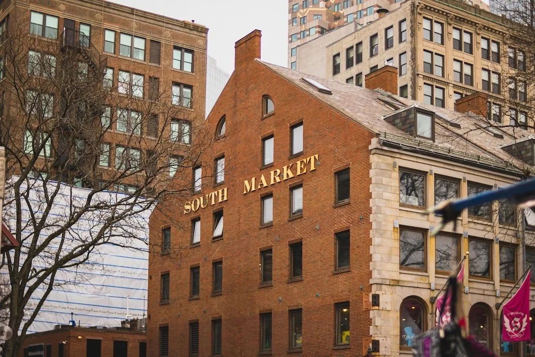
The Quiet Season For Exterior Planning
Winter strips away distractions and reveals the true condition of a home’s exterior. Without landscaping or summer light to soften the view, paint fatigue, wear patterns, and aging surfaces become easier to see. This reflective season offers homeowners a rare opportunity to take inventory, plan thoughtfully, and prepare for spring exterior work with clarity rather than urgency.
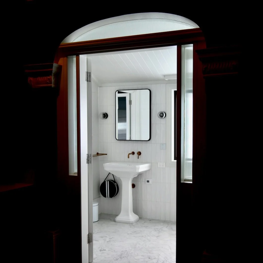
The Most Demanding Room In The House (And Why Paint Matters More There)
Bathrooms are the most demanding rooms in the house, facing daily moisture, heat, and constant use. Winter makes those pressures impossible to ignore. Here’s why paint matters more here than anywhere else — and how thoughtful choices quietly improve daily life.

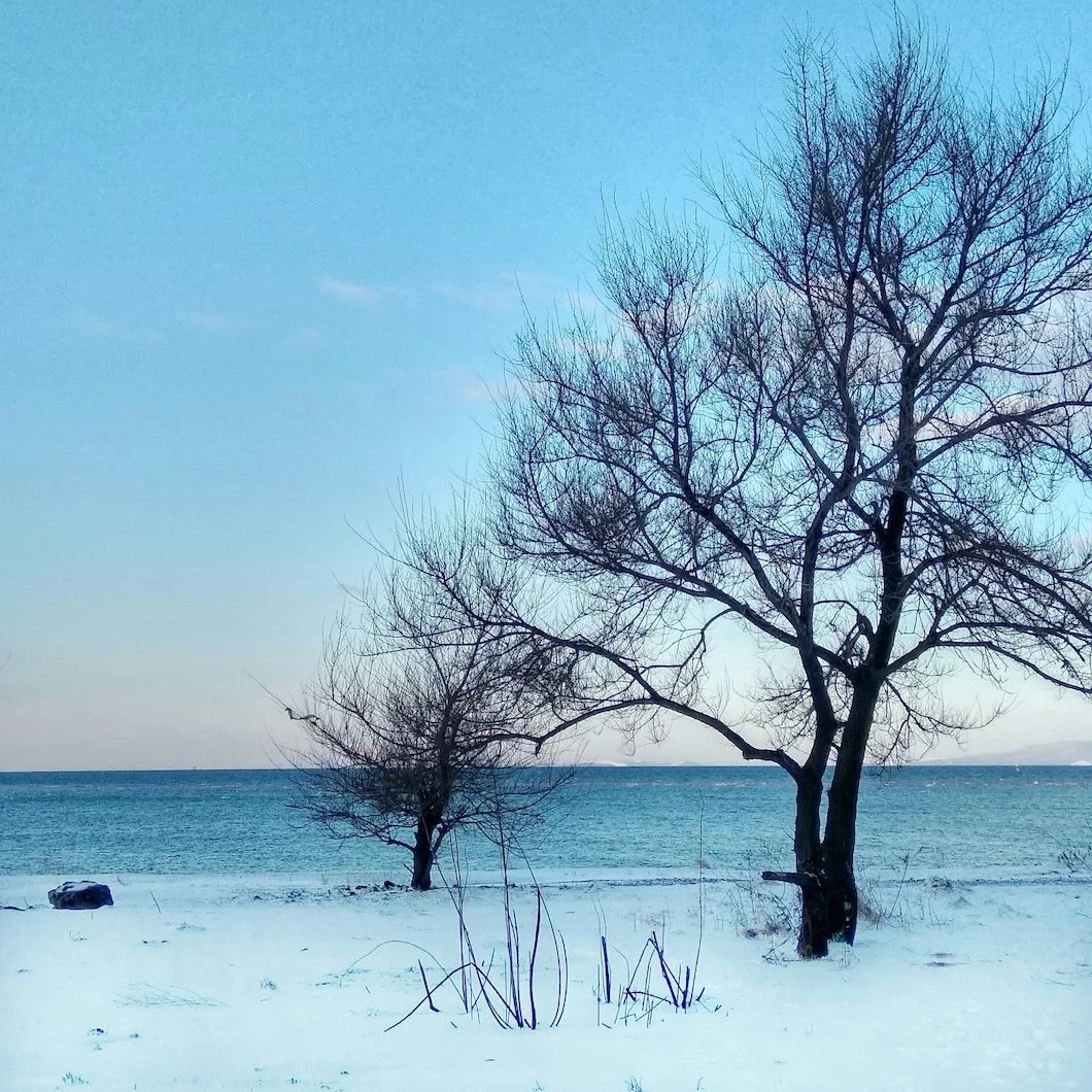
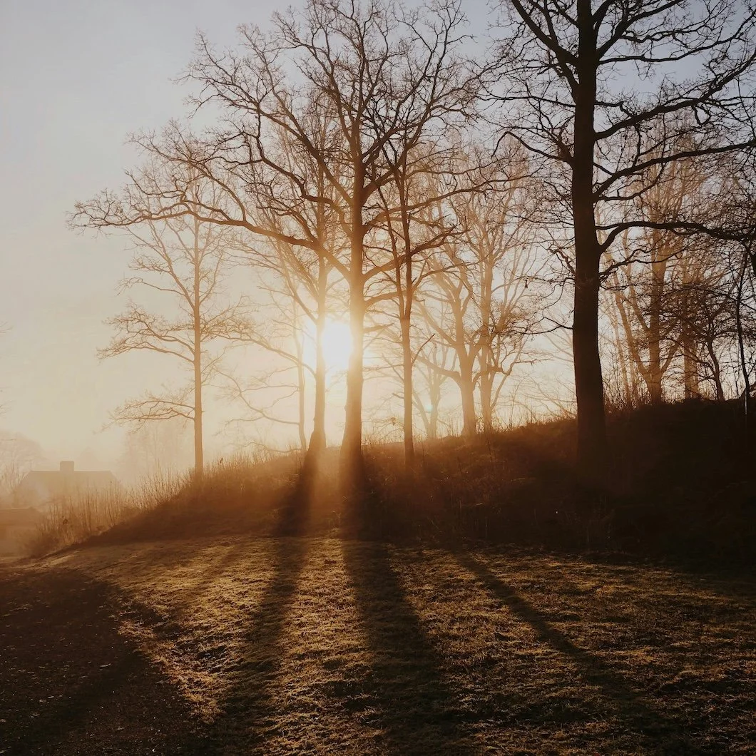
The Color of Snow: What Winter Light Reveals About Paint (And Why It Matters In Fairfield County)
Snow doesn’t just change the landscape—it changes the light inside your home. After a heavy Northeast snowfall, winter brightness can reveal undertones, shift whites cooler or warmer, and make neutrals behave differently than they did in fall. This guide breaks down what “the color of snow” really means for interior paint choices, from soft whites to snow-shadow grays, and how Fairfield County homeowners can choose colors that stay beautiful in every season.

Color Notes: This Week At Stanwich Painting
Welcome to Color Notes, your Sunday digest from Stanwich Painting. This week we explore quick mood-shift updates, smart ways to use AI for paint colors, and what to know before painting a brick exterior.
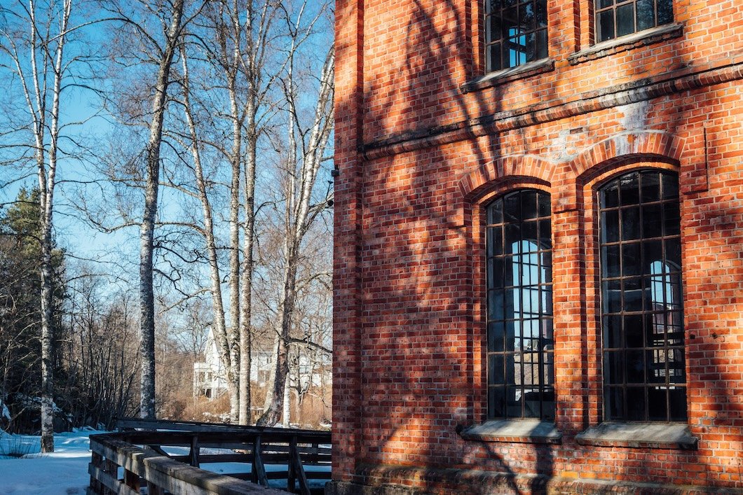
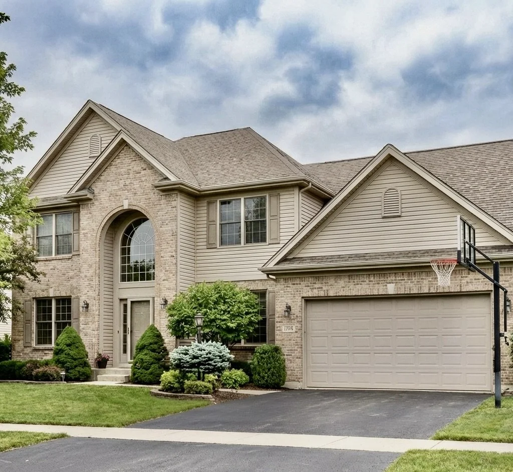
Can You Paint Brick? The Truth Behind The Most Controversial Exterior “Upgrade”
Painting brick is one of the most debated exterior upgrades—and for good reason. Brick isn’t siding: it’s porous masonry that manages moisture differently, and the wrong paint system can lead to peeling, trapped moisture, and long-term damage. In this guide, we break down when painting brick is a smart choice, when it’s a mistake (especially on historic homes), and what alternatives like limewash or brick stain can offer. If you’re considering painting a brick home in Fairfield County, here’s the grounded, no-drama truth before you commit.

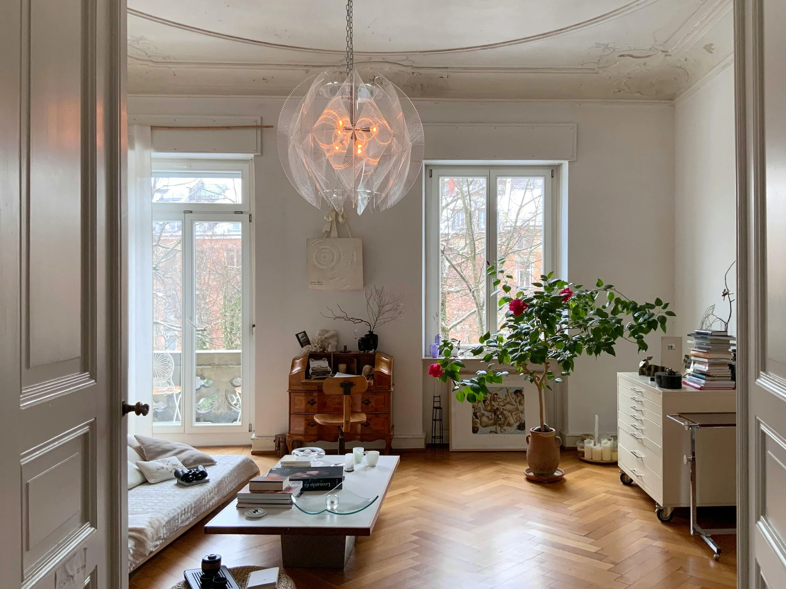
Paint Regret, Replaced: Using AI To Choose Interior Colors With Confidence
AI paint visualizers and design tools are changing how homeowners choose interior paint colors. Learn how to use AI to avoid paint regret and paint with confidence.
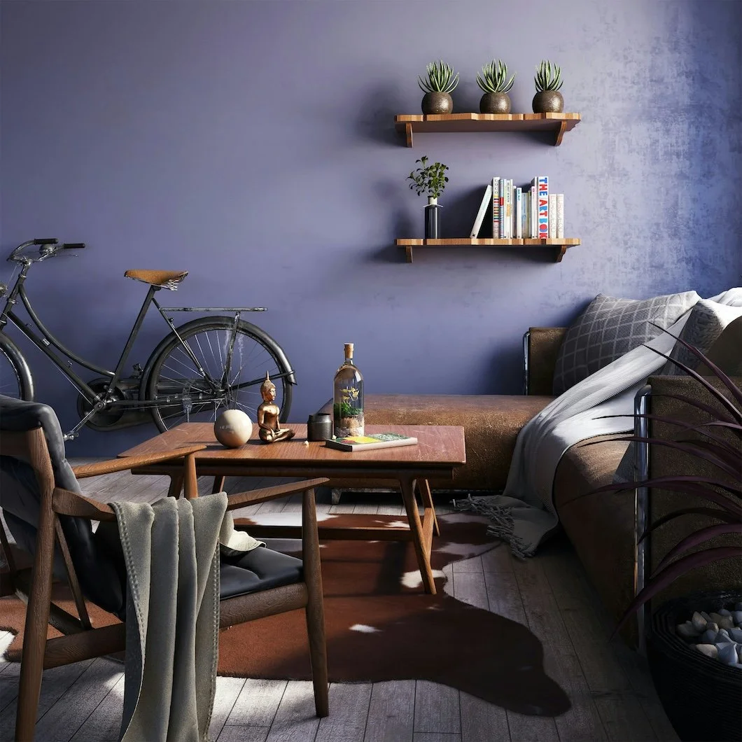
The 5-Minute Color Mood Shift: Paint Choices That Instantly Change A Room’s Energy
The fastest way to refresh your home is paint. Here are five color directions that transform a room’s energy in minutes, plus a simple finish tip that makes it all feel intentional.
Color Notes: This Week At Stanwich Painting
Welcome to Color Notes, your Sunday digest from Stanwich Painting. This week we looked at freeing 1990s homes from dated palettes, exploring frosted January tints, and understanding how winter light affects paint undertones.
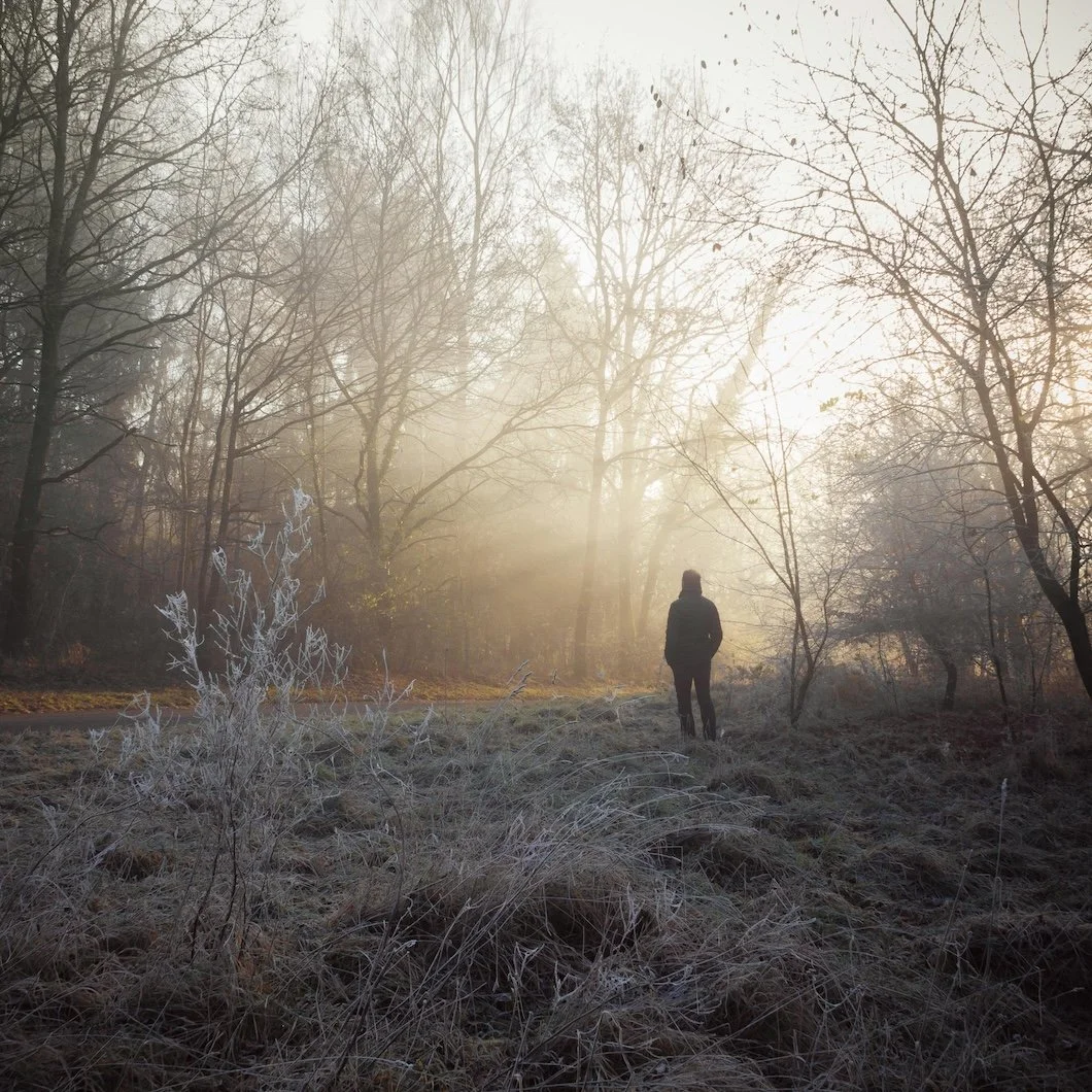
Winter Light Doesn’t Lie: Choosing Paint Colors That Hold Up In Snow Season
Winter light is the season where paint tells the truth. Snow reflection amplifies undertones, exposes sheen, and makes “safe neutrals” feel suddenly wrong—here’s how to choose colors that hold up.

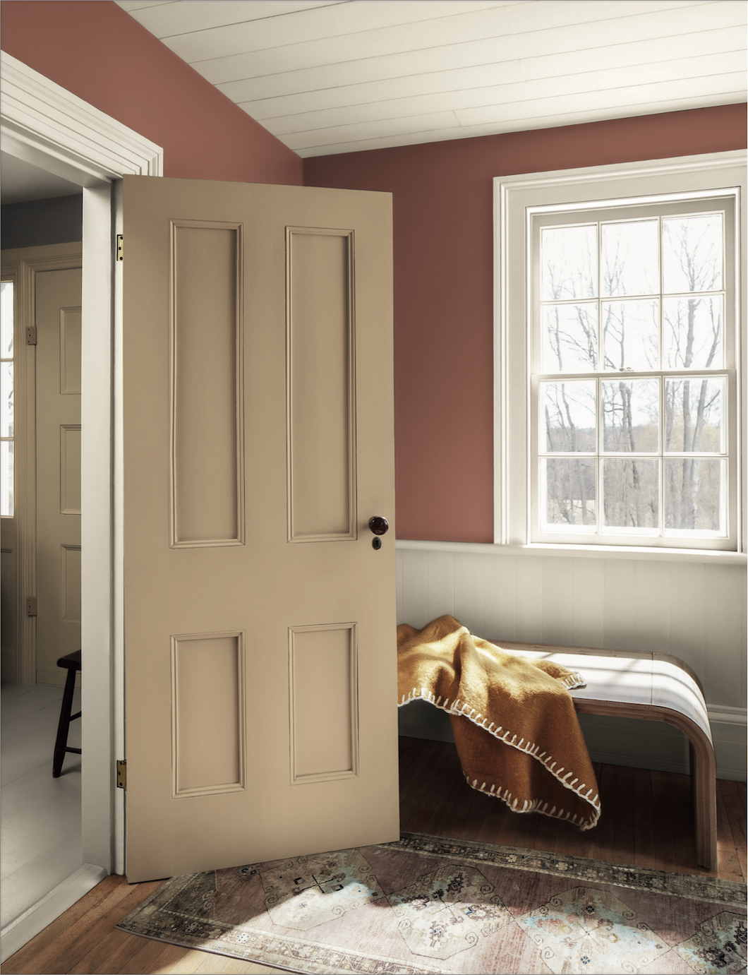
The Colors Of January: Frosted Tints And The Quiet Return Of Color
January interiors call for restraint, calm, and quiet optimism. Discover how Sherwin-Williams’ Frosted Tints bring soft color and modern warmth to winter spaces—without overwhelming the season.
Why 1990s Homes Feel Stuck And Why That Was The Point
Homes built in the 1990s were designed to be safe, neutral, and broadly appealing. Decades later, that stability can feel like indecision. This essay looks at why those homes feel stuck today—and how thoughtful paint choices can help them move forward.

Color Notes: This Week At Stanwich Painting
Welcome to Color Notes, your Sunday digest from Stanwich Painting. This week we explored personal color identity, how to apply the Sherwin-Williams 2026 forecast, and what design experts are predicting for next year.
What The Design World Is Really Predicting For 2026
Designers aren’t predicting bold new looks for 2026, instead they’re predicting correction. A thoughtful overview of where color, paint, and interiors are actually heading in the new year.
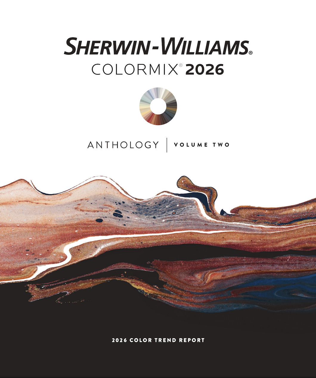
How To Use The Sherwin-Williams 2026 Colormix Forecast (Without Overthinking It)
Sherwin-Williams’ 2026 Colormix Forecast offers dozens of colors—but you don’t need all of them. A calm, edited guide to using the forecast without overwhelm.
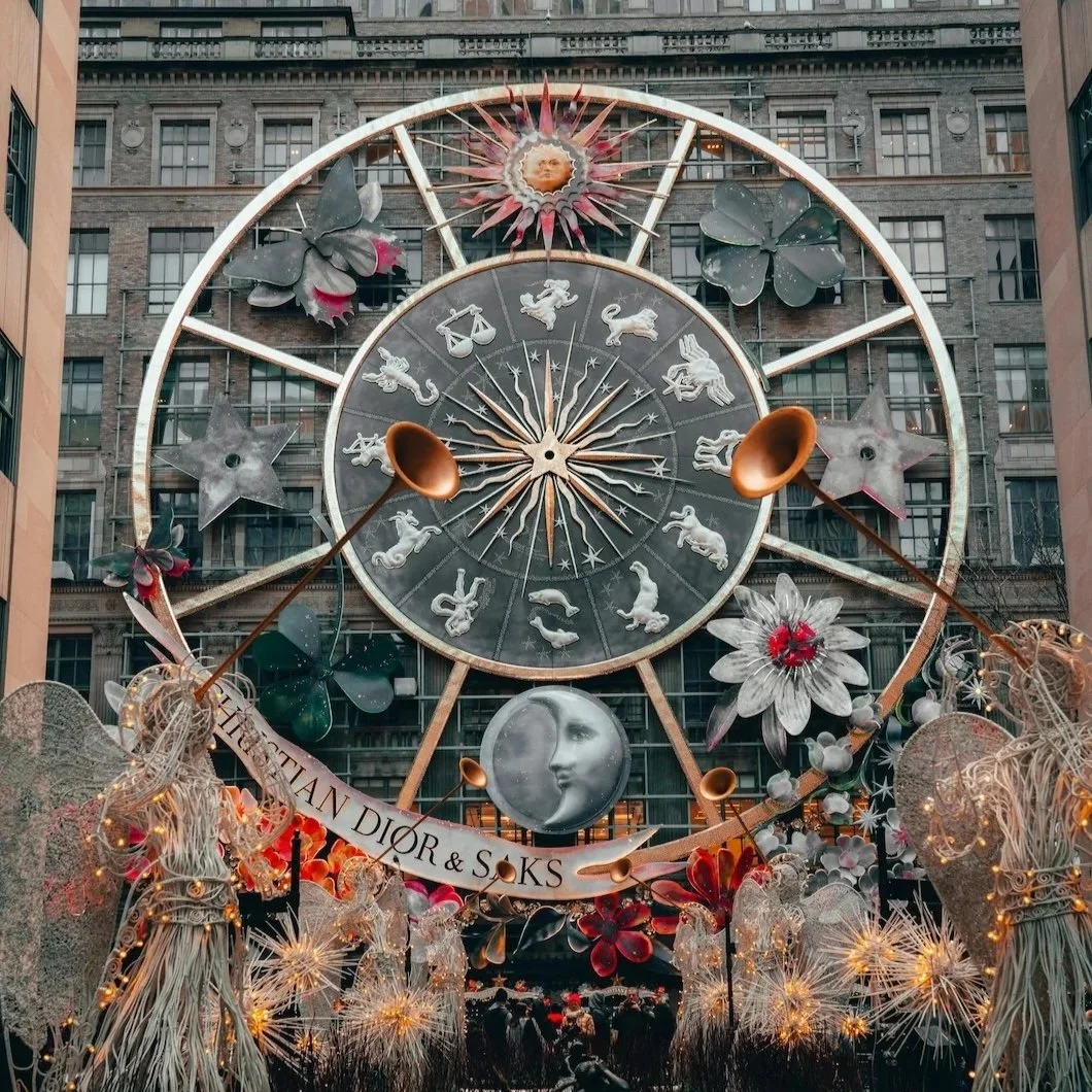
What Color Is Your Sign? Astrology, Personality, And Paint Choices
What if your favorite paint colors say more about your temperament than your taste? A fun, sophisticated look at astrology and personality through overlooked Benjamin Moore shades.
Color Notes: This Week At Stanwich Painting
Welcome to Color Notes, your Sunday digest from Stanwich Painting. This week we explored fresh New Year interior colors, the value of deliberate painting choices, and the Benjamin Moore 2026 color trends.
Inside The 2026 Benjamin Moore Color Trends: Mood, Meaning, And A New Way Forward
A thoughtful look at Benjamin Moore’s Color Trends 2026 palette—Silhouette AF-655 plus seven companion shades—what they mean, where they work, and why they feel like a reset.
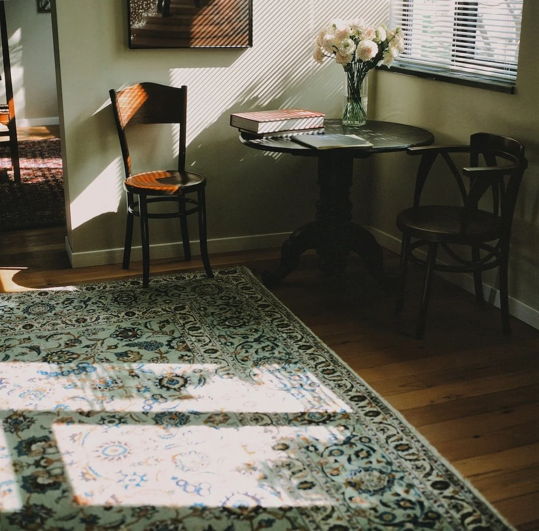
The Aesthetics Of Waiting: Why Some Paint Decisions Improve With Time
In a culture that rewards quick updates, some of the best paint decisions come from waiting. This essay explores patience as a design value—and why time often reveals what color truly belongs.
Painting Forward: Interior Colors For A New Year That Feels Genuinely Optimistic
As the New Year approaches, many homeowners are ready to move beyond gray and white interiors. This essay explores forward-thinking paint colors that feel optimistic, grounded, and quietly modern—designed to support real life, not trends.