
The 5-Minute Color Mood Shift: Paint Choices That Instantly Change A Room’s Energy
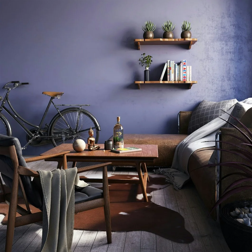
Photo by WILLIAN REIS on Unsplash
Sometimes your home doesn’t need a renovation.
It doesn’t need new furniture, a dramatic layout change, or a three-month Pinterest spiral that ends in decision fatigue.
Sometimes…it just needs a mood shift.
And paint is the fastest way to get one.
Not because paint is magic (though it occasionally behaves like it). But because color changes how a space feels before you’ve even processed what’s different. It can make a room feel cleaner, calmer, warmer, brighter, or more grounded—almost instantly.
So if your home feels slightly “off” lately—too flat, too loud, too sterile, too beige in a way that’s not charming—this is your permission slip to adjust the atmosphere without overhauling your life.
Here are a few of the quickest, most reliable color moves that create that 5-minute mood shift.
Crisp Whites That Feel Clean (Not Cold)
A good white is like opening the windows on the first warm day of spring. Everything feels lighter. The room feels clearer. The edges sharpen. Your home looks more “kept,” even if the laundry situation says otherwise.
But here’s the thing: the wrong white can feel like a dentist’s office.
The goal isn’t sterile. The goal is fresh and lived-in like sunlight on cotton sheets.
If you want that “clean reset” energy, look for whites that have a subtle softness to them. Not yellow. Not gray. Just…calm.
Try these:
Benjamin Moore White Dove (OC-17) – warm, balanced, classic for trim or walls
Benjamin Moore Chantilly Lace (OC-65) – crisp and bright, best in well-lit rooms
Sherwin-Williams Pure White (SW 7005) – clean without looking icy
Sherwin-Williams Alabaster (SW 7008) – soft and cozy, especially for older homes
Best for: hallways, kitchens, living rooms, ceilings, and trim refreshes
Mood shift: “Everything feels cleaner and more put-together.”
Warm Neutrals That Feel Expensive (Without Trying)
Warm neutrals are having a moment and not in a trendy way, but in a this is what people actually want to live with way.
Because the truth is: most homeowners don’t want a room that screams “statement.”
They want a room that quietly says: this is taken care of.
The right warm neutral makes a home feel elevated. It softens hard lines. It flatters wood tones. It makes furniture look more intentional. It gives that subtle “custom home” vibe without needing a custom home budget.
Think: creamy, soft, and grounded.
Try these:
Benjamin Moore Pale Oak (OC-20) – warm, airy, and quietly luxurious
Benjamin Moore Edgecomb Gray (HC-173) – warm neutral that plays well everywhere
Sherwin-Williams Accessible Beige (SW 7036) – warm and reliable without feeling heavy
Sherwin-Williams Natural Linen (SW 9109) – soft, light, and easy
Best for: open-concept spaces, dining rooms, bedrooms, and “everything rooms”
Mood shift: “My house feels warmer, calmer, and more expensive.”
Soft Greens That Feel Restorative
There’s a reason green keeps showing up in high-end interiors, spa-like bathrooms, and those “I can breathe again” bedrooms.
Soft greens are quietly therapeutic.
They don’t demand attention the way bold color does. Instead, they sit in the background like a supportive friend who doesn’t need to talk the whole time.
The best greens right now aren’t bright. They’re muted, herbal, slightly gray-toned, and grounded. Think: eucalyptus, sage, olive mist.
They make a space feel balanced, especially in homes where life is busy, loud, or always moving.
Try these:
Benjamin Moore Saybrook Sage (HC-114) – classic, earthy, and timeless
Benjamin Moore October Mist (1495) – soft, modern, and calm
Sherwin-Williams Sea Salt (SW 6204) – airy green-blue that feels light and fresh
Sherwin-Williams Evergreen Fog (SW 9130) – muted, upscale, and extremely livable
Best for: bedrooms, bathrooms, kitchens, and home offices
Mood shift: “This room feels like a deep exhale.”
Dusty Blues That Feel Calm + Grown-Up
Blue is one of the most “safe” colors people reach for… and one of the easiest to get wrong.
Too bright and it feels childish.
Too gray and it feels lifeless.
Too dark and it can get heavy fast.
But a dusty, softened blue? That’s where the magic lives.
These are the blues that feel like quiet confidence. Like a room that doesn’t need to prove anything. Like the calm version of “coastal” without seashell décor.
They work beautifully in older homes and newer builds because they add color without turning the room into a theme.
Try these:
Benjamin Moore Boothbay Gray (HC-165) – classic, soft, and timeless
Benjamin Moore Smoke (2122-40) – moody, muted, and sophisticated
Sherwin-Williams Misty (SW 6232) – pale, calming, and easy
Sherwin-Williams Slate Tile (SW 7624) – deeper, grounded, and dramatic without going black
Best for: bedrooms, offices, guest rooms, and dining rooms
Mood shift: “This room feels calmer, smarter, and more settled.”
Deep Moody Colors That Feel Like a Reset
Moody paint colors are the fastest way to change a room’s personality.
A deep color doesn’t just decorate a wall—it creates a boundary. It makes a space feel protected. It gives the room weight, intention, and atmosphere.
And when done correctly, it doesn’t feel dark. It feels rich.
This is the move when you want a room to feel like a retreat: a library vibe, a cocktail-hour vibe, a “don’t bother me, I’m reading” vibe.
If you’re nervous, start with one room where you want drama and depth: a dining room, a powder room, a den, or a primary bedroom.
Try these:
Benjamin Moore Hale Navy (HC-154) – iconic, deep, and elegant
Benjamin Moore Wrought Iron (2124-10) – charcoal-black with softness
Sherwin-Williams Iron Ore (SW 7069) – rich, modern, and moody
Sherwin-Williams Inkwell (SW 6992) – bold and inky without looking cartoonish
Best for: dining rooms, offices, powder rooms, accent walls, built-ins
Mood shift: “This room has presence. It feels intentional.”
A Quick Finish Tip (Because Finish Is Part of the Mood)
If color is the mood, finish is the texture of that mood.
A flat or matte finish feels soft and calm.
Eggshell feels clean and versatile.
Satin feels slightly brighter and more “wipeable.”
Semi-gloss and high-gloss feel bold and reflective.
If you want a room to feel relaxed and modern, matte is often the cheat code—especially for bedrooms and living spaces.
If you want something durable for a family space, eggshell is usually the best balance.
(And yes, the right prep matters. A beautiful color can still look wrong if the walls aren’t properly repaired and sanded first.)
The Real Secret: The Mood Shift Comes From the Right Direction
Most paint decisions don’t go wrong because someone picked a “bad” color.
They go wrong because the color is fighting the home’s lighting, floors, trim, and architecture.
That’s why the best paint choices feel effortless: they’re aligned with the space, not forced onto it.
And in Fairfield County—especially in homes with strong natural light, varied trim styles, and a mix of old and new architecture—that alignment matters even more.
Want the Mood Shift Without the Guesswork?
If you’ve been thinking about repainting and you’re not sure where to start, we can help you choose a direction that fits your home and your daily life—whether you want clean and bright, warm and grounded, soft and restorative, or rich and dramatic.
Stanwich Painting works with homeowners across Greenwich, Stamford, New Canaan, Riverside, Wilton, Darien, and Westport, handling the details that make paint look truly finished: prep work, clean lines, smooth surfaces, and results that hold up.
If you want a home that feels better to live in, start with the fastest shift available.
Call Stanwich Painting at 475-252-9500 or request a consultation.