
Inside The 2026 Benjamin Moore Color Trends: Mood, Meaning, And A New Way Forward
Early January has its own kind of energy—not the dramatic “new me” impulse, but a quieter reset. The moment when the noise fades and you can hear your own thoughts again. It’s when you start noticing how the morning light moves through the hallway, or realize your living room has been quietly asking for something different. Not novelty. Not a trend…just a correction.
That’s why Benjamin Moore’s Color Trends & Color of the Year 2026 launch feels unusually well-timed. The palette isn’t loud. It isn’t trying to win the internet. It’s composed—balanced between deep and delicate—and it has a clear message: we’re moving away from spectacle and toward refinement.
This year’s Color of the Year, Silhouette AF-655, anchors a curated set of hues that Benjamin Moore frames as “enchanting pales and handsome midtones,” with an overall mood of “style and grace.” In other words: less dopamine décor, more long-game design.
And that’s what makes this palette feel forward-looking. It’s not predicting what will photograph well next month. It’s responding to what people want to live with—quiet confidence, warmth without nostalgia, and colors that don’t burn out after you’ve stared at them for two weeks.
The 2026 Palette, at a Glance
Benjamin Moore’s eight Color Trends 2026 shades are: Raindance 1572, First Crush CSP-310, Swiss Coffee OC-45, Batik AF-610, Narragansett Green HC-157, Southwest Pottery 048, Sherwood Tan 1054, and the Color of the Year Silhouette AF-655.
What’s interesting is how deliberately they hold tension: airy vs. grounded, tailored vs. relaxed, classic vs. current. This is a palette that expects homeowners to have taste—and rewards them for it.
Now let’s talk about what each color is really doing in 2026.
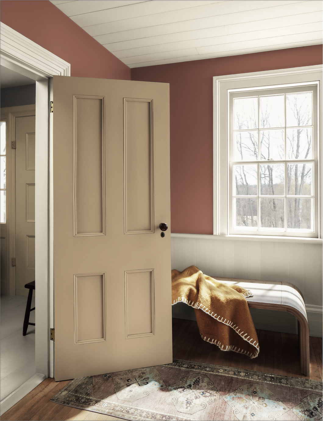
Silhouette AF-655: Tailored Depth (Color of the Year)
Benjamin Moore describes Silhouette AF-655 as a distinctive, refined shade—“luxurious burnt umber with delicate notes of charcoal,” inspired by the enduring polish of classic suiting, but updated for now.
In human terms: Silhouette is the antidote to flat, trend-neutral beige and the antidote to attention-seeking black. It’s deep, but not harsh. Sophisticated, but not precious. It gives a room structure—like clean typography in a well-designed book.
Where it works:
Living rooms that want intimacy without feeling heavy
Dining rooms that want drama without feeling formal
Bedrooms that want calm but not “spa white”
A smart use in 2026:
Silhouette is a “commitment color,” but it doesn’t demand maximalism. It can wrap a room (walls + ceiling) for a modern cocoon, or it can appear as a lower wall, built-ins, or a door to add tailored contrast. Benjamin Moore itself shows Silhouette used across walls and ceilings, paired with lighter tones like Swiss Coffee for balance.
Swiss Coffee OC-45: The Soft Power Neutral
Every palette needs a stabilizer, and Swiss Coffee OC-45 is exactly that. It’s not icy. It’s not sterile. It’s the kind of off-white that behaves like a good supporting actor—making everything around it look more intentional.
Benjamin Moore uses Swiss Coffee repeatedly in pairings on the Color Trends 2026 page (trim, ceilings, and complementary contrast), which is its real superpower: it’s designed to layer.
Where it works:
Whole-home continuity (especially for open plans)
Trim and millwork when you want warmth without creaminess
Rooms with inconsistent daylight, where stark whites can turn cold
The 2026 insight:
Swiss Coffee isn’t about “playing it safe.” It’s about letting materials speak—wood floors, stone counters, woven textiles, art. This is part of the broader 2026 shift: fewer “look at the wall” moments, more “the room feels right” moments.
Sherwood Tan 1054: Warmth Without the Throwback
If Swiss Coffee is the quiet base layer, Sherwood Tan 1054 is warmth with posture. Benjamin Moore showcases it across walls, trim, lower cabinets, and even a ceiling beam—an all-over application that reads cohesive, not monotone.
Where it works:
Kitchens and breakfast areas that want warmth without looking dated
Hallways and connecting spaces that need softness and continuity
Rooms that feel “a little chilly” even when the heat is on
The 2026 insight:
Sherwood Tan is part of what’s emerging as a new kind of neutral: less gray, less sterile, and more human. It doesn’t scream “trend.” It just quietly improves the emotional temperature of a space.
Raindance 1572: The Calm Blue-Gray That Doesn’t Go Coastal
Raindance 1572 lives in that high-demand territory: blue-gray that feels calming but not theme-y. Benjamin Moore shows it on built-ins and wall surfaces, paired with Swiss Coffee—exactly how most homeowners want to use a color like this: as an architectural accent that still reads soft.
Where it works:
Built-ins, cabinetry, mudrooms, laundry rooms
Bedrooms where you want serenity without feeling sugary
Offices that need focus, not stimulation
The 2026 insight:
Raindance is for the person who wants color but refuses to cosplay a design era. It’s modern calm: clean enough for a minimal home, soft enough for a traditional one.
Batik AF-610: Dusty Mauve for Adults
Let’s be honest: mauve has baggage. But Batik AF-610 sidesteps all of it. Benjamin Moore uses it on kitchen walls in the palette imagery, and it reads like a dusty mauve with composure—more design-forward than romantic.
Where it works:
Kitchens and dining areas where you want warmth without beige
Powder rooms that can handle a little personality
Bedrooms when you want softness but not pastels
The 2026 insight:
Batik feels like a nod to color without the performative “statement wall” vibe. It’s gentle, but it still has identity. This is a huge 2026 theme: color that doesn’t beg for attention.
First Crush CSP-310: A Blush That’s Actually Architectural
First Crush CSP-310 is the palette’s blush note—Benjamin Moore shows it across full wall applications, including spaces where it pairs beautifully with Swiss Coffee and Sherwood Tan.
Where it works:
Bedrooms when you want warmth that still feels clean
Dining rooms where you want glow without heaviness
Upper walls / ceilings for a subtle lift
The 2026 insight:
This is not “pink.” It’s a color that behaves like light. Used properly, it creates a flattering atmosphere—especially in winter months when daylight turns silver and indoor lighting does most of the work.
Southwest Pottery 048: Clay Red That Feels Grounded, Not Trendy
Now we’re into the palette’s earthier heart: Southwest Pottery 048. Benjamin Moore shows it on walls in both matte and eggshell contexts, paired with Swiss Coffee and even grounded against Silhouette—proof that this clay-red can live in the same world as refined neutrals.
Where it works:
Entryways and vestibules (instant warmth)
Dining rooms and conversation spaces
Accent zones where you want depth without darkness
The 2026 insight:
This shade nails what’s happening culturally: people want warmth and craft, but they don’t want to feel like they’re trapped inside a trend cycle. Clay tones are sticking around because they feel elemental.
Narragansett Green HC-157: The One Bold Move That Still Feels Classic
Narragansett Green HC-157 is the palette’s moody standout—a deep teal-green that Benjamin Moore shows used on walls and ceilings in a bathroom setting, paired with Swiss Coffee.
Where it works:
Bathrooms (especially with bright white fixtures)
Libraries and dens
Dining rooms where you want richness without red
The 2026 insight:
This is a color for people who are done apologizing for wanting a room to feel like something. It’s bold, but it’s not chaotic. It gives you saturation with restraint—very 2026.
The Real 2026 Shift: Trends as Signals, Not Instructions
If there’s a quiet philosophy behind Benjamin Moore’s Color Trends 2026 palette, it’s this: refinement beats reinvention. The eight colors aren’t trying to bulldoze your house into a new identity. They’re offering options for adjustment—subtle shifts that make a home feel more composed, warmer, calmer, and more “you.”
That matters because paint is one of the rare design decisions that’s both emotional and practical. You live inside it. You see it tired. You see it in February. You see it when the sun’s out, and you see it when it isn’t. A trendy color that looks great on a screen can become exhausting in real life. The 2026 palette seems designed to avoid that trap.
Which is why, on January 2, it feels like a smart place to start.
A Forward-Looking Way to Use This Palette
If you’re stepping into 2026 with the urge to change your home, here’s the simplest, most durable approach:
Choose one grounding color (Silhouette, Narragansett Green, or Southwest Pottery)
Choose one stabilizing neutral (Swiss Coffee or Sherwood Tan)
Let the midtones (Raindance, Batik, First Crush) become your transitions—cabinetry, a bedroom, a hallway, a secondary space
This is how you get a home that feels cohesive without feeling coordinated.
The Point Isn’t New…It’s Right.
This palette doesn’t ask you to chase the year. It asks you to choose what lasts inside the year.
If you’re drawn to these 2026 colors but want help translating them into a cohesive plan—one that considers light, flow, finishes, and the way your home actually lives—Stanwich Painting can help you make choices that feel current now and still feel right later.
Sometimes the most forward-looking move is simple: choose what you won’t get tired of.
Ready for your 2026 Renew? Contact Us today for your free online consultation, or Call 475-252-9500.