
Winter Light Doesn’t Lie: Choosing Paint Colors That Hold Up In Snow Season
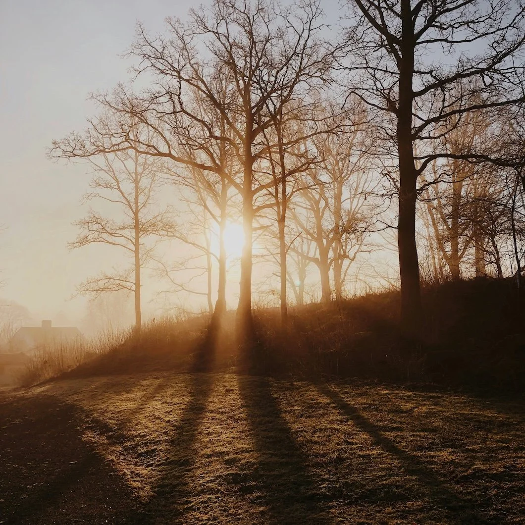
Photo by Magnus Jonasson on Unsplash
There’s a specific kind of honesty that only happens in winter.
Not the poetic kind, but the visual kind.
Because when the leaves are gone, the sky is pale, and the world outside is basically a cold white reflector, your home stops getting away with things. Color stops being “a vibe.” It becomes a fact. Undertones show up uninvited. Sheens start behaving like mirrors. The soft neutral you loved in October suddenly looks like it’s having an identity crisis.
And if you live in Fairfield County, where the architecture leans classic and the light can swing from bright and crystalline to gray and coastal in the same week, winter becomes the ultimate paint test.
Winter light doesn’t flatter, instead winter light reveals.
So if you’ve ever walked into your living room on a snowy morning and thought,
Why does this wall color look…different?
You’re not imagining it. You’re just finally seeing what your paint has been doing the whole time.
Snow Light: The Great Amplifier
Most people think winter is “dark season,” but snow changes the whole equation. It’s not just that the sun is lower—it’s that the outdoors becomes a giant bounce board.
Snow reflects a surprising amount of light back into your home, and that reflected light is cooler and sharper than the warm glow you get in summer. Even if you’re not looking at a literal snowbank, winter skies create a kind of clean, diffused brightness that makes paint colors behave differently.
This is why winter has a reputation for exposing flaws in walls, but it’s also why it exposes flaws in color selection.
A paint color that looks soft and calm under warm afternoon sun can look stark, gray, or slightly icy in winter. And anything with a sneaky undertone — green, violet, pink — becomes louder when the light outside turns neutral and cold.
Winter doesn’t create new undertones, it just turns the volume up.
The Real Reason Your “Perfect Neutral” Suddenly Feels Off
In summer, color has competition. You have warm light, greenery outside, golden hour tones bouncing around the room. Those things soften a paint color. They add warmth and context.
In winter, your walls are basically standing alone in a gallery.
So if your “neutral” was always a little too cool, winter makes it feel cold.
If it was always a little too beige, winter makes it feel dingy.
If it was always a little too pink, winter makes it feel like it’s blushing.
The tricky part is that neutrals are where homeowners get burned the most, because neutrals are where we assume we’re being safe. But winter is the season that proves: safe isn’t the same as stable.
Stable colors are the ones that don’t change personalities depending on the month.
A Winter-Proof Palette Isn’t “Cool.” It’s Balanced.
There’s a misconception that winter means you should go full cool-tone: icy whites, steely grays, pale blues. Sometimes that works, especially in very modern homes with clean lines and lots of glass.
But in many Fairfield County interiors, especially the ones with traditional trim, warm wood floors, and layered textures, too-cool paint can feel like you’re living inside a refrigerator showroom.
The winter-proof approach is usually about balance: colors that can hold their own in cold light without becoming sterile.
That means:
Whites that stay soft without going yellow
Greiges that don’t turn purple
Warm grays that don’t go muddy
Blue-greens that feel atmospheric, not aquatic
Deep tones that look rich even under overcast skies
This is where the best paint colors start to feel less like “decor” and more like architecture. Like they belong to the house, not to a Pinterest board.
The Direction of Your Room Matters More in Winter
In warmer months, almost every room gets at least a little help. In winter, north-facing rooms become their truest selves and their truest selves can be…well, humbling.
North-facing light is cooler and more consistent. It doesn’t warm up as much throughout the day. So if you put a cool gray in a north-facing room, it can start reading like concrete.
South-facing rooms get the most light, but in winter, even that light can feel pale. East-facing rooms get a sharp morning brightness and then fade. West-facing rooms can feel flat until late afternoon.
If you’ve ever wondered why a color looks perfect in one room and weird in another, winter is when the answer becomes obvious: it’s not the paint brand. It’s the light.
A winter-conscious paint plan isn’t about choosing one “best” color. It’s about choosing the right color for that direction.
The Sheen Problem Nobody Talks About (Until Winter)
Here’s the thing about winter light: it doesn’t just expose undertones. It exposes shine.
When you have snow reflection and crisp daylight coming through windows at a low angle, higher sheens can get aggressive fast. Walls that looked “nicely cleanable” in satin can suddenly look like they’re lightly laminated. You start seeing roller marks, patchwork repairs, and surface inconsistencies.
In winter, matte and eggshell finishes tend to look more expensive because they absorb light instead of bouncing it back. They create depth. They soften the room. They make the color feel like it’s part of the wall rather than sitting on top of it.
That doesn’t mean you can’t use satin—you absolutely can, especially in hallways, kitchens, and busy family spaces—but winter is the season that proves why sheen should be chosen intentionally, not automatically.
A great winter room doesn’t sparkle, instead It glows quietly.
A Few Winter-Smart Color Families (That Still Feel Design-Forward)
If you want your home to look good year-round, winter is the season you design for. The goal is colors that feel calm in summer but still hold depth in January.
Here are a few directions we love for winter-proof interiors:
1) Soft, complex whites
Not blinding. Not yellow. Just clean with a little softness. These are the whites that make trim look crisp without making walls feel sterile.
2) Balanced greiges
Greige is popular because it bridges warm and cool but only the right greige. The wrong one turns purple in winter, or dull and muddy under gray skies.
3) Atmospheric blue-grays and blue-greens
These look incredible in winter because they harmonize with the season instead of fighting it. The key is choosing ones that feel smoky and muted rather than bright and “beachy.”
4) Earthy, grounded mid-tones
Clays, softened olives, mushroom tones, tobacco neutrals. These colors feel like warmth without being loud, and they pair beautifully with natural wood and stone.
5) Deep winter tones (done right)
Charcoal, ink, forest, deep navy. These colors look luxurious in winter light — but they require great prep and the right finish to look intentional instead of heavy.
Benjamin Moore + Sherwin-Williams Picks That Hold Up in Winter
If you want a few solid, winter-friendly options that tend to behave well in cold light, these are worth sampling:
Benjamin Moore
White Dove (OC-17) – a classic soft white that stays calm
Classic Gray (OC-23) – light, warm-leaning but still clean
Balboa Mist (OC-27) – a reliable greige with softness
Boothbay Gray (HC-165) – coastal without being too blue
Kendall Charcoal (HC-166) – deep and grounded, not harsh
Sherwin-Williams
Alabaster (SW 7008) – warm, soft, and very livable
Snowbound (SW 7004) – brighter, crisp but not icy
Agreeable Gray (SW 7029) – popular for a reason (but still sample!)
Sea Salt (SW 6204) – muted and calming, a classic blue-green
Iron Ore (SW 7069) – a deep charcoal that reads modern and rich
The key word there is sampling. Winter makes sampling non-negotiable.
The Winter Sampling Rule: Test It When the Weather Is Being Rude
If you’re going to test paint, don’t do it on a perfect sunny day when everything looks flattering. Test it when the sky is gray. Test it in the morning. Test it at night under lamplight.
Winter gives you the harshest conditions, which means it gives you the most accurate read on whether a color is truly stable.
And don’t just test one wall. Test multiple walls if the room has changing light, and watch how the color behaves against your floors, your trim, and your furnishings.
Paint is relational. Winter is when the relationships get exposed.
The Quiet Truth: Winter Colors Create Emotional Architecture
This is the part people don’t say out loud, but everyone feels…
Winter is the season when we’re home more. We’re inside more. We notice things more. The emotional tone of a room matters more because you’re actually living in it.
A winter-smart color palette isn’t just about aesthetics — it’s about atmosphere. It’s about creating a home that feels steady when the season feels sharp.
The right paint color in winter doesn’t just look good. It makes the room feel like it’s holding you.
And when spring finally arrives, the best part is this: if it holds up in winter light, it’s going to look incredible in everything else.
If you’re thinking about refreshing your interior this season, Stanwich Painting can help you choose colors that stay beautiful through every kind of Fairfield County light: from bright snow mornings to soft coastal gray afternoons. Reach out anytime for a consultation or quote, and we’ll help you get it right the first time.