
What Color Is Your Sign? Astrology, Personality, And Paint Choices
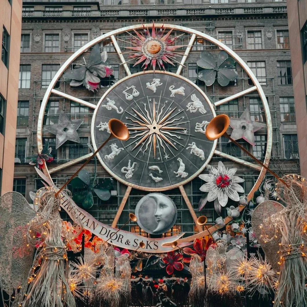
Photo by Alex Hoces
A Slightly Unscientific, Very Enjoyable Look at Astrology and Paint
Astrology has a way of sneaking into conversations it technically doesn’t belong in. You hear it at dinner parties, on long walks, halfway through a glass of wine: “That makes sense — you’re a Virgo.” It’s not about belief so much as language. A shorthand for temperament. For how people move through the world.
Paint works the same way.
Most homeowners don’t choose colors because they’re trending. They choose them because something about a room feels wrong: too loud, too flat, too exposed, too dull. Astrology, at its best, isn’t predictive. It’s descriptive. And when you start thinking about paint that way—not as style, but as emotional tone—the overlap becomes oddly useful.
So no, this isn’t a list telling you what color you must paint your house based on your sign. Think of it instead as a personality study, using some of the more under-the-radar shades from Benjamin Moore—colors with opinions, inner lives, and a bit of mystery.
If nothing else, it’s a fun way to think about why you’re drawn to certain spaces…and quietly repelled by others.
Why Astrology Keeps Showing Up in Design Conversations
Astrology’s resurgence has very little to do with horoscopes and everything to do with fatigue. When people feel overstimulated, over-advised, and over-sold, they reach for systems that explain why they feel the way they do and not what they should buy next.
Design trends work the same way. After years of being told to optimize, refresh, modernize, and reinvent, homeowners are increasingly uninterested in spectacle. They want environments that make sense to them personally. That’s where astrology quietly slips in—not as belief, but as shorthand.
Saying “I’m a water sign” is often another way of saying I don’t like harsh contrast or I need my space to feel contained. Saying “I’m an air sign” might mean I notice light before furniture or I feel claustrophobic in dark rooms. None of this is mystical. It’s descriptive.
Paint, at its best, responds to temperament. When it doesn’t, rooms feel restless and visually correct, but emotionally wrong. That’s why this exercise works. It’s not about assigning colors. It’s about understanding why certain shades feel supportive while others quietly drain you.
Fire Signs (Aries · Leo · Sagittarius)
Paint energy: grounded heat, confidence without chaos
Fire signs are often associated with boldness, but the truth is, they don’t need help being noticed. What they need are colors that contain energy rather than amplify it—warmth with structure, not volume.
Caliente AF-290
A red with discipline. This isn’t a shout; it’s a statement. Best used where confidence matters: dining rooms, entryways, or a single architectural wall that can hold its own.
Potters Clay 1221
Earthy, tactile, quietly sensual. This color feels handmade, not performative. Ideal for living spaces that want warmth without theatrics.
Ranchwood 2041-30
Deep, woody, and unexpectedly calming. A reminder that fire signs often relax best in spaces that feel grounded and natural.
Why this works:
Fire signs don’t need louder color. They need colors that hold their presence without escalating it.
Earth Signs (Taurus · Virgo · Capricorn)
Paint energy: stability, texture, earned calm
Earth signs repaint when something feels worn…not outdated, just tired. They gravitate toward colors that feel reliable, layered, and quietly serious.
Gettysburg Gray HC-107
Historic, grounded, and deeply reassuring. This is a gray with memory. Perfect for rooms meant to last such as libraries, offices, stair halls.
Cromwell Gray HC-103
Complex without being busy. This neutral has weight, which makes it ideal for spaces where you want focus and order.
Stone Hearth 984
Soft warmth without decoration. It doesn’t announce itself, but it makes everything around it feel more considered.
Why this works:
Earth signs trust colors that feel earned. These shades don’t chase attention…they reward commitment.
Air Signs (Gemini · Libra · Aquarius)
Paint energy: lightness, movement, mental clarity
Air signs notice light first. Then proportion. Then mood. They’re drawn to colors that shift subtly throughout the day; nothing static, nothing heavy.
Paper Doll 1629
Barely there, almost conceptual. A color that feels like atmosphere rather than paint. Perfect for spaces where thinking happens.
Silver Chain 1472
Softly reflective, never cold. This shade changes constantly, which is exactly the point.
Nimbus Gray 2131-50
A foggy, poetic gray that reads differently every hour. Ideal for rooms that need calm without emptiness.
Why this works:
Air signs want rooms that breathe. These colors think quietly in the background.
Water Signs (Cancer · Scorpio · Pisces)
Paint energy: depth, protection, emotional quiet
Water signs are sensitive to overstimulation: visual noise, harsh contrast, rooms that feel exposed. They crave spaces that feel enveloping.
Deep Royal 2061-10
Saturated, immersive, unapologetic. A blue that creates instant emotional containment.
Nightfall 1596
Moody without heaviness. Think dusk, not darkness. Ideal for bedrooms and retreat spaces.
Black Forest Green HC-187
Protective, inward, deeply grounding. A color that feels like shelter.
Why this works:
Water signs repaint when a room feels emotionally loud. These colors quiet things down.
The Mistake People Make When Choosing “Vibe”
One of the most common things homeowners say is, “I want the room to feel calm,” or “I want something cozy but not dark,” or “I want it to feel elevated but not cold.” These are good instincts, but they’re incomplete instructions.
Vibe without structure leads to confusion. Calm can mean pale and open, or it can mean deep and cocooning. Cozy can mean warm light neutrals, or it can mean dark, enveloping tones that quiet the edges of a space. Two people can use the same word and mean opposite things.
This is where temperament matters more than trend. A color that feels serene to one person can feel empty to another. A shade that feels grounding in one home can feel oppressive in the next. When paint choices ignore that difference, regret follows…not immediately, but slowly.
Understanding how you respond to space is far more useful than memorizing what’s “in.” Astrology just happens to give people a language for that awareness.
A Necessary Disclaimer (Because We’re Adults)
Astrology isn’t telling you what color to choose. It’s offering language for why certain colors feel right—or very wrong—in your space.
The mistake is taking it literally. The value is using it intuitively.
Most paint regrets happen when someone chooses a color that fights their temperament: a high-energy color in a home craving calm, or a pale neutral in a space that needs grounding. When paint aligns with how you live, rooms stop demanding attention and start supporting you.
That’s the real goal.
Why the “Oddball” Colors Are Often the Right Ones
There’s a reason the most emotionally accurate paint colors are rarely the most popular. Fringe shades—the ones that don’t photograph easily, don’t trend loudly, and don’t show up in every showroom—tend to be more specific. And specificity is what makes a home feel personal.
These colors often look unassuming on a fan deck. Slightly strange. Hard to pin down. But once they’re on the wall, in the right light, they suddenly make sense. They don’t announce themselves. They settle in.
For homeowners who know themselves—or are learning to—these are often the colors that last the longest. Not because they’re safe, but because they’re accurate.
So… What Color Are You, Really?
Whether or not you know your rising sign, you already know this much: some rooms energize you, and some exhaust you. Some colors make you linger. Others make you restless.
That response is the thing to pay attention to.
If this little astrological detour helps you name what your home has been asking for—more warmth, more quiet, more structure, more depth—then it’s doing exactly what good design should do: clarify instinct.
And if you want help translating that instinct into a paint plan that actually works with your home’s light, layout, and daily life, a professional consultation can make all the difference.
After all, the best spaces don’t predict the future, instead they understand the person living inside them.
Ready To Find Your Color? Call today or visit for your free consultation.