
The Color of Snow: What Winter Light Reveals About Paint (And Why It Matters In Fairfield County)
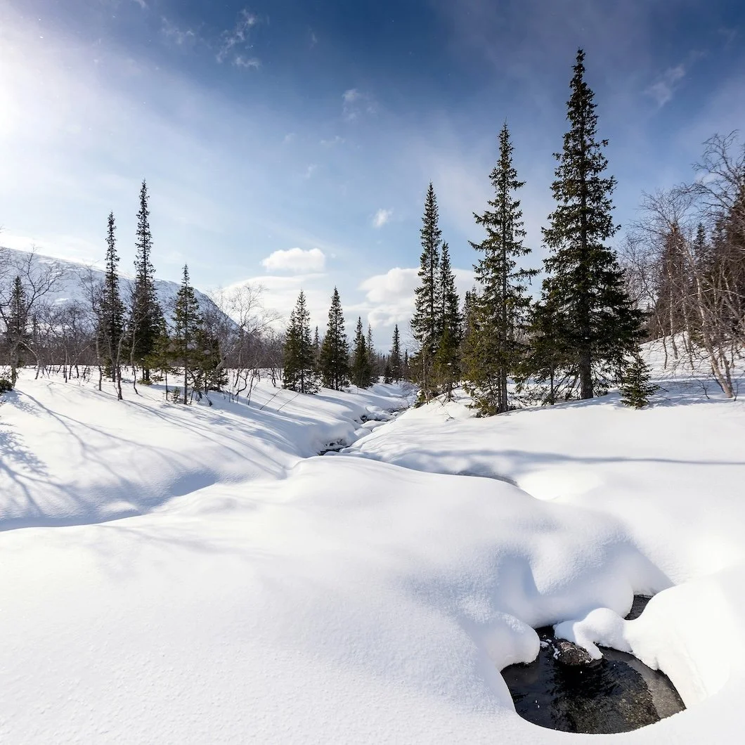
Photo by Master Unknown on Unsplash
There's a reason your house feels different after a big snowfall. Yes, there's the quiet, and yes, there's that clean slate outside. But what really transforms things is the light.
Snow doesn’t just cover the landscape, instead it transforms it into a massive natural reflector. In Greenwich, Stamford, Darien, New Canaan, Wilton, and Westport, the world outside your windows suddenly turns brighter, cooler, softer, and more intense all at once. And in that new light, paint colors don’t behave the way they did last week.
A wall that felt creamy in November might suddenly look beige. A crisp white that looked “clean” in fall might start reading icy or gray. Even warm neutrals can feel flatter—like they’re being edited by the season.
So if you’ve been staring at your walls lately thinking, Something’s off… you’re not imagining it.
Let’s talk about the real color of snow and what it teaches Fairfield County homeowners about choosing the right paint.
Snow Isn’t “White.” It’s a Whole Spectrum.
Here’s the strange truth: snow almost never reads as pure white.
In shade, it can look blue.
At sunset, it can turn peachy-pink.
On overcast days, it becomes a soft gray filter across everything.
At night, it takes on that faint silver glow—especially near outdoor lighting.
That’s because snow doesn’t have a single “color.” It’s a surface that reflects whatever light is available.
And your home works the same way.
Paint isn’t a fixed truth, it’s a relationship between pigment, sheen, and light. Snow just makes that relationship impossible to ignore.
The Big Winter Shift: Snow Light Makes Undertones Loud
When there’s snow on the ground, daylight bouncing into your home becomes more intense and more directional. That extra reflected light exaggerates undertones, especially in lighter colors.
That means:
Warm whites can look yellower
Cool whites can look bluer
Greiges can suddenly lean green or violet
Soft beiges can start looking dull or muddy
This is why winter is one of the best seasons to test paint colors. It’s brutally honest. Snowlight doesn’t flatter.
If a color holds up in January, it usually holds up all year.
The “Snow White” Mistake: Bright White Isn’t Always the Answer
A lot of homeowners see snow outside and think:
“We should paint everything white. Clean, fresh, timeless.”
Sometimes that’s perfect.
But many of the brightest whites—especially high-chroma, ultra-clean whites—can feel harsh in a Northeast winter. They bounce that cold light around and make rooms feel more clinical than cozy.
In Fairfield County homes (especially ones with traditional architecture, wood floors, or warmer trim details), the better move is often a soft white with intention—something that feels like snow at sunrise, not snow under fluorescent lighting.
A few Benjamin Moore “snow-inspired” whites that stay elegant
White Dove (OC-17) – warm, classic, never sterile
Simply White (OC-117) – bright but not icy, great for trim and clean interiors
Cloud White (OC-130) – a gentler, creamier option for older homes
A few Sherwin-Williams whites that read clean in winter light
Alabaster (SW 7008) – soft, warm, calm (a Fairfield County favorite for a reason)
Pure White (SW 7005) – crisp without being sharp
Snowbound (SW 7004) – a cooler white with a subtle softness
If you’re not sure which direction to go, this is the simplest rule:
If your home has a lot of warm wood tones, lean warm-white. If it has a lot of gray stone or cooler finishes, consider a balanced or slightly cool white.
The Real “Color of Snow” Might Be… Gray
Here’s the twist: the most believable snow palettes aren’t pure white at all. They’re made of soft grays, silvers, and foggy off-whites—the colors you see in fresh snow under an overcast sky.
These tones are incredibly high-end when used correctly. They feel architectural. Calm. Intentional. And they’re a perfect match for homes that want a modern edge without going cold and trendy.
Benjamin Moore winter-grays that feel expensive
Classic Gray (OC-23) – barely-there warmth, a perfect “snow shadow” neutral
Balboa Mist (OC-27) – light greige that behaves beautifully in natural light
Paper White (OC-55) – crisp, airy, quietly modern
Sherwin-Williams soft neutrals that pair beautifully with winter light
Agreeable Gray (SW 7029) – popular because it’s reliable
Repose Gray (SW 7015) – cooler, modern, clean
Drift of Mist (SW 9166) – light, relaxed, “snowy” without being white
These shades are especially strong for open layouts where you want the home to feel cohesive and calm—without turning every room into the same beige box.
What Snow Teaches You About Contrast (Trim, Doors, and Fireplaces)
Snow makes contrast look sharper. That’s why black shutters and dark doors look so good against a winter landscape.
Inside your home, winter is the season when contrast decisions become obvious:
White walls with white trim can look flat
White walls with slightly deeper trim can look intentional
Dark doors suddenly feel bold and grounded
Fireplaces become visual anchors again
If you’ve been considering a subtle contrast update, snow season is the perfect time.
Trim ideas that feel classic, not trendy
Soft white walls + crisp white trim (clean and tailored)
Soft white walls + warm white trim (traditional, cozy)
Light greige walls + white trim (quietly elevated)
Door ideas that look incredible in winter
Charcoal / near-black
Deep navy
Forest green
Warm black-brown
(These choices look especially good in Fairfield County colonials and transitional homes—timeless architecture with a little modern tension.)
Winter Light Reveals Sheen Problems, Too
Snow doesn’t just change color—it changes texture.
Because the light is brighter and more reflective, you may suddenly notice things you didn’t notice before:
Patchy drywall repairs
Roller marks
Flashing (uneven sheen)
Scuffed walls that looked “fine” in summer
This is one reason professional prep work matters so much. In winter, the light is unforgiving. A great paint job doesn’t just look good in perfect lighting—it looks smooth and consistent when the world outside is a giant reflector.
At Stanwich Painting, we treat prep like the foundation of the whole finish: clean lines, corrected surfaces, proper priming, and consistent application—so the final result holds up in every season, not just in the easy months.
A Fairfield County Rule: Snow Makes Your Home Feel More Modern (So Choose Warmth on Purpose)
When everything outside goes white and gray, your home’s interior naturally feels more “minimal” and modern, even if your style is traditional.
That can be a good thing. It can also make your space feel colder than you want.
This is why winter is the season to bring warmth back through paint choices:
warmer whites instead of stark whites
balanced greiges instead of icy grays
gentle taupes instead of flat beige
muted colors with depth instead of bright “pops”
If you want your home to feel calm, inviting, and high-end during the cold months, the best palettes are usually the ones that whisper instead of shout.
The Best Time to Choose Paint Might Be Right Now
A lot of people think paint decisions should happen in spring or summer.
But if you’re choosing colors for a home in Greenwich, Stamford, Darien, New Canaan, Wilton, or Westport, winter is one of the smartest times to do it, because you’re seeing your home under the most revealing conditions of the year.
If a color feels balanced during a snowy week in New England light, it’s going to feel right when:
spring turns everything green
summer light warms up
fall shadows deepen
holiday lighting shifts the mood indoors
Winter doesn’t lie.
Ready to Make Your Home Feel Right Again?
If the snow has you looking around your home differently, that’s not random—it’s your environment showing you what’s possible.
If you’d like help choosing a palette that looks beautiful in real Fairfield County light—and a finish that holds up season after season—Stanwich Painting is here to help.