
Fresh Inspiration For Every Room. Exploring Color, Design, And The Art Of Home Transformation In Fairfield County, CT.

The Summer Bathroom Makeover
A summer bathroom makeover is not just about choosing a new color. Bathrooms cycle through steam, condensation, heat, cleaning, and daily moisture, which means proper prep, primer, and finish matter as much as the palette. From soft whites and spa-like blues to deeper powder room colors, the right paint plan can make one of the smallest rooms in the house feel cleaner, calmer, and more refreshed.

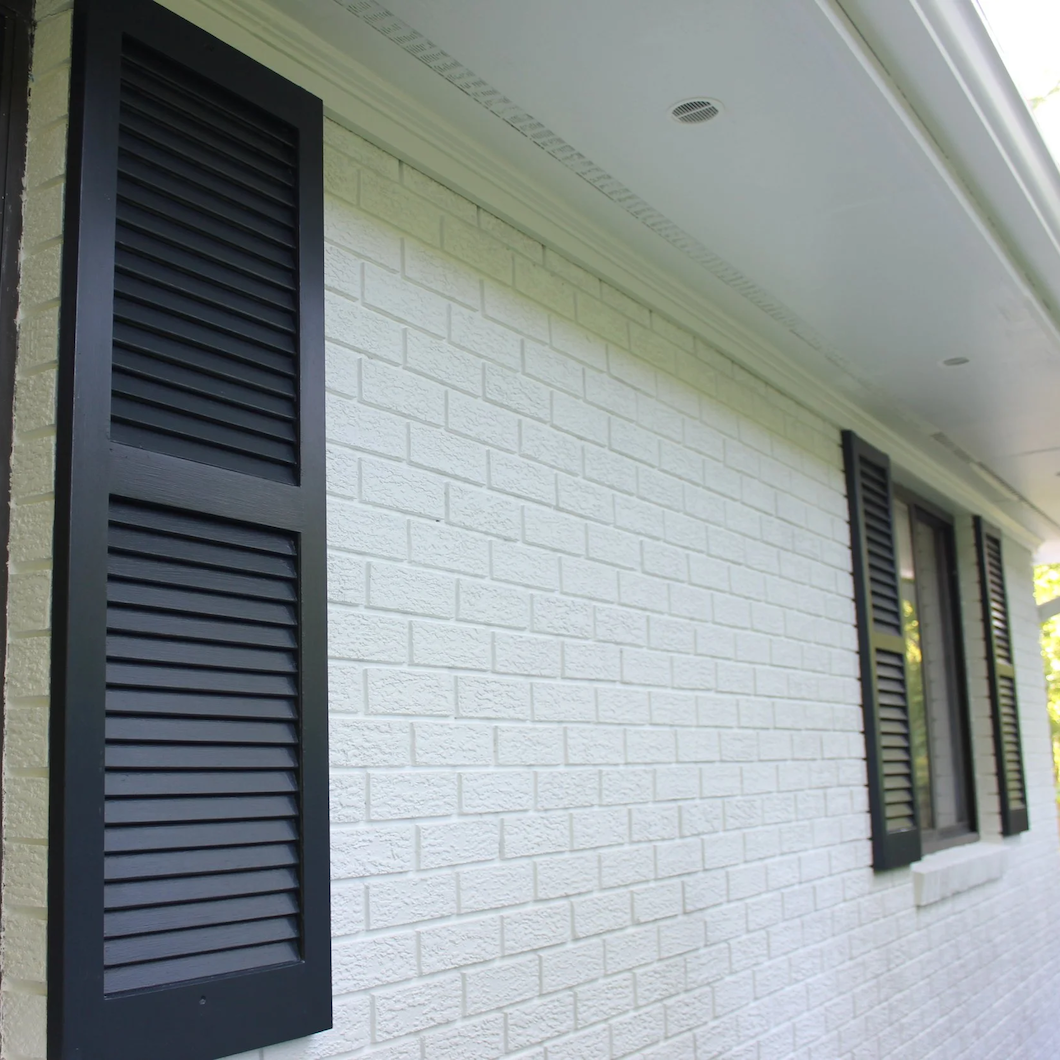
The Trim Is Telling on the House
Exterior trim often reveals a home’s true condition before the siding does. From fascia boards and window casings to shutters, doors, porch columns, and railings, these details carry the architecture and show the earliest signs of wear. For Fairfield County homeowners, a thoughtful trim refresh can protect the home, sharpen curb appeal, and restore the character of the exterior.

Color Notes: This Week at Stanwich Painting
This week on Color Notes we examine how exterior paint weathers over time and the growing interest in textured wall treatments and mineral-inspired finishes.

Summer 2026 Home Design Trends: Texture, Color, and the Return of Character
Summer 2026 design trends are moving beyond flat white walls and cool neutrals. Warmer color, tactile wall finishes, mineral paint, limewash-inspired movement, painted millwork, and richer architectural detail are bringing more depth and character into Fairfield County homes.

Why Exterior Paint Ages Differently on Every Side of the House
Exterior paint rarely wears the same way on every side of a house. Sun, shade, moisture, trees, cedar shingles, and water-adjacent conditions can all change how siding and trim age over time. For Fairfield County homeowners, a thoughtful exterior painting plan begins by reading the house elevation by elevation.

Color Notes: This Week at Stanwich Painting
This week on Color Notes we explore the enduring appeal of mineral paint finishes and how color helps transform a new house into a home.

Making a New House Feel Like Home
Moving into a new house is more than a logistical change. Even when the home is beautiful, the rooms may still feel shaped by the life that came before. Thoughtful interior painting can help a family settle in, create calm, and make a new Fairfield County house begin to feel like home.
Mineral Paint for Masonry & Stucco Exteriors
For masonry, stucco, and other mineral-based exterior surfaces, mineral paint offers a finish that feels more connected to the architecture. Breathable, matte, and quietly refined, it protects compatible surfaces while preserving their natural depth and character.

The Home You Stop Seeing
Over time, homeowners can become so used to their surroundings that they stop noticing the slow signs of wear: faded trim, scuffed walls, tired entryways, and exterior surfaces that no longer feel as fresh as they once did. This post looks at how thoughtful interior and exterior painting can help you see your home again.

The Exterior Paint Refresh That Pisses Off Your HOA
Not every exterior paint refresh needs to behave. From moody front doors and deeper shutters to porch ceilings with a little personality, the right paint choice can give your home character, curb appeal, and just enough attitude to make the beige committee nervous.

Threshold Light: The Symbolism of June in Interior and Exterior Paint Colors
June carries a distinct design energy: longer light, fuller gardens, open windows, and homes that begin turning outward for summer. This guide explores how the symbolism of June can inspire interior and exterior paint colors that feel luminous, grounded, and quietly alive.

Color Notes: This Week at Stanwich Painting
This week on Color Notes we explore the growing interest in mineral-based interior paints and the deeper historical roots of the house painter’s craft.
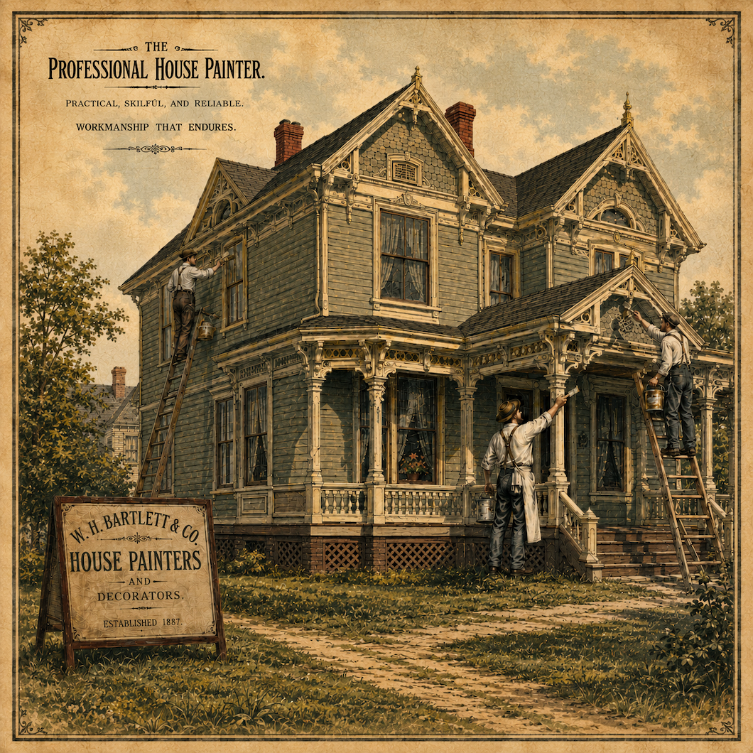
The Original House Painter: How a Once-Suspicious Trade Became Essential to the Home
Long before house painting became a normal part of home maintenance, it carried deeper meanings of craft, protection, taste, and even moral suspicion. From medieval guilds to modern Fairfield County homes, the house painter has always worked at the intersection of beauty and preservation.

The Healthy Wall: Why Interior Mineral Paint Is Gaining Attention
Interior mineral paint is gaining attention as homeowners look beyond color and toward healthier, more breathable, more material-conscious wall finishes. With its matte mineral depth, vapor permeability, low-odor appeal, and connection to older building traditions, mineral paint offers a quieter kind of luxury for bedrooms, nurseries, kitchens, bathrooms, home offices, plaster walls, and design-forward interiors.

Color Notes: This Week at Stanwich Painting
This week on Color Notes we explore backyard outdoor living spaces and how exterior paint choices shape curb appeal and the face of a house
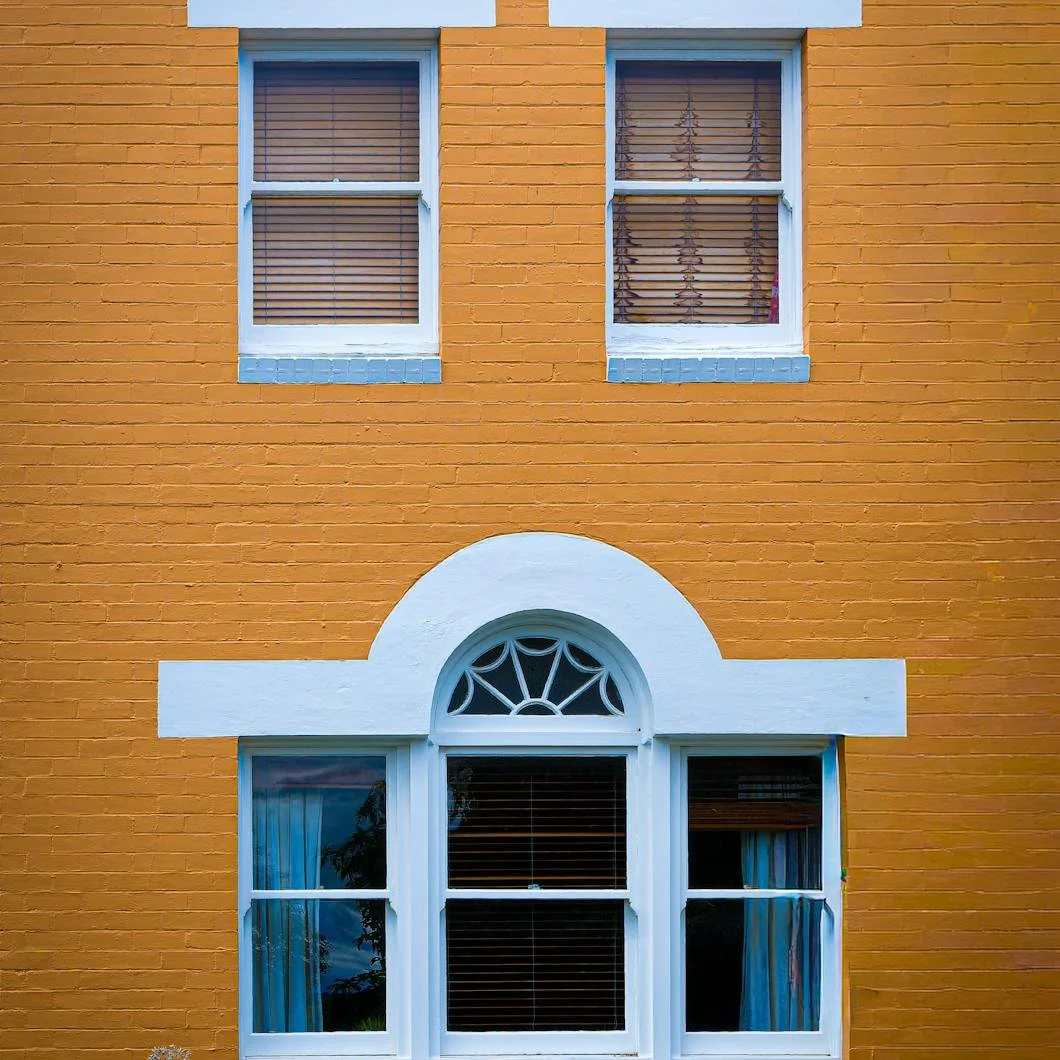
The House Has a Face: What Exterior Paint Says Before Anyone Knocks
Before anyone steps inside, a house has already introduced itself. Windows, doors, trim, shutters, porches, rooflines, and chimneys all shape the way a home appears from the outside. Exterior paint can soften, sharpen, brighten, or restore that expression, changing how the home feels before the doorbell ever rings.
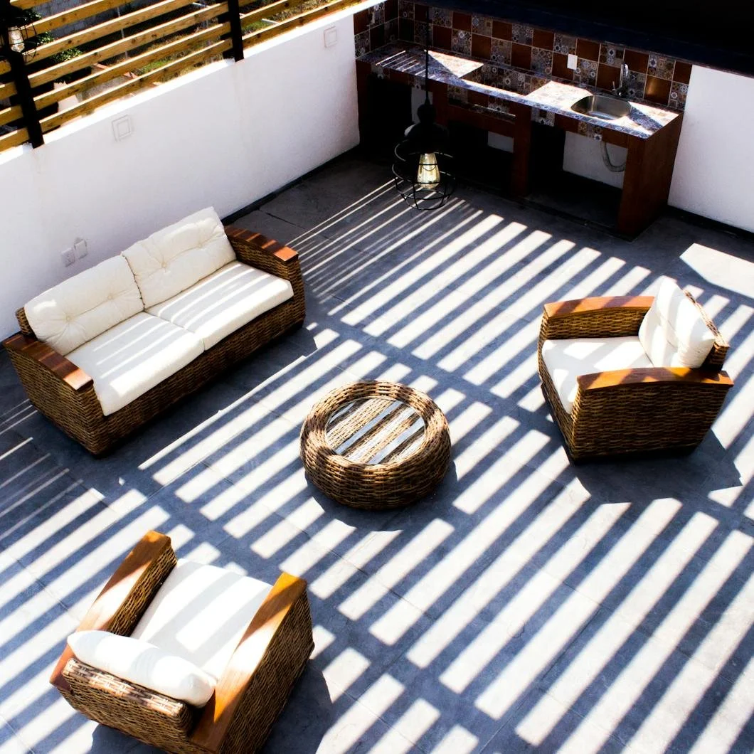
The Backyard as a Room: How Paint Shapes Outdoor Living
In warm weather, the backyard becomes more than scenery. It becomes one of the most-used rooms of the home. From painted fences and stained decks to porch railings, back doors, pergolas, trim, and shutters, paint helps define the edges, mood, and atmosphere of outdoor living spaces.

Color Notes: This Week at Stanwich Painting
This week on Color Notes we explore historic Victorian color palettes, the importance of paint finish, and the enduring warmth of French country interiors.
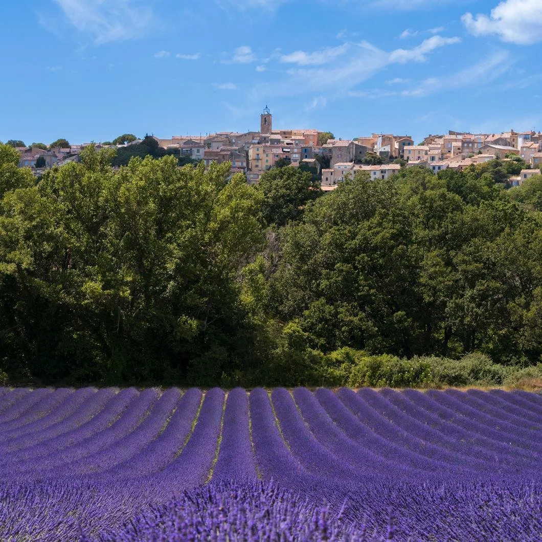
Sun-Washed and Lived-In: How French Country Paint Colors Bring Warmth Home
French country color is not about copying a theme. It is about creating warmth, softness, age, and quiet elegance through sun-washed paint colors. From Benjamin Moore warm whites and soft neutrals to herb greens, muted blue-grays, lavender, and grounding black accents, these colors can help a home feel more collected, relaxed, and deeply lived-in.
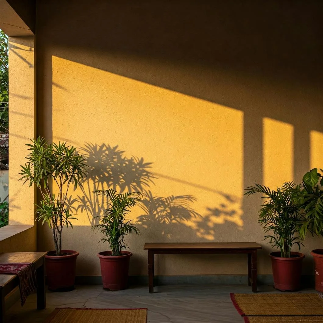
The Finish Changes Everything: Why Paint Sheen Matters as Much as Color
Paint color gets most of the attention, but finish determines how that color actually lives in a room. From matte and eggshell to satin, semi-gloss, and high gloss, each sheen changes light, durability, cleanability, and atmosphere. Here’s how to choose the right paint finish for the room, the surface, and the way your home is used.