
Fresh Inspiration For Every Room. Exploring Color, Design, And The Art Of Home Transformation In Fairfield County, CT.

Color Notes: This Week at Stanwich Painting
This week on Color Notes we explore backyard outdoor living spaces and how exterior paint choices shape curb appeal and the face of a house
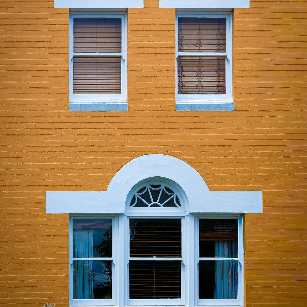
The House Has a Face: What Exterior Paint Says Before Anyone Knocks
Before anyone steps inside, a house has already introduced itself. Windows, doors, trim, shutters, porches, rooflines, and chimneys all shape the way a home appears from the outside. Exterior paint can soften, sharpen, brighten, or restore that expression, changing how the home feels before the doorbell ever rings.

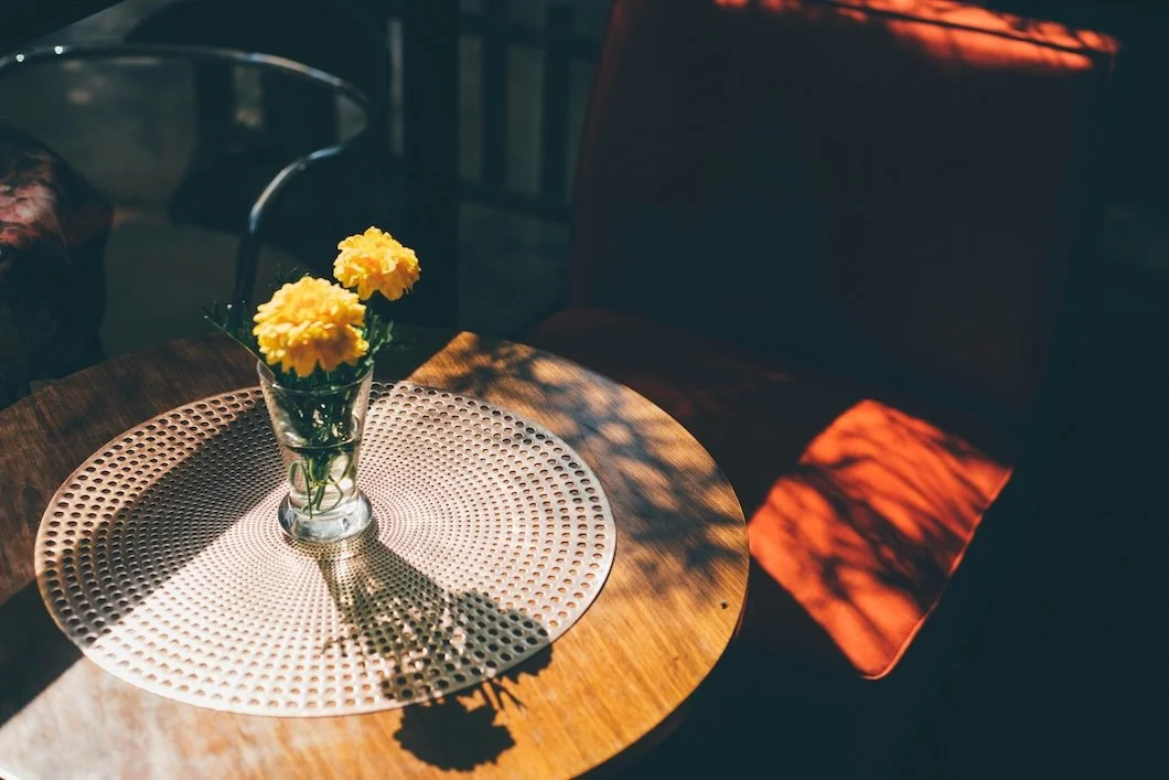
The Backyard as a Room: How Paint Shapes Outdoor Living
In warm weather, the backyard becomes more than scenery. It becomes one of the most-used rooms of the home. From painted fences and stained decks to porch railings, back doors, pergolas, trim, and shutters, paint helps define the edges, mood, and atmosphere of outdoor living spaces.
Color Notes: This Week at Stanwich Painting
This week on Color Notes we explore historic Victorian color palettes, the importance of paint finish, and the enduring warmth of French country interiors.
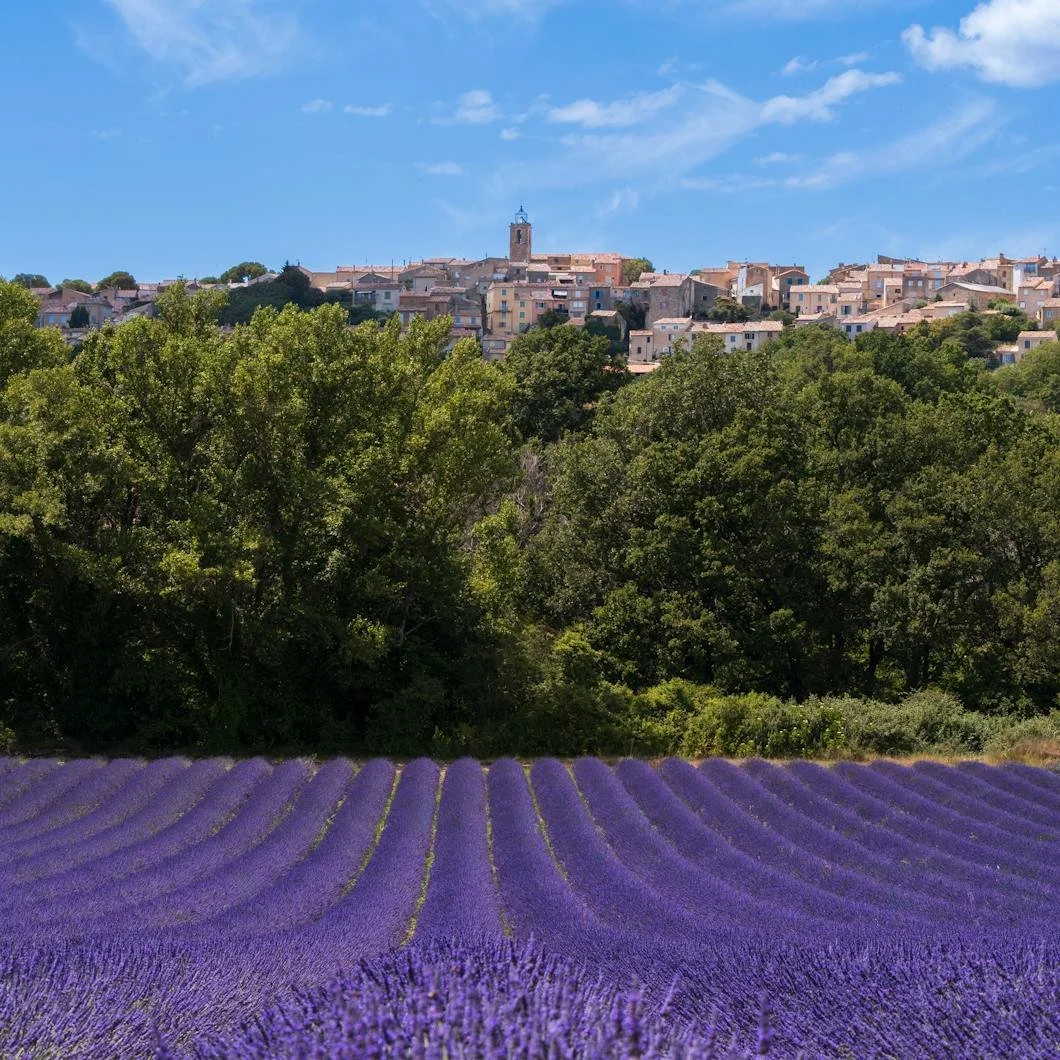
Sun-Washed and Lived-In: How French Country Paint Colors Bring Warmth Home
French country color is not about copying a theme. It is about creating warmth, softness, age, and quiet elegance through sun-washed paint colors. From Benjamin Moore warm whites and soft neutrals to herb greens, muted blue-grays, lavender, and grounding black accents, these colors can help a home feel more collected, relaxed, and deeply lived-in.

The Finish Changes Everything: Why Paint Sheen Matters as Much as Color
Paint color gets most of the attention, but finish determines how that color actually lives in a room. From matte and eggshell to satin, semi-gloss, and high gloss, each sheen changes light, durability, cleanability, and atmosphere. Here’s how to choose the right paint finish for the room, the surface, and the way your home is used.
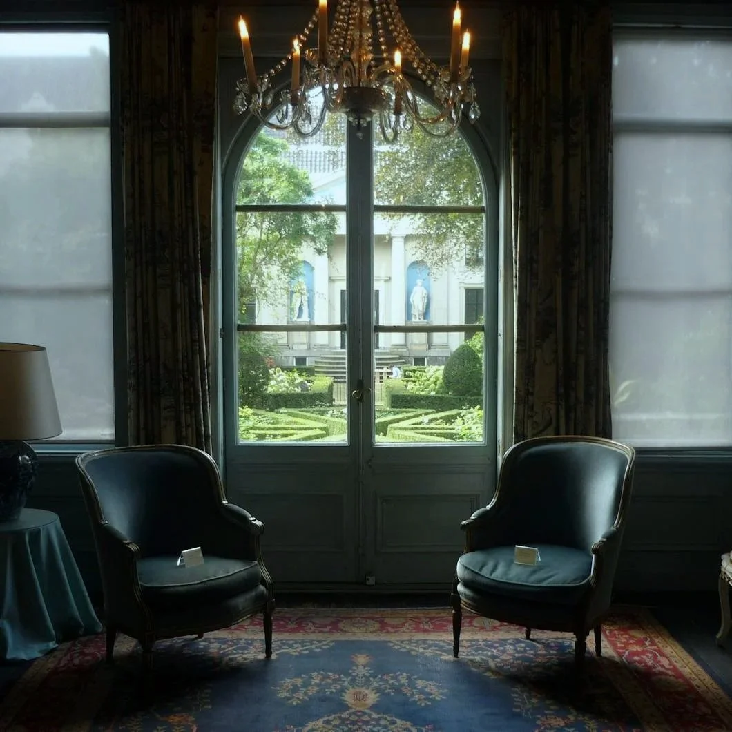
The New Victorian Mood: Why Historic Paint Colors Feel Modern Again
Victorian paint colors are not just dark reds, browns, and dusty museum shades. Sherwin-Williams’ historic Victorian palette includes soft blue-greens, smoky mauves, earthy terra cottas, serious greens, and rich jewel tones that feel surprisingly modern in today’s homes. Here’s why these historic colors are returning — and how to use them with restraint, confidence, and proper preparation.

Color Notes: This Week at Stanwich Painting
This week on Color Notes we explore the emotional reasons homeowners repaint and the practical realities of spring exterior prep during pollen season.
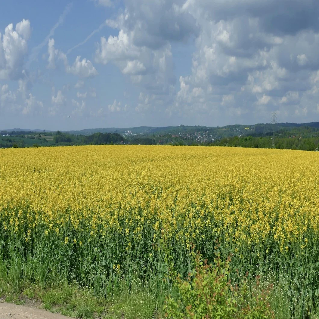
The Pollen Layer: What Spring Leaves Behind Before the Paint Goes On
Spring pollen is more than a seasonal nuisance. For exterior painting, it is a visible reminder that siding, trim, porches, and other surfaces need to be properly cleaned and prepared before paint can perform. Here’s why washing, inspection, and prep work matter before the first coat goes on.

Why Do We Really Paint Our Houses?
Why do we really paint our houses? On the surface, the answer is maintenance, curb appeal, resale value, or a much-needed refresh. But beneath the practical reasons, painting often reveals something deeper about identity, pride, belonging, control, and the psychology of home.

Color Notes: This Week at Stanwich Painting
This week on Color Notes we explore why paint bleeds through despite matching color and how traditional brushwork shaped the history of painting craftsmanship.
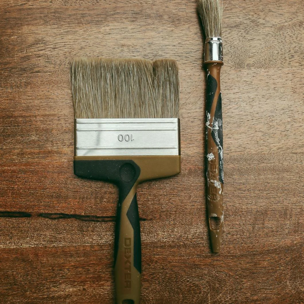
The History of the Paint Brush: How Traditional Brushwork Shaped Homes
Before rollers and sprayers, every surface was painted by hand. Explore the history of the paint brush and how traditional brushwork shaped historic homes and finishes.
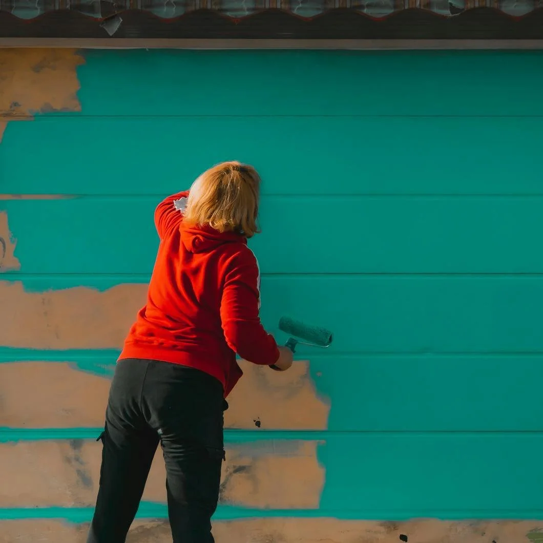
The Surface Remembers: Why Paint Bleeds Through Even When the Color Matches
A perfectly matched paint color does not always guarantee a perfect result. Sometimes old paint, stains, or incompatible coatings begin to show through revealing that color matching and paint compatibility are not the same thing. Learn why paint bleed-through happens, how primer plays a critical role, and why understanding the surface beneath matters as much as the finish coat itself.

Color Notes: This Week at Stanwich Painting
This week on Color Notes we explore forgotten parts of the property and the rooms that feel personal rather than trend-driven.

The Room That Defies Trends
Some rooms aren’t designed for guests or trends—they evolve slowly through habit, comfort, and personal use. Explore the kind of room that feels lived in rather than styled.
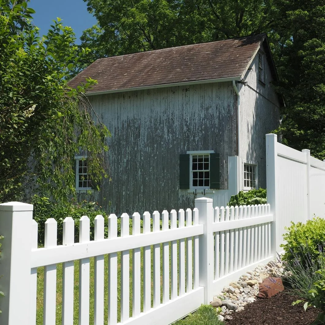
The Forgotten Parts of the Property
Spring has a way of revealing the forgotten parts of a property—carriage houses, railings, trim, and architectural details that quietly shape the whole. Explore how exterior painting restores continuity beyond the main house.

Color Notes: This Week at Stanwich Painting
This week on Color Notes we explore what lies beneath paint, the rise of coffee-inspired warm neutrals, and how Rothko’s influence shapes modern color drenching.
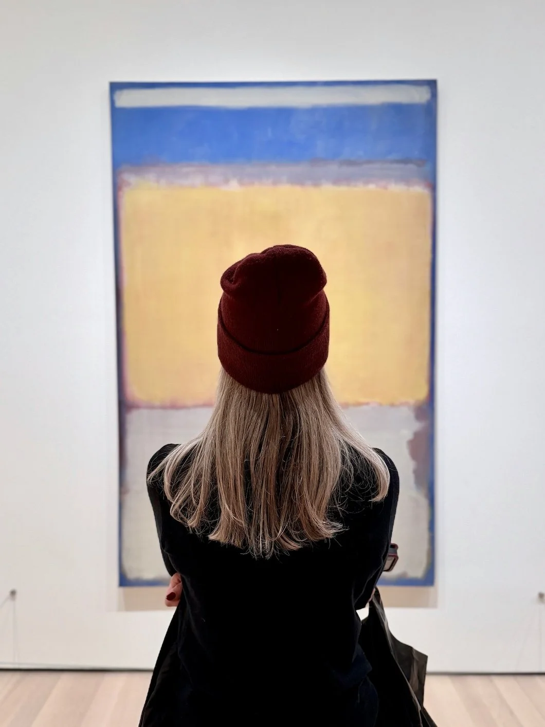
Mark Rothko and the Room Made of Color
Mark Rothko didn’t paint colors—he created environments. Discover how layered, immersive paint palettes bring depth, continuity, and atmosphere into modern interiors.

The Colors Within Coffee
Coffee isn’t a single shade—it’s layered, warm, and constantly shifting. Explore rich neutral paint colors inspired by coffee tones to create depth and balance in your home.

The Colors Beneath the Surface
The ocean isn’t a single shade of blue—it’s constantly shifting. Explore layered, light-responsive paint colors that bring depth and calm into modern interiors.