
Mark Rothko and the Room Made of Color
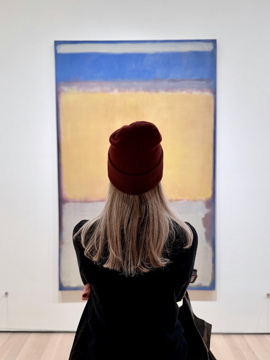
Photo by Tim Wildsmith on Unsplash
Most color is chosen quickly…
Held against a wall, compared to another swatch, decided on in a moment that feels more final than it actually is. It’s meant to be understood immediately—this is blue, this is warm, this is neutral—and once it’s applied, it’s expected to hold that identity without shifting too much over time.
It’s a practical way to work, but it assumes that color is something fixed.
Mark Rothko didn’t treat color that way.
His paintings appear simple at a distance—fields of tone, loosely structured, hovering in relation to one another—but that solidity dissolves the closer you get. Edges blur. Colors soften into each other. What reads as a single surface begins to separate into layers, each one slightly adjusting the one above it.
Nothing is as stable as it first appears. And that instability is what gives the work its presence.
Rothko built his paintings slowly, often in thin washes that allowed earlier layers to remain active beneath the surface. The canvas was not just painted—it was developed, adjusted, reconsidered. He would rotate it as he worked, removing any fixed orientation so that the composition could settle into something less rigid, less dependent on a single point of view.
What remains is not a color; instead it’s the accumulation of color.
That distinction is part of what makes his work difficult to translate outside of the gallery, and even more difficult to apply within a home. Because most interiors are still built around separation. Walls are one color. Trim is another. Ceilings are treated as their own plane, often lighter, often distinct. The room is constructed through contrast, each surface defined clearly enough that it can be read at a glance.
It’s legible, but also fragmented.
Rothko’s work suggests another way of thinking about it: not as a collection of surfaces, but as a field—something continuous, something that doesn’t fully resolve into parts. Color, in that context, doesn’t sit on a wall. It occupies the space, extending beyond edges, softening transitions, creating a sense that the room is held together by tone rather than divided by it.
This is where the idea of immersion begins.
People often describe a kind of emotional response to Rothko’s paintings, especially in spaces like the Rothko Chapel, where scale, light, and silence allow the work to operate without interruption. The reaction isn’t immediate. It builds, slowly, as the eye adjusts and the color begins to register not just visually, but spatially.
You’re not looking at it—you’re inside it.
That experience is difficult to replicate, but the principle behind it translates more easily than it seems. It’s not about scale, or even about intensity. It’s about continuity.
In a home, continuity often comes down to how color moves across surfaces. When walls, ceilings, and trim are treated as separate elements, the eye is forced to navigate between them. Edges become more pronounced. Transitions become more abrupt. The room is read in sections.
But when those same surfaces are brought into alignment—when the palette is allowed to operate within a tighter range—the structure of the room begins to soften. Boundaries remain, but they become less important.
This is where color drenching, at its best, begins to resemble something closer to Rothko’s thinking.
Not as a stylistic choice, and not as a way to make a room feel bold, but as a way to reduce the visual breaks that keep a space from feeling whole. A single color, or a closely related range of tones, carried across multiple surfaces, allows the room to settle into itself.
The effect is not dramatic, but rather cumulative. But like Rothko’s work, the success of that approach depends on variation. A flat, single-note application rarely holds the same depth. Without subtle shifts—through light, through finish, through the way the surface is prepared—the color can collapse into something static.
What makes Rothko’s paintings resonate is not their uniformity. It’s the tension between consistency and change. That tension can exist in interiors as well, though it’s often overlooked.
A deep, grounded tone like Farrow & Ball’s Tanner’s Brown carries warmth without reading as overtly “brown,” shifting depending on the time of day and the surrounding materials. Benjamin Moore’s Iron Mountain holds a similar weight, sitting somewhere between charcoal and soft black, absorbing light in some conditions and releasing it in others.
Even more restrained tones—Farrow & Ball’s Jitney, or Benjamin Moore’s Edgecomb Gray—can operate in this way when used across multiple surfaces, their subtle undertones becoming more apparent as the light changes and the room begins to settle into a rhythm.
None of these colors announce themselves immediately. They reveal themselves over time with a sense of gradual recognition—and that is what gives a space its depth. Not contrast, not brightness, but the ability to hold attention without demanding it. The room doesn’t present itself all at once. It unfolds slightly, depending on where you stand, how long you stay, what time of day it is.
Color becomes less declarative. More atmospheric, but with a degree of required restraint.
Rothko’s palettes are limited, even when they feel expansive. The variation exists within a narrow range, which is what allows the work to remain cohesive despite its internal complexity. Too many competing tones, and the effect breaks apart.
The same is true in a home. A contained palette, carried consistently, allows for subtle shifts to register without being overwhelmed. Materials support the color rather than interrupt it. Light moves across surfaces without being broken by abrupt changes—holding the room.
Ultimately, what Rothko’s work demonstrates is not just how color looks, but how it behaves. It can recede. It can advance. It can hold space without defining it too rigidly. It can create an environment that feels stable, even when it’s built from layers that are anything but static.
In that sense, the most effective use of color in a home isn’t about making a statement. It’s about creating a condition: a space where color doesn’t stop at the surface, but extends into the way the room is experienced—quietly, consistently, and over time.
And when that happens, the room doesn’t feel decorated. It feels composed.
Ready to Help
If you’re considering a more immersive approach to color—whether through deeper tones or a more unified palette—the way those colors are applied and finished plays a critical role in how the space ultimately feels.
At Stanwich Painting, every project begins with a detailed estimate that outlines surface preparation, materials, and the full scope of work before anything begins. That clarity ensures the finished result feels cohesive, intentional, and built to last.
To schedule a consultation, visit or call 475-252-9500.
Stanwich Painting proudly provides top-quality residential painting services throughout Fairfield County, including: Greenwich, Cos Cob, Riverside, Old Greenwich, Stamford, Darien, New Canaan, and Wilton