
The New Victorian Mood: Why Historic Paint Colors Feel Modern Again
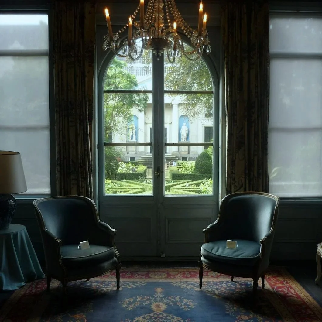
Photo by Trento Vacca
For a long time, Victorian color had a public relations problem.
Say the word “Victorian” and many people imagine heavy drapes, overstuffed rooms, dark furniture, carved everything, patterned wallpaper, and a house that feels like it might come with a faint smell of dust, roses, and old piano sheet music. It is not an entirely fair association, but it is a persistent one. Victorian design has often been treated as the opposite of modern taste: too ornate, too emotional, too dark, too much.
But color has a strange way of returning when we need it.
After years of white walls, gray floors, pale kitchens, resale-safe neutrals, and interiors designed to look clean through a phone screen, Victorian paint colors suddenly feel less like relics and more like a corrective. They have weight. They have shadow. They have personality. They understand that a room does not always need to feel open, bright, and optimized. Sometimes a room is meant to gather you in.
That is what makes Sherwin-Williams’ Victorian historic color palette so interesting. The collection includes familiar warm neutrals and deep reds, yes, but the real energy is in the stranger shades: misted blue-greens, earthy terra cottas, smoky slates, serious greens, bruised mauves, and jewel-toned accents that feel both old and oddly current.
The lesson is not that every homeowner should turn the house into a period drama. The modern appeal of Victorian color is not about costume. It is about atmosphere.
Victorian Color Was Never Afraid of Personality
One of the reasons Victorian color feels so refreshing now is that it was not designed to disappear. These colors were meant to participate in the room. They worked with millwork, upholstery, fireplaces, artwork, patterned textiles, lamps, wood tones, and architectural detail. They had to hold their own.
A color like Peacock Plume SW 0020 captures that beautifully. It is saturated without feeling cartoonish, dramatic without becoming loud. There is a decorative richness to it, the kind of blue-green that can make a powder room, built-in, interior door, or small dining space feel intentional rather than merely painted.
Then there is Deepest Mauve SW 0005, which may be one of the more interesting colors in the Victorian group because it resists easy prettiness. It is smoky, dusky, and slightly bruised, with a mood that feels closer to velvet than flowers. In the wrong room, it could become heavy. In the right one, it could be quietly stunning.
These are not background colors in the modern builder-grade sense. They are colors with a point of view.
That is exactly why they feel fresh again.
The Return of Rooms That Feel Like Rooms
Modern interiors have spent years chasing openness. Walls came down. Kitchens merged with living rooms. Dining rooms became optional. Everything became lighter, cleaner, and easier to photograph.
There is nothing wrong with brightness. But when every space is asked to feel open, social, flexible, and neutral, something is lost. Certain rooms are not meant to do everything. A study is allowed to feel focused. A dining room is allowed to feel intimate. A library is allowed to feel quiet. A powder room is allowed to be dramatic for no practical reason at all.
Victorian color understood this.
A shade like Rookwood Jade SW 2812 brings that room-specific intelligence back. It has more gravity than a soft sage, but it is not as severe as a traditional hunter green. It feels grounded, architectural, and calm. In a study, library, dining room, or built-in shelving, it can create that sense of enclosure people often describe as cozy, but what they really mean is contained.
Billiard Green SW 0016 lives in similar territory, though with a deeper club-room quality. Used carefully, it can make a space feel established almost immediately. Pair it with warm wood, aged brass, creamy trim, leather, or natural stone, and it becomes less “old-fashioned” than deeply rooted.
This is one of the strongest arguments for Victorian-inspired color today: not every room needs to be bright to feel alive.
Historic Color Is Not Just Red and Brown
The lazy version of Victorian color is all dark red, brown, and gold. Those colors have their place, but they are not the whole story. Some of the most beautiful shades in the Victorian palette are softer, stranger, and more atmospheric.
Calico SW 0017 is a perfect example. It has a quiet blue-green quality that feels almost watery, but not beachy. It is softened enough to feel historical, yet light enough to work in a bedroom, sitting room, sunroom, or powder room. It offers the surprise of Victorian color without the heaviness people often associate with the period.
Downing Slate SW 2819 is another compelling option because it behaves almost like a modern neutral, but with more depth. It is not the flat gray that dominated interiors for so long. It has a blue-gray seriousness, a mineral quality, and an architectural calm that could work on cabinetry, mudroom walls, shutters, interior doors, or a bedroom with good natural light.
Together, these colors show why historic palettes still matter. They are rarely one-note. They shift with light. They carry undertones. They have a little age built into them, which is often what newer homes need most.
Earth Tones Before They Were Trendy
One of the more interesting developments in recent design is the return of clay, rust, ochre, amber, and terra cotta. After the long reign of cool gray and white, homeowners are beginning to want warmth again. Not just beige warmth, but earthy warmth. Color that feels baked, mineral, and human.
Victorian palettes were already there.
Rookwood Terra Cotta SW 2803 is one of the strongest colors in the collection because it feels both historic and very current. It has the warmth of clay without becoming orange in a simplistic way. In a dining room, foyer, powder room, or even on a front door, it can give a home a sense of age and confidence.
This is where Victorian color overlaps beautifully with contemporary taste. The current appetite for warm, grounded interiors is not really new. It is a return to something older: color with body, color that belongs to wood and plaster and brick and stone, color that does not feel manufactured for a trend cycle.
A terra cotta, amber, olive, or muted gold can make a room feel lived-in before it has even been furnished.
How to Use Victorian Color Without Turning the House Into a Museum
The key is restraint. Victorian-inspired color works best when homeowners borrow the mood, not the entire costume.
A historic palette can go wrong when every decision becomes too literal. Dark walls, ornate furniture, patterned rugs, heavy window treatments, antique art, and period-style lighting can quickly make a room feel staged rather than soulful. The goal is not to recreate the 1880s. The goal is to let the color bring depth into the present.
Some of the best places to use Victorian-inspired colors include:
Powder rooms, where a bolder color can feel jewel-like rather than overwhelming
Dining rooms, where deeper tones support intimacy and evening light
Studies and libraries, where greens, slates, and browns create focus
Built-ins, where saturated color can highlight craftsmanship
Interior doors, where a historic shade can add quiet punctuation
Entryways, where color can establish mood immediately
Exterior shutters or front doors, where deeper tones add architectural weight
Bedrooms, especially with softened shades like Calico or Deepest Mauve
A modern home does not need stained glass, carved mantels, or elaborate moldings to benefit from these colors. Sometimes the contrast is what makes them work. A clean-lined room painted in a historic shade can feel more interesting precisely because the color brings memory where the architecture is simpler.
Finish and Prep Decide Whether It Feels Rich or Rough
With colors this expressive, execution matters.
Deep greens, smoky mauves, terra cottas, and saturated blue-greens can be beautiful, but they are less forgiving than plain white walls. They reveal poor patching. They emphasize uneven surfaces. They can make sloppy cut lines, rough sanding, or failed caulk more visible. The richer the color, the more important the preparation becomes.
Finish also changes the entire story. A deep green in matte can feel quiet and enveloping. In satin, it becomes sharper and more architectural. In gloss, it turns dramatic and reflective, especially on doors, trim, or built-ins. None of these choices are automatically right or wrong, but they need to be intentional.
This is where professional painting becomes more than application. The color may create the mood, but the prep work determines whether that mood feels refined.
Older homes, in particular, often require careful surface evaluation before a historic color is applied. There may be previous coatings, repaired plaster, worn trim, moisture issues, or layered paint histories that need attention. A beautiful Victorian shade cannot compensate for a surface that was never made ready.
Why Victorian Color Feels So Alive Now
The renewed interest in Victorian color is not just nostalgia. It is a response to thinness.
People are tired of interiors that feel temporary, frictionless, and overly safe. They want rooms with more emotional temperature. They want color that changes from morning to evening. They want homes that feel personal without becoming chaotic, historic without becoming precious, designed without feeling showroom-cold.
Victorian paint colors offer that possibility because they understand atmosphere. They remind us that color can do more than brighten a room or protect resale value. It can create intimacy. It can add memory. It can make architecture feel more present. It can turn a small room into a destination.
Used well, these colors do not drag a home backward. They give it depth.
And perhaps that is why the Victorian mood feels modern again. Not because we want to live in the past, but because we are remembering that rooms should have presence. They should hold something. They should feel like more than clean space.
A home does not need to be old to have an old soul. Sometimes it only needs the right color, applied with care, and enough confidence to let the room become itself.
Ready to bring some modern, Victorian soul into your home?
Stanwich Painting proudly provides top-quality residential painting services throughout Fairfield County, including: Greenwich, Cos Cob, Riverside, Old Greenwich, Stamford, Darien, New Canaan, and Wilton
Suggested Further Reading:
Sherwin-Williams Historic Paint Colors — Victorian Collection
Sherwin-Williams Color Collections