
Sun-Washed and Lived-In: How French Country Paint Colors Bring Warmth Home
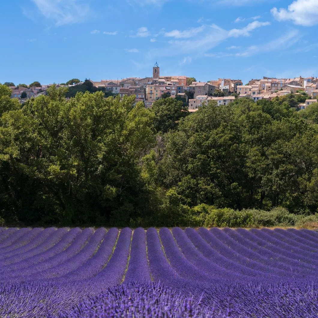
Photo by Le sixième rêve
French country style is easy to misunderstand.
At its worst, it can become a theme: roosters, distressed signs, overly rustic furniture, and a room trying a little too hard to prove it once visited Provence. But at its best, French country design is not really a theme at all, but a mood. It is relaxed, weathered, warm, and quietly elegant. It knows how to live with age. It understands that beauty does not always need to look polished within an inch of its life.
That is why French country color still feels so appealing in modern homes. It offers an antidote to interiors that feel too cold, too new, too gray, or too showroom-perfect. The palette is soft without being weak, rustic without being sloppy, and romantic without becoming precious.
Benjamin Moore describes French country paint colors as a way to evoke “rustic chic glamour,” with Provençal inspiration rooted in pale yellows, pinks, off-whites, muted spring colors, natural materials, and an easy blend of old and new. The effect is less about decoration and more about atmosphere: the feeling of sun, stone, linen, herbs, wood, and rooms that have been lived in lovingly over time.
For homeowners, that is the real lesson. French country color is not about copying a farmhouse in southern France. It is about choosing paint colors that make a home feel softer, warmer, more collected, and more human.
French Country Is Not a Theme. It Is a Feeling.
The most successful French country interiors never feel overly coordinated—they feel gathered. A weathered table, a limestone floor, a simple linen curtain, an old ceramic bowl, a painted cabinet, a wood beam, a garden clipping in a vase; nothing needs to match perfectly because the beauty comes from the layering.
Paint color works the same way. These are not colors that shout for attention. They are colors that seem to have been softened by use, sun, and time.
The best French country-inspired rooms often share a few qualities:
Warmth without heaviness
Softness without blandness
Color without saturation
Elegance without stiffness
Imperfection without neglect
Rustic texture balanced by refinement
That balance is what makes the style so enduring. It can work in an older home with plaster walls and original woodwork, but it can also bring soul to a newer home that feels too crisp or unfinished.
The Quiet Power of Warm Whites
Every French country palette needs a good white, but not the cold, gallery-like white that can make a room feel sterile. The whites in this world tend to be warmer, creamier, chalkier, or more relaxed. They do not announce themselves. They let materials do their work.
Benjamin Moore points to colors like Atrium White OC-145, White Dove OC-17, and Wind’s Breath OC-24 as part of this warm, neutral foundation. These shades work beautifully because they do not flatten a room. They allow wood, stone, tile, linen, brass, ceramics, and natural light to feel integrated rather than staged.
A warm white can be especially useful in rooms where texture is already doing a lot of the visual work. Think of a kitchen with open shelving and stone counters, a bedroom with exposed beams, or a living room with wood floors and soft upholstery. In those spaces, the wall color does not need to perform dramatically. It needs to hold the room together.
A color like White Dove OC-17 can feel clean but not cold. Wind’s Breath OC-24 adds a little more softness and warmth. Atrium White OC-145 can help create that easy, sun-washed quality that feels appropriate to French country inspiration without becoming yellow or heavy.
The point is not to choose “plain white.” The point is to choose a white that has enough warmth to make everything around it feel more natural.
Soft Neutrals Make a Room Feel Collected
French country style also relies heavily on neutrals that feel aged rather than generic. Beige, cream, clay, sand, and greige can all work when they are chosen with care. The danger is choosing a neutral that feels flat. The opportunity is finding one that feels like it belongs to stone, plaster, wood, and daylight.
Clay Beige OC-11 is a good example of a neutral with more character than a basic beige. It has an earthy quality that can support a room without making it feel decorated around a trend. In a hallway, dining room, kitchen, or bedroom, it can create warmth while still allowing furniture, textiles, and architectural details to lead.
This is where French country color becomes useful beyond the style itself. Many homeowners want warmth, but they do not necessarily want strong color. A soft neutral gives them a way in. It can make a room feel older, calmer, and more settled without asking the walls to become the main event.
Warm neutrals are especially effective when paired with:
Natural wood tones
Cream or off-white trim
Stone floors or fireplaces
Linen, cotton, and woven textures
Aged brass or iron accents
Softly patterned textiles
Ceramic or handmade decorative pieces
This is the difference between neutral as absence and neutral as atmosphere.
Color Should Feel Sun-Washed, Not Saturated
French country color often feels as if it has been filtered through light. Blues are softened. Greens feel herbal. Pinks are pale rather than sugary. Yellows feel buttery or sun-faded instead of bright. Even stronger accents tend to feel grounded by natural materials.
Benjamin Moore’s page notes that French country colors often have a soft, muted quality with pale, warm, unsaturated spring colors inspired by sky, sea, southern sun, and Provençal herbs.
That is why a color like Smoke 2122-40 works so well in this conversation. It is a blue-gray with enough softness to feel atmospheric rather than coastal-cliché. Benjamin Moore shows it on a bedroom ceiling, where it plays against floral curtains and cream bedding. It is a reminder that color does not always need to go on four walls to change a room. A ceiling, bed frame, interior door, or built-in can carry the mood more subtly.
Lavender Mist 2070-60 brings a different softness. Used carefully, it can suggest faded flowers, early morning light, and vintage textiles without becoming overly sweet. This kind of color works best when the surrounding materials keep it grounded: warm white trim, natural wood, linen bedding, antique furniture, or brushed metal.
The French country approach to color is rarely about maximum impact. It is about memory, softness, and restraint.
The Kitchen Should Feel Collected, Not Perfect
The French country kitchen may be the easiest room to imagine and the hardest one to get right.
Too perfect, and it loses the charm. Too rustic, and it becomes theatrical. The best version feels functional, layered, and deeply usable: open shelves, ceramic dishes, natural materials, patterned textiles, worn wood, perhaps a little black or green to ground the softness.
Benjamin Moore’s French country kitchen example includes cabinets painted in Jet Black 2120-10, a useful reminder that this palette is not only pale and pretty. Black can give a French country kitchen structure. It can make cream walls feel warmer, patterned dishes feel sharper, and natural wood feel more substantial.
Used well, black does not fight the softness of French country design. It balances it.
This can work beautifully on:
Lower kitchen cabinets
A painted island
Interior doors
Pantry cabinetry
A hutch or built-in
Window sash or architectural accents
The key is finish and proportion. A black cabinet in the right sheen can feel elegant and grounded. Too much shine or too little preparation, however, can make it feel harsh. Like most “effortless” interiors, the casual look depends on careful execution.
Herb Greens Bring the Garden Inside
No French country palette is complete without green. Not neon green. Not trendy emerald, but the right greens feel herbal, dusty, leafy, and connected to the garden.
Benjamin Moore includes Rosemary Sprig 2144-30 and High Park 467 in its French country inspiration, tying these colors to potted herbs, petite flowers, vines, and outdoor living.
These greens are useful because they bridge interior and exterior life. They can make a kitchen feel fresher, a mudroom feel more connected to the garden, or a sunroom feel relaxed without becoming overly decorative.
A green like Rosemary Sprig 2144-30 can work beautifully where you want a natural but noticeable color. High Park 467 has a richer garden quality that could be lovely on a furniture piece, plant stand, door, or accent area.
Herb greens are especially effective in spaces that touch daily routines:
Kitchens
Breakfast rooms
Mudrooms
Sunrooms
Laundry rooms
Garden-facing entries
Porch details
Exterior doors or shutters
They remind the home that it is connected to the landscape, not sealed away from it.
The Lived-In Look Still Needs the Right Finish
French country color should not look plastic. Too much shine can work against the softness that makes the style appealing. Walls often benefit from matte, eggshell, or other lower-luster finishes that let color feel chalky, relaxed, and breathable.
That does not mean every surface should be flat. Cabinets, doors, trim, and built-ins need durability and definition. Satin or semi-gloss may be appropriate depending on the surface, the product, and the desired effect. But the finish should support the mood. A soft neutral in the wrong sheen can suddenly feel slick. A delicate blue-gray can lose its romance if it becomes too reflective.
The same is true of preparation. French country style may celebrate age, texture, and imperfection, but painted surfaces still need to be properly repaired, sanded, primed, and finished. There is a difference between charming irregularity and careless application.
That difference matters.
Effortless Is Usually Built Carefully
The great paradox of French country style is that it looks effortless when it is done well. The room seems natural, collected, and unforced. Nothing appears over-designed. The colors feel like they were always meant to be there.
But that ease depends on discipline.
The right white has to be warm enough. The neutral has to avoid looking muddy. The blue needs to be soft without becoming cold. The green should feel herbal, not loud. The black should ground the room without overwhelming it. The finish needs to suit the surface. The prep needs to support the final look.
At Stanwich Painting, this is where color selection and craftsmanship meet. A French country-inspired palette is not difficult because it is flashy. It is difficult because the beauty lives in subtlety. Small differences in undertone, sheen, lighting, and surface condition can change the entire feeling of the room.
Done well, French country color brings warmth without clutter, elegance without stiffness, and softness without fading into the background. It makes a home feel less like a showroom and more like a place with memory.
Not old-fashioned. Not themed. And definitely not precious—just sun-washed, lived-in, and quietly full of life.
Call 475-252-9500 or online for your free consultation.
Stanwich Painting proudly provides top-quality residential painting services throughout Fairfield County, including: Greenwich, Cos Cob, Riverside, Old Greenwich, Stamford, Darien, New Canaan, and Wilton
Further ReadingBenjamin Moore’s French Country Color Collectionhttps://www.benjaminmoore.com/en-us/project-ideas-inspiration/design-style/french-country-color-palette-ideas