
The House Has a Face: What Exterior Paint Says Before Anyone Knocks
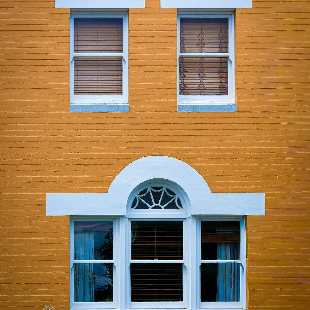
Photo by Warren Griffiths
Before anyone steps inside, the house has already introduced itself.
It does this quietly, through proportion, symmetry, color, light, shadow, age, landscaping, and all the small architectural details people feel before they consciously name. A home can seem cheerful, stern, elegant, sleepy, guarded, gracious, awkward, formal, warm…
Or tired before the front door ever opens.
That may sound strange, but most homeowners understand it instinctively. Some houses look friendly. Some look imposing. Some look neglected even when they are structurally sound. Others look beautifully cared for without being flashy. Curb appeal is often described in terms of value, maintenance, or resale, but at a deeper level, it is about expression.
A house has a face.
The windows behave like eyes. The front door acts almost like a mouth. The roofline can suggest a brow. Trim gives definition. Shutters, railings, porches, steps, and chimneys all contribute to the way the home presents itself to the street, the neighborhood, and the people approaching it.
Exterior paint does not create the architecture, but it changes how that architecture is read. It can soften a severe house, sharpen a sleepy one, brighten a tired exterior, or make a beautiful home feel more intentional. Paint is not only protection. It is expression.
The House Makes an Impression Before the Doorbell Rings
Every home has a posture. Some homes seem to lean forward, welcoming visitors in. Others feel reserved, tucked back behind hedges, shade, or darker colors. Some appear formal and composed. While others feel relaxed and lived-in.
Paint plays a major role in that impression because color organizes what the eye notices first. A crisp trim color can make the architecture feel alert. A warm body color can make the exterior feel approachable. A dark door can create confidence and gravity. A faded or mismatched palette can make the same home feel uncertain.
This is why exterior painting should never be treated as simply “choosing a color for the house.” A successful exterior palette considers the whole expression.
A few questions matter immediately:
What should the home feel like from the street?
Which architectural features deserve attention?
Which features should recede?
Does the current contrast feel too harsh, too flat, or just right?
Does the color support the age and style of the home?
Does the house feel welcoming, elegant, playful, traditional, relaxed, or severe?
The best exterior paint choices do not force a personality onto a home, instead they reveal the one that already belongs there.
Windows Are the Eyes
Windows are among the most expressive features of a house. They give the facade its rhythm, symmetry, openness, and gaze. A home with large, evenly placed windows may feel open and bright. A home with small or deeply recessed windows may feel more private, historic, or inward.
Paint around windows changes that expression dramatically.
Light trim can make windows feel larger, cleaner, and more awake. Dark sash can add depth and sophistication. Shutters can frame the windows like eyelids or lashes, giving the house more definition. Too much contrast can make a house look startled. Too little contrast can make the windows disappear, leaving the exterior feeling flat or blank.
The goal is not always to make every window stand out. Sometimes the most elegant choice is subtlety. On a historic home, cream trim against a muted body color can feel graceful. On a more modern exterior, black or charcoal window accents can feel crisp and architectural. On a cottage or shingle-style home, softer greens, blues, or weathered neutrals can help the windows settle into the landscape.
Windows determine how the house “looks back.” Paint determines whether that gaze feels sharp, soft, warm, or distant.
The Front Door Is the Mouth
If windows are the eyes, the front door is the mouth.
It is the point of welcome. It is where the house speaks most directly. A front door can feel cheerful, formal, mysterious, traditional, bold, quiet, or deeply personal. It is also one of the most powerful places to use color because it carries emotional weight without requiring the entire exterior to change.
A red door can feel classic, hospitable, and confident. A black door can feel elegant and composed. A deep green door can connect the house to the landscape. A blue door can feel calm or coastal depending on the shade. A warm clay, rust, or terracotta door can make the entrance feel earthy and generous.
But a front door color should never be chosen in isolation. It needs to speak to the siding, trim, shutters, roof, stonework, brick, walkway, and landscaping. A beautiful color in the wrong context can feel like a sentence spoken in the wrong tone.
The front door does not have to shout. Sometimes the best door color is the one that gives the house a clearer voice.
The Roofline Is the Brow
The roofline gives a home much of its attitude.
A steep roof can feel dramatic, historic, or protective. A low roofline can feel grounded and calm. A wide overhang can create shadow and depth. Dormers can add charm or alertness. Gables can make the home feel expressive, almost animated.
Paint cannot change the shape of a roofline, but it can influence how that shape is perceived. Trim color under eaves, fascia, soffits, gutters, dormers, and upper-story details all affect whether the top of the house feels heavy, crisp, soft, or balanced.
A stark trim color beneath a dark roof may sharpen the expression. A softer trim may relax it. Matching or closely related tones can make a complex roofline feel calmer. Higher contrast can emphasize architectural detail, but it can also make a home feel busier.
Like a brow on a face, the roofline sets emotional tone. It can make the house look stern, lifted, relaxed, or watchful. The paint around it decides whether that tone is softened or intensified.
Trim Defines the Features
Trim is the contour of the house.
It outlines windows, doors, corners, porches, roof edges, columns, and transitions between materials. When trim is chosen well, it gives the exterior clarity. When it is too bright, too dull, too contrast-heavy, or poorly maintained, it can change the whole face of the home.
A clean white trim can feel classic and crisp, especially on colonials and traditional homes. A creamy off-white can soften older architecture. A darker trim can make a house feel more modern, dramatic, or grounded. Muted trim can create a quieter, more blended look that works beautifully with stone, cedar, brick, and wooded settings.
Trim can:
Sharpen the home’s architecture
Soften strong features
Highlight craftsmanship
Create contrast and rhythm
Make windows and doors feel more intentional
Help older homes feel refreshed without losing character
But trim also shows wear. Peeling, cracking, staining, or faded trim can make an otherwise handsome house appear tired. Because trim is often where the eye goes first, its condition matters more than homeowners sometimes realize.
Porches, Railings, and Columns Create Posture
If the windows are eyes and the door is the mouth, the porch is posture.
A porch changes how a house stands in the world. It can make the home feel open and generous, shaded and restful, formal and balanced, or casual and welcoming. Columns, railings, steps, spindles, and porch ceilings all contribute to that impression.
Paint is especially important here because porch elements are both architectural and tactile. People touch the railings. They walk the steps. They sit near the columns. Guests notice the condition of these surfaces up close.
Freshly painted porch railings can make a home feel cared for immediately. A porch ceiling in a soft blue or pale neutral can create lift and atmosphere. Crisp columns can restore a sense of dignity. Repainted steps or risers can make the entrance feel safer, cleaner, and more finished.
A porch does not need to be grand to shape the home’s expression. Even a small entry porch can change the entire mood of the exterior when it is painted with intention.
The Chimney Gives the House Character
The chimney is one of the strangest and most overlooked features of a home’s exterior personality.
On some houses, paired chimneys really can read almost like ears, balancing the silhouette on either side. On others, a single chimney acts more like a profile feature, giving the house age, weight, and character. It may not be the center of the face, but it often changes the way the whole exterior is perceived.
Brick chimneys, especially older ones, can be beautiful. But they can also feel visually heavy if the color clashes with the siding, roof, or trim. A dark red brick chimney against a softer exterior may feel charming, or it may feel too loud. A weathered chimney may add character, or it may simply make the house look neglected.
This is where treatments like limewashing can be worth considering. Limewash can soften brick, reduce harsh contrast, and give the chimney a more aged, integrated appearance. It does not erase the feature. It changes its tone.
That is the point. Sometimes the goal is not to hide the chimney, but to help it belong to the rest of the house.
Paint Can Change the Expression Without Changing the House
One of the most valuable things about exterior painting is that it can transform perception without changing the architecture. The house remains itself. The bones are the same, but the expression shifts.
A few changes can make a major difference:
Darkening shutters can give the windows more depth
Repainting the front door can change the tone of welcome
Softening trim can make the house feel less severe
Refreshing porch railings can improve the home’s posture
Limewashing a chimney can reduce visual heaviness
Adjusting contrast can make the exterior feel calmer or sharper
Repainting faded siding can make the whole house look more awake
Choosing warmer whites can make an older home feel more gracious
This is why exterior painting is both practical and emotional. It protects the home, but it also changes how the home feels to the people who live there and the people who approach it.
A tired house may not need a new identity. It may simply need its expression restored.
A Home Should Look Like It Knows Itself
The best exterior paint palettes do not chase attention. They create coherence. They help the home look more like itself.
A colonial does not need the same expression as a shingle-style home. A cottage does not need to behave like a modern farmhouse. A Tudor should not be forced into a palette that ignores its weight and contrast. A coastal home, wooded property, brick house, or antique home each has its own visual language.
Paint should listen before it speaks.
At Stanwich Painting, exterior color is not only about choosing something attractive. It is about understanding proportion, architecture, surface condition, light, materials, and the emotional impression a home creates from the outside. The right paint choices can make a house feel more welcoming, more grounded, more elegant, or more alive.
Because before anyone knocks, the house has already said something.
The question is whether it is saying what it means.
Ready for your home to know itself?
Stanwich Painting proudly provides top-quality residential painting services throughout Fairfield County, including: Greenwich, Cos Cob, Riverside, Old Greenwich, Stamford, Darien, New Canaan, and Wilton