
The Colors Beneath the Surface
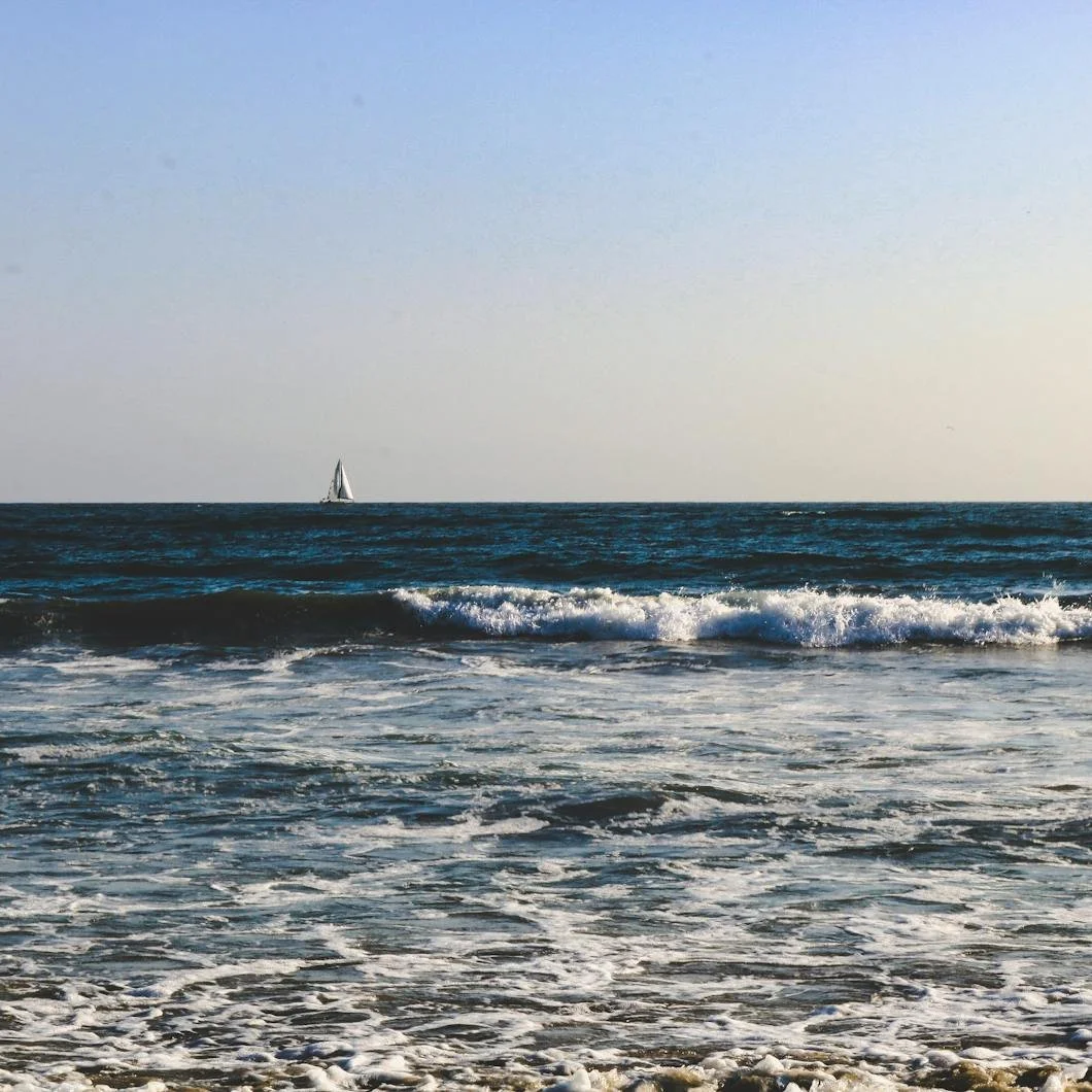
Photo By Riley Franzke
The ocean isn’t blue.
Not in the way most people think of it.
Stand in front of it long enough, and the idea of a single color begins to fall apart. In the early morning, it can read almost gray, flattened by low light and a muted sky. Under cloud cover, it leans green, heavy and slightly opaque. By late afternoon, it picks up reflection: silver in some places, deeper in others, shifting depending on where you’re standing and how the light is moving.
And in certain conditions, it darkens completely, losing any clear sense of color at all.
What you’re looking at is never fixed. It’s always responding.
That responsiveness is what gives the ocean its depth.
Not depth in the physical sense, though that’s part of it, but visual depth—the sense that there’s more happening beneath the surface than what you can immediately see. Color isn’t sitting on top of the water. It’s moving through it, shaped by light, by shadow, by what’s below and what’s above at the same time.
Even the sky becomes part of it.
The ocean reflects, absorbs, and refracts all at once, which is why it rarely holds a single tone long enough to be defined by it.
And yet, when people try to bring that feeling into the home, the instinct is usually to simplify it.
The request becomes “ocean blue.” A color that’s meant to represent something far more complex than a single paint can hold.
What gets chosen is often a cleaner, brighter version of blue—something that reads clearly on a swatch, something that feels like it captures the idea of water without requiring much interpretation.
But once it’s on the wall, that clarity can work against it. Without variation, without the shifting conditions that give the ocean its character, the color tends to settle. It holds in one place. It becomes more literal than intended. And in doing so, it loses the quality that made it compelling to begin with.
The issue isn’t the color itself. It’s the absence of what surrounds it.
The ocean works because it exists in layers—light above, depth below, constant movement between the two. The color you see at any given moment is the result of those layers interacting, not a fixed surface applied uniformly across it.
Interiors, by contrast, tend to isolate color. A wall is painted once, in one tone, and expected to hold that tone consistently regardless of how the light changes throughout the day. And while that consistency can be useful in some contexts, it limits the kind of variation that gives a space its sense of depth.
A more effective approach is not to match the ocean’s color, but to understand how it behaves. That often means moving away from obvious blues and toward tones that feel less resolved, more responsive. Colors that carry a bit of gray, a bit of green, something that allows them to shift rather than declare themselves immediately.
A blue like Benjamin Moore’s Boothbay Gray doesn’t read as a single color so much as a range, moving between blue and gray depending on the light. Quiet Moments carries a softness that leans slightly green, particularly in natural light, giving it a quality that feels closer to water under cloud cover than a clear sky reflection.
From Farrow & Ball, De Nimes introduces depth without becoming overly dark, holding its tone in a way that feels grounded but still variable. Even a color like Light Blue, which in practice reads more like a softened gray, has enough subtlety to shift throughout the day without losing its presence.
None of these are direct representations. And they don’t need to be.
What they offer instead is a kind of flexibility. They allow the room to change as the light changes, creating small variations in tone that keep the space from feeling static. In the morning, they may read cooler, more subdued. In the evening, they pick up warmth, or deepen slightly, depending on the surrounding materials and the direction of the light.
This is closer to how the ocean is experienced. Not as a fixed color, but as something that moves between states.
There’s also a matter of restraint.
The ocean, for all its variation, never feels chaotic. Its palette remains relatively narrow, even as it shifts within that range. Blues, greens, grays—subtle differences, layered rather than contrasted. When that idea is carried into the home, it tends to work best when the palette is allowed to remain contained. Adjacent spaces don’t compete. Materials don’t interrupt the flow. The color is given room to move, rather than being forced to define every surface at once.
The goal isn’t to recreate a scene. It’s to recreate a condition.
Because what people respond to in the ocean isn’t the color alone.
It’s the sense of depth. The way the surface holds light. The way the color never fully settles into one thing.
That’s what translates. Not the blue, but the variability.
In that sense, the most successful interiors are not the ones that replicate natural color directly, but the ones that borrow from how those colors behave.
They allow for change. They account for light. They avoid over-definition. And in doing so, they create spaces that feel less fixed, less forced, and more capable of shifting with the way they’re used.
The ocean isn’t blue. It’s something more complex than that—something that can’t be held in a single tone without losing what makes it compelling.
And the same is true, in quieter ways, inside the home.
Ready to Help
If you’re considering a palette inspired by natural tones—whether from the shoreline, the sky, or something less easily defined—the way those colors are selected and applied will determine how they live in the space over time.
At Stanwich Painting, every project begins with a detailed estimate that outlines surface preparation, materials, and the full scope of work before anything begins. That clarity ensures the finished result feels balanced, intentional, and responsive to the way light moves through the home.
To schedule a consultation, visit or call 475-252-9500.
Stanwich Painting proudly provides top-quality residential painting services throughout Fairfield County, including: Greenwich, Cos Cob, Riverside, Old Greenwich, Stamford, Darien, New Canaan, and Wilton