
The Color That Comes and Goes: What Cherry Blossoms Teach Us About Paint
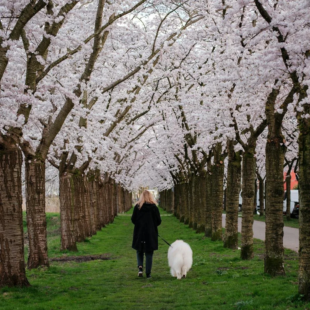
Photo by Haberdoedas Photography
This morning, the trees finally turned.
Not all at once, and not in a way that demands attention, but just enough to register if you happen to be looking for it. A softness beginning to settle into the branches. Pale pinks appearing in clusters, whites just behind them, the whole canopy still partially bare but shifting, almost quietly, into something else.
It’s the kind of change that can be missed if you move too quickly. But once you see it, it’s difficult not to notice it everywhere.
There’s something particular about cherry blossom color that doesn’t translate easily into language, or even into memory. It isn’t a single tone so much as a range that exists somewhere between pink and white, constantly shifting depending on the light, the time of day, and even the angle from which it’s viewed.
In the early morning, it can feel almost muted, closer to a soft gray than a true color. By mid-afternoon, it brightens just enough to separate itself from the branches. And in certain moments—usually when the light hits it just right—it seems to almost disappear into the sky behind it.
It’s not a color that holds still, rather it’s a color that exists in conditions and that’s part of what makes it so compelling; also what makes it so difficult to recreate. Because when people try to bring that color into the home, they often focus on the hue itself—the idea of a soft pink, or a pale white with warmth—without accounting for the environment that allows it to work.
Outside, that color is never isolated. It’s layered against dark branches, open sky, and constantly changing light. It moves, it breathes and—it’s temporary.
Inside, those conditions don’t exist in the same way. The color is fixed. The light is more controlled and the surrounding elements are more static.
And without those variables, something that felt delicate outdoors can begin to feel overly present indoors.
This is where the translation tends to falter.
Not because the color is wrong, but because it’s being asked to do something it was never meant to do.
Cherry blossom color works because it comes and goes. Because it doesn’t fully assert itself. Because it allows the eye to move through it rather than stopping at it.
When that same color is applied directly to a wall—without adjustment, without grounding—it can lose that quality, becoming flatter, more literal, and often more dominant than intended.
The result isn’t necessarily unpleasant.
It just feels different from what inspired it. A more effective approach is not to replicate the color, but to interpret it.
To look at what makes it work—the softness, the lack of saturation, the way it responds to light—and translate those qualities into something more stable, more livable, but still connected to the original feeling.
That’s where certain paint colors begin to make sense.
A tone like Benjamin Moore’s First Light carries a similar warmth, but with enough restraint to prevent it from feeling overly sweet. It sits closer to neutral than pink, which allows it to shift throughout the day rather than remain fixed.
Farrow & Ball’s Setting Plaster moves in a similar direction, but with more depth beneath it—a kind of muted, almost dusty quality that grounds the color and gives it a sense of permanence that blossom color itself doesn’t have.
Even softer, more neutral tones begin to enter the conversation here. Benjamin Moore’s Pale Oak, for example, or Farrow & Ball’s School House White, both carry just enough warmth to echo that early spring softness without ever reading as explicitly pink.
These aren’t direct matches. They’re echoes.
What they share is an ability to hold light rather than compete with it. And that distinction matters more than the color itself. Because in a home, especially one that experiences changing natural light throughout the day, the success of a color often comes down to how it behaves over time rather than how it looks in a single moment.
Cherry blossoms are compelling because they never look the same twice.
A well-chosen interior color, while more stable, can still carry a version of that variability—shifting subtly as the light moves, revealing different qualities without losing its coherence.
There’s also something to be said for restraint in how these colors are used.
Blossom color, in nature, is rarely isolated to a single point. It appears in clusters, distributed across the branches, allowing the eye to take it in gradually rather than all at once.
That same principle can apply within the home.
A full room in a soft blush can work, but often it’s more effective when balanced—either through adjacent spaces that carry a quieter palette, or through trim, ceiling, and surrounding materials that give the color a place to settle.
The goal isn’t to recreate the tree—it’s to recreate the feeling of seeing it.
And that feeling, more than anything, is tied to its impermanence.
In a few weeks, the blossoms will be gone. The trees will return to green, the color will disappear, and the moment will pass in the way it does every year—gradually, almost without notice.
But the impression of it tends to remain. Not as a specific shade, but as a memory of softness. Of lightness. Of a kind of color that didn’t need to assert itself to be noticed.
That’s the part worth bringing inside.
Not the exact color, but the way it behaves.
A palette that doesn’t overwhelm the space, but settles into it. A tone that shifts slightly with the light rather than holding one fixed expression. A room that feels open, responsive, and just restrained enough to remain comfortable over time.
Because in the end, the lesson of cherry blossom color isn’t about pink.
It’s about how lightly a color can exist, and still be fully felt.
Ready to Help
If you’re considering introducing softer, more responsive color into your home this season, the way a paint is selected, prepared, and applied makes all the difference in how it ultimately lives in the space.
At Stanwich Painting, every project begins with a detailed estimate that outlines preparation, materials, and the overall process before work begins. That clarity helps ensure the finished result feels balanced, intentional, and built to last.
To schedule a consultation, visit or call 475-252-9500.
Stanwich Painting proudly provides top-quality residential painting services throughout Fairfield County, including: Greenwich, Cos Cob, Riverside, Old Greenwich, Stamford, Darien, New Canaan, and Wilton