
Fresh Inspiration For Every Room. Exploring Color, Design, And The Art Of Home Transformation In Fairfield County, CT.
Spring Color Design: Benjamin Moore And Farrow & Ball Palettes For Fresh Interiors
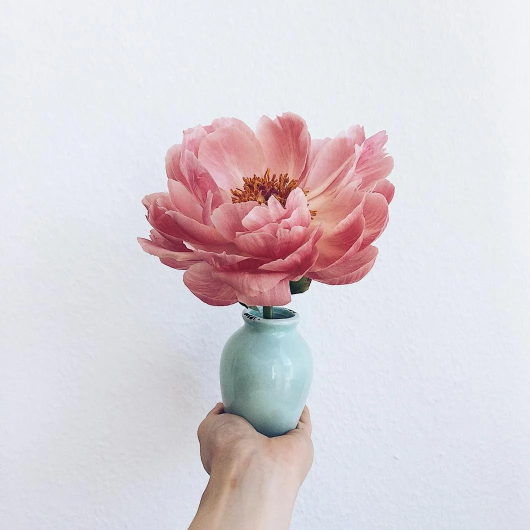
Spring interiors often call for lighter palettes and fresh color combinations. In this guide, we explore Benjamin Moore and Farrow & Ball hues that create elegant spring-inspired palettes for living rooms, bedrooms, kitchens, and sunrooms.
A Well-Kept Home Grows With Time (Rather Than Fighting It)
A well-kept home doesn’t fight time—it grows with it. Thoughtful painting and careful maintenance allow homes to evolve gracefully while preserving the character that makes them feel lived in and loved.

Color Notes: This Week At Stanwich Painting
This week on Color Notes we explore how homes evolve through interior repainting and why the first signs of spring are the perfect time to assess your exterior.

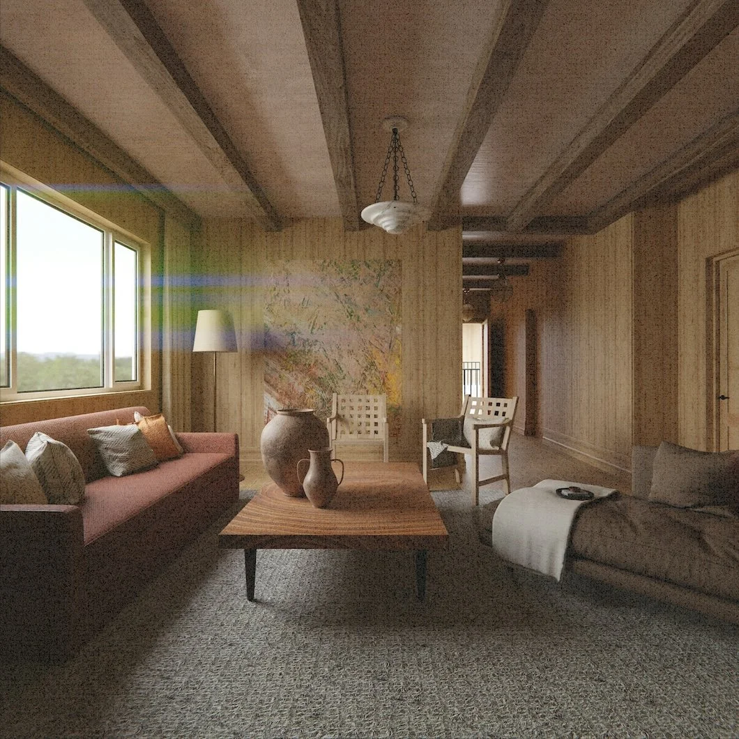
Let The House Grow With You: Why The Best Homes Are Never Finished
Homes change as life unfolds—families grow, routines shift, and rooms take on new purpose. Discover how thoughtful interior painting can help your home evolve alongside the people who live in it, creating spaces that feel fresh, intentional, and aligned with each new chapter.
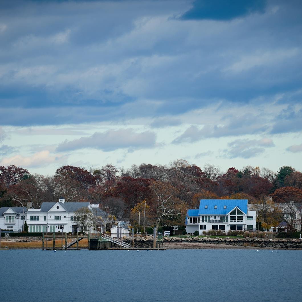
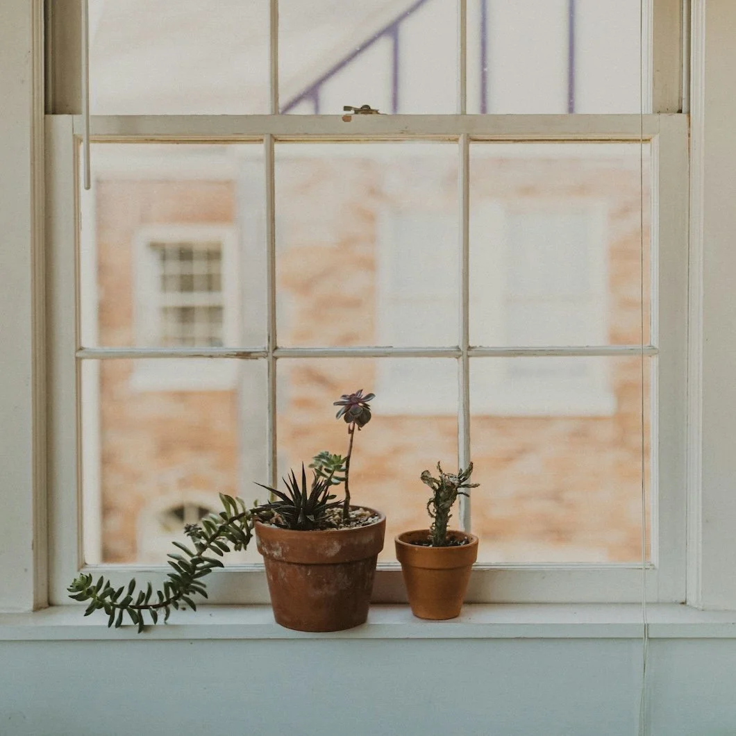
Spring’s First Impression: Reviving Your Exterior With Color, Care, And Seasonal Smarts
Spring light has a way of revealing what winter hides. From subtle fading and peeling trim to shifts in how your exterior color reads against fresh landscaping, this is the season to reassess your home’s first impression. Here’s what Fairfield County homeowners should look for and why early-season updates make all the difference.

Color Notes: This Week At Stanwich Painting
Welcome to Color Notes. This week, we explored the morning room as meditation space, nursery design that supports calm, and interior paint colors for those who want simplicity and function.

I Don’t Care About Paint. That’s Why I’m Hiring You.
Not everyone wants to study undertones and sheen levels. This essay is for the homeowner who just wants their house to feel better—without turning paint selection into a second job.

The Room Where Calm Begins: Designing A Nursery That Holds A Life
A nursery is one of the few rooms designed before we know who will live in it. This essay explores how paint color and finish quietly shape the emotional atmosphere of a child’s first room.
The Morning Room: Why Your Breakfast Nook Is A Meditation Space In Disguise
The breakfast nook is more than a place to eat. It’s often the first quiet room we enter each day. This essay explores how paint color, finish, and morning light quietly shape that daily ritual.

Color Notes: This Week At Stanwich Painting
This week on Color Notes, we explored how historic palettes shape interior color and why the first hints of spring snowmelt are a good time to start thinking about exterior painting.

When The Snow Starts To Melt: Is It Time To Think About Painting The House?
As the snow begins to melt and the light slowly shifts, homeowners start noticing their exterior again. Peeling trim. Faded siding. Small signs that winter left behind. This in-between moment—before spring fully arrives—is when exterior painting season truly begins. Not with the first warm day, but with awareness, planning, and quiet observation. In this guide, we explore what winter hides, what the thaw reveals, and how Fairfield County homeowners can prepare for a smoother, longer-lasting exterior paint project.

Presidential Palettes: How American History Still Shapes Interior Color Today
A quiet exploration of how American design eras—from early Federal homes to mid-century interiors—shaped the color traditions we still live with today. This essay looks at the enduring palettes rooted in order, craftsmanship, and optimism, and how Fairfield County homeowners can reinterpret those timeless hues in modern spaces.

Color Notes: This Week At Stanwich Painting
Welcome to Color Notes. This week we explored pink-brown paint colors for winter, chocolate-inspired wall tones, and Valentine’s Day color accents beyond red.

Love In The Details: Valentine’s Day Color Accents That Aren’t Red
Romance in interiors rarely announces itself. It lives in nuance, in warmth, and in color choices that feel considered rather than declared. This piece explores Valentine’s-inspired accent paint colors that create emotional richness without relying on red, offering a quieter, more enduring approach to romantic design.

Chocolate On The Walls: Browns That Feel Like A Gift
Brown is returning not as a background neutral, but as an emotional anchor. Chocolate-toned walls create spaces that feel warm, grounded, and quietly luxurious—less about making a statement, more about making a home feel held. This piece explores why brown is becoming one of today’s most compelling interior colors, and how to use it beautifully.

Blush & Bittersweet: Designing With Love-Tinged Pinks And Cocoa Browns
Valentine’s doesn’t have to mean red. Some of the most romantic interiors are built on quieter gestures—blushes that feel like skin tones, browns that recall chocolate, coffee, and worn leather. This piece explores how soft pinks and cocoa-rich browns create spaces that feel intimate, grounded, and timeless, offering a grown-up approach to love-inflected color that lives beautifully long after February ends.

Color Notes: This Week At Stanwich Painting
Welcome to Color Notes, your Sunday digest from Stanwich Painting. This week we explored winter palettes, intentional design choices, and color strategies for emotional uplift during the darker months.

Get Rid Of The Winter Blues: Bright, Bold, & Slightly Unhinged Color Thinking
Winter doesn’t always need calmer colors. Explore how bright, bold, and slightly unhinged paint choices can bring energy, personality, and joy back into your home.
Stop Designing For Other People: Making A Home That Feels Like You
Most homeowners aren’t actually chasing trends, instead they’re chasing permission. This essay explores why borrowing taste often leads to hollow interiors, and how choosing paint colors from instinct rather than influence creates homes that feel personal, grounded, and lasting.

Soft Weight: Why Pink And Maroon Feel Right In February
February is a season of emotional warmth wrapped in physical cold. This essay explores why soft pink and maroon paint colors feel unexpectedly right in winter interiors—offering grounded pairings from Benjamin Moore and Farrow & Ball that prioritize depth, finish, and longevity over trend or theme.