
Soft Weight: Why Pink And Maroon Feel Right In February
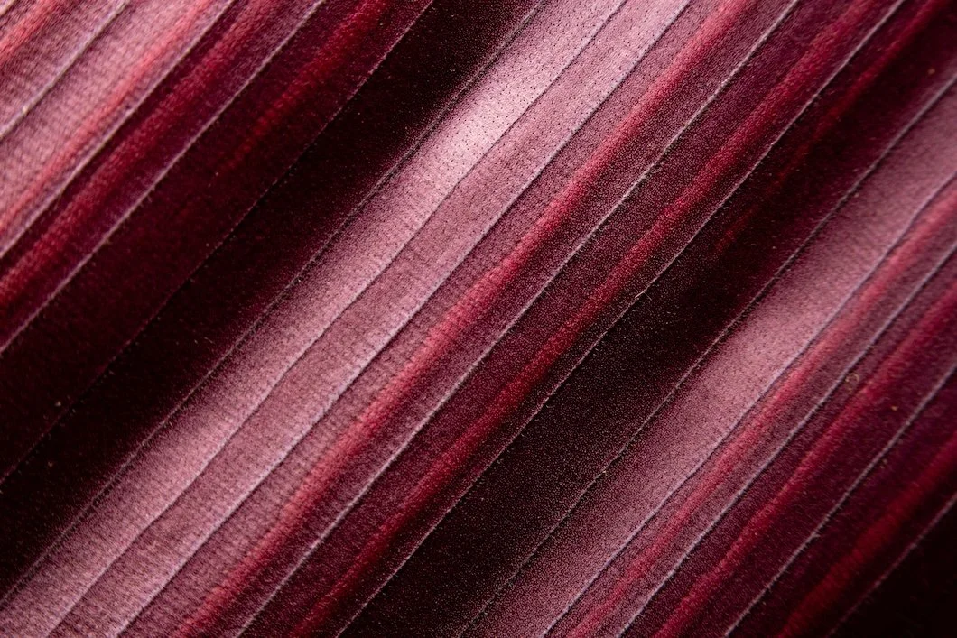
Photo by Ariwan Sri Setya
February in the Northeast carries a quiet contradiction.
It is physically cold—often gray, stripped back, almost skeletal—but emotionally, it’s warmer than it appears. Not loudly warm. Not celebratory. Just…human.
Valentine’s Day plays a role, of course. But the deeper reason February feels different is subtler. This is the month when people crave closeness without spectacle: warmth without brightness and comfort without performance. It’s a season of emotional understatement.
That’s why a color pairing like pastel pink and maroon feels unexpectedly right this time of year.
On paper, it sounds seasonal and nearly obvious. In practice, when done with restraint, it’s anything but. This is not a Valentine’s palette. It’s a late-winter palette. One that pairs gentleness with gravity, softness with structure, lightness with depth. A palette that understands February not as a celebration, but as a pause.
The Emotional Logic of Late Winter Color
Winter has a way of simplifying things. Bright colors lose their edge. High contrast feels louder than intended. Rooms that felt energetic in summer can suddenly feel restless or exposed.
February is when people start to notice this—not intellectually, but emotionally. It’s the point in the season when the novelty of winter has worn off, but spring still feels distant. Interiors become more important. The way a room holds you matters more than how it photographs.
Pink and maroon work here because neither color is performative. Soft pink brings warmth without stimulation. Maroon provides depth without severity. Together, they create a kind of visual steadiness that winter light rewards.
Pink, Reconsidered: Pastels That Behave Like Neutrals
Pink’s reputation suffers from its loudest versions. When it’s too clean, too sweet, or too eager to charm, it reads cosmetic or decorative. The pinks that work—especially in winter—are quieter. Chalked. Dusty. Slightly complex.
These are pinks that don’t announce themselves. They settle.
From Benjamin Moore, some of the most reliable late-winter pinks include:
First Light 2102-70 – Pale and luminous, but grounded enough to feel architectural rather than playful.
Pink Bliss 2093-70 – A gray-blush that behaves almost like a warm neutral in subdued light.
Mauve Desert 2113-50 – Barely pink at all, with a dusty undertone that softens rooms without sweetness.
From Farrow & Ball, pinks tend to carry more earth and history:
Setting Plaster No.231 – Familiar, but still underused; warm, calm, and materially grounded.
Peignoir No.286 – Powdery and complex, never cosmetic or precious.
Templeton Pink No.303 – Deeper and more substantial than expected, especially effective in winter light.
These colors function less like accents and more like surfaces—closer to plaster or stone than paint.
Maroon’s Quiet Authority
Maroon has long been miscast as dramatic or formal. In reality, its strength lies in containment: its able to shorten visual distance while deepening shadow. It gives rooms a sense of gravity that feels especially welcome during long winter months.
In February interiors, maroon often outperforms navy or charcoal. It’s warmer. More forgiving. Less emotionally distant. When chosen carefully, it feels architectural rather than theatrical.
Consider these options:
Benjamin Moore
Dinner Party AF-300 – A deep red with restraint; rich without feeling heavy.
Etruscan AF-355 – A clay-leaning brown-red with mineral warmth; an intentionally unusual choice that shifts subtly with light, giving it architectural depth rather than decorative punch.
Cinnabar CSP-1165 – A mineral-leaning red with spice and warmth; brings energy and depth without tipping into theatricality, especially in winter light.
Farrow & Ball
Preference Red No.297 – Historic depth softened for modern interiors.
Brinjal No.222 – A maroon-aubergine crossover that feels intimate and moody.
Eating Room Red No.43 – Enveloping without excess; particularly effective in low light.
These are not accent colors in the traditional sense. They’re grounding elements.
How Pink and Maroon Should Meet
The success of this pairing depends on hierarchy. Pink and maroon should never compete at equal intensity. One must lead; the other must support.
A few guiding principles:
Allow the lighter color to occupy more surface area.
Use maroon where the eye naturally pauses such as doors, trim, built-ins, or a single enclosing wall.
Avoid matching saturation levels; imbalance creates calm.
Some particularly effective pairings include:
Setting Plaster with Etruscan – Soft walls anchored by serious architectural elements.
Pink Bliss with Preference Red – Light-filled rooms grounded by depth.
Peignoir with Brinjal – Bedrooms or dining rooms that benefit from enclosure.
Mauve Desert with Dinner Party – Transitional spaces balancing restraint and warmth.
When done well, the room feels composed rather than styled.
Finish as Feeling, Not Specification
In February, finish matters as much as color. Winter light exaggerates sheen, and surfaces that feel lively in summer can read harsh or restless this time of year.
Matte and estate finishes soften pinks, giving them a plaster-like calm.
Maroon benefits from slightly more body—eggshell or soft satin—to maintain depth without glare.
High gloss is rarely forgiving in winter interiors; restraint almost always reads better.
Finish completes the emotional read of a room. It’s not technical—it’s perceptual.
Where This Palette Lives Best
Pink and maroon thrive in spaces designed for slowing down:
Bedrooms, where softness and containment matter most.
Dining rooms, where depth enhances intimacy.
Powder rooms, where limited square footage rewards bold restraint.
Entryways, offering warmth against winter coats and gray days.
These are rooms people feel before they analyze.
What This Pairing Is Not
This is not seasonal décor. It isn’t Valentine’s themed nor is it trendy. It’s a grown-up palette for homeowners who want warmth without brightness and color without noise.
February Is for Choosing, Not Showing
February has always been a planning month. A moment to notice what feels thin, tired, or unresolved and to choose differently before spring light returns.
Pink and maroon, when handled with care, don’t demand attention. They hold a room together quietly, offering a sense of warmth that lasts well beyond winter.
Some colors decorate. Others stabilize.
And in a season defined by restraint, that distinction matters.
Ready for a Conversation?
Pairings like pink and maroon work not because they’re fashionable, but because they’re handled with restraint.
When color choices are made with an understanding of light, finish, and proportion, the results tend to age better—and feel better to live with.
If you’re considering a change and want guidance grounded in experience rather than trends, Stanwich Painting is always happy to talk through options.