
Chocolate On The Walls: Browns That Feel Like A Gift
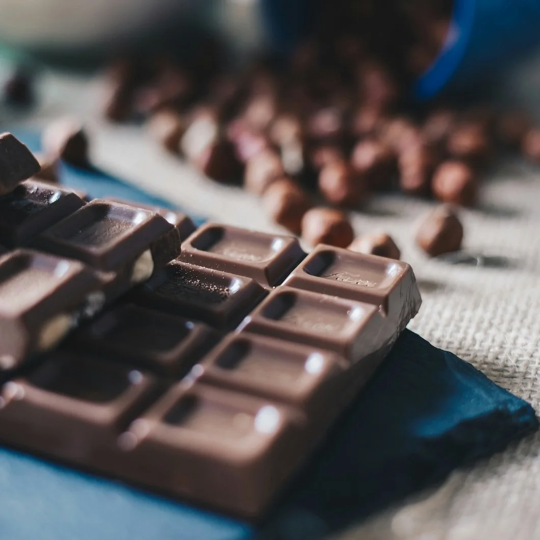
Photo by Rūta Celma on Unsplash
There is something quietly subversive about choosing brown in a design culture that has spent years orbiting around brightness, contrast, and visual immediacy. Brown does not shout. It does not perform for a screen. It does not announce trend awareness. Brown settles, absorbs and holds.
For a long time, brown was framed as the color design had outgrown. It became associated with heaviness, with outdated interiors, with a past many homeowners were eager to distance themselves from. Cool grays replaced it. Stark whites displaced it. Entire homes were bleached into tonal uniformity in the name of modernity.
And yet, beneath that shift, something important was lost…
Warmth.
Not visual warmth in the technical sense, but emotional warmth. The feeling that a room is not simply styled, but inhabited. The feeling that a space is not just impressive, but supportive.
Brown is returning now because people are craving what it naturally provides. Depth. Groundedness. Soft enclosure. A sense of material reality in an increasingly digital world.
Chocolate-toned browns, in particular, occupy a uniquely generous place on the spectrum. They feel rich without being heavy. Luxurious without being showy. Comforting without being dull. They reference cacao, coffee, leather, toasted wood, worn stone. Substances that feel earned. Substances that feel good to live with.
In that way, chocolate on the walls becomes less about color and more about atmosphere. Instead, it becomes a gift.
Brown as an Emotional Envelope
When brown moves from a supporting neutral into a primary wall color, the entire posture of a room changes.
Walls stop behaving like boundaries and begin behaving like shelter.
Chocolate browns create visual quiet. They lower contrast. They soften edges. They absorb excess light and bounce back a warmer, more forgiving version of it. The result is a space that feels steadier, calmer, and more grounded the longer you spend inside it.
This is especially powerful in rooms where intimacy matters.
Bedrooms begin to feel cocooned rather than simply darkened. Dining rooms feel more conversational. Living rooms feel less performative and more personal. Even small spaces like powder rooms or hallways gain a sense of intentionality when wrapped in brown.
Rather than asking a room to feel bigger, brown allows a room to feel better.
Milk Chocolate Browns: Warm, creamy, and inviting
Milk chocolate browns sit on the lighter, warmer side of the family. They often carry soft red or golden undertones that keep them from drifting into flatness. These are excellent entry points for homeowners drawn to brown but hesitant to go deep immediately.
They read as approachable and easy to live with, especially in living rooms, family rooms, and bedrooms where warmth is essential.
Benjamin Moore
Farrow & Ball
In matte or eggshell finishes, these colors feel velvety and dimensional, pairing beautifully with warm whites, creams, soft taupes, and natural wood tones.
Dark Chocolate and Espresso Browns: Deep, enveloping, and atmospheric
Deeper browns introduce a different kind of romance. They feel moody, cinematic, and quietly dramatic without tipping into severity.
These shades excel in dining rooms, primary bedrooms, libraries, and studies, where a sense of enclosure enhances the experience of the space rather than limiting it.
Benjamin Moore
Farrow & Ball
Low-luster or eggshell finishes allow these darker tones to maintain depth while offering a subtle glow that keeps the room from feeling flat.
Caramel and Tawny Browns: Soft, glowing, and sun-warmed
Caramel browns live closer to golden territory. They feel lighter and more radiant, making them ideal for spaces that lack abundant natural light or that serve as transitions between rooms.
These browns bring warmth without heaviness and help unify varied palettes throughout a home.
Benjamin Moore
Farrow & Ball
These shades work especially well in kitchens, hallways, and open-plan living areas where a welcoming tone is key.
Brown and the Softening Influence of Pink
One of the most compelling ways to style chocolate browns is alongside blush, dusty rose, or rose-taupe tones.
Not novelty pinks or candy-coated pinks. But pinks that behave like neutrals.
These softer pinks introduce a human quality into brown’s grounded presence. Brown gives pink credibility. Pink gives brown tenderness. Together, they form a palette that feels romantic without being literal.
It is an ideal Valentine’s pairing precisely because it does not look like Valentine’s. It looks like a home.
The Importance of Finish
Finish quietly determines how brown is experienced.
High-gloss tends to push brown toward formality. Matte and velvet finishes make it feel plush and intimate. Eggshell and satin sit comfortably in between.
For most residential interiors, lower-sheen finishes support brown’s warmth and depth more naturally, allowing the color to read as soft rather than hard.
A Color That Ages Gracefully
Chocolate browns are not trend colors in the traditional sense. They do not rely on novelty or shock value. They rely on material memory.
Wood has always been beautiful. Leather has always felt rich. Coffee has always felt comforting. Brown taps into these associations instinctively.
As a result, brown walls tend to feel better with time. They collect light differently as seasons change. They develop character rather than fatigue. They remain flexible as furnishings evolve.
In a design culture often driven by constant reinvention, there is something quietly luxurious about choosing a color that is willing to stay.
Chocolate on the walls is not about making a statement. It is about creating an environment that feels warm, grounded, and emotionally supportive.
It is about choosing depth over dazzle and giving your home something it can give back to you every day.
And sometimes, that is the most meaningful gift of all.
If you’re drawn to the quiet richness of chocolate-toned walls and curious how these browns could live in your home’s light, layout, and architecture, a professional consultation can help refine the right shade, finish, and application for a result that feels both intentional and enduring.
If you prefer, Call 475-252-9500 for your consultation.