
The Morning Room: Why Your Breakfast Nook Is A Meditation Space In Disguise
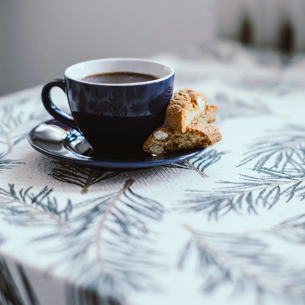
Photo by belettenoir on Unsplash
Most people don’t think of the breakfast nook as a room. It’s a corner, or some sort of leftover space. A few square feet that happen to hold a small table and a couple of chairs, usually inherited from whoever lived in the house before. We design kitchens. We design living rooms. We argue over tile and appliances and islands and lighting plans. But the breakfast nook often escapes intention, even though it quietly hosts some of the most intimate moments of daily life.
It is where the day actually begins.
Not in a cinematic way. Not in an aspirational, linen-shirt, sunlight-pouring-through-sheer-curtains way. In the real way. Barefoot. Half awake. Holding something warm. Sitting before the world starts asking anything of you.
In that sense, the breakfast nook functions much less like a dining area and much more like a meditation room.
Not a formal one or something curated for Instagram, but a practical one. A secular one. A place where you sit still without calling it stillness. A place where presence happens accidentally.
And like any space that holds quiet, it is deeply affected by color.
Morning light behaves differently than any other light in the house. It arrives at a low angle. It travels across surfaces instead of blasting straight down. In winter especially, it carries a pale, silvery quality that can exaggerate coolness and flatten color in surprising ways. The same white that looks creamy and soft at noon can feel sharp and slightly blue at eight a.m. The same gray that feels balanced in the afternoon can feel cold and distant first thing in the morning.
This is why breakfast nooks often feel “off” even when nothing is technically wrong. The furniture works. The layout is fine. The light is plentiful. But the color is quietly fighting the moment.
Most homes default to some version of white in these spaces, usually out of habit rather than intention. White feels safe and clean. White feels like it will stay out of the way. But in a room meant to hold the first quiet minutes of the day, white can be surprisingly demanding.
It reflects everything. It amplifies contrast. It sharpens edges.
In morning light, especially during the colder months, white can feel more awake than you are.
What tends to work better are colors that behave like a soft landing rather than a spotlight. Colors that don’t announce themselves. Colors that seem to warm as light touches them instead of cooling. Colors that ground us during that wake-up phase of the day.
Not every morning needs to energize. Some mornings need to steady. We live in a culture that treats mornings like a performance. Wake up early. Be productive. Optimize your routine. But most people aren’t actually chasing optimization. They’re chasing a few minutes of feeling okay. A few minutes of quiet before momentum takes over.
Paint can support that. When chosen well, it becomes a background presence that lowers the volume in the room. It removes visual friction. It allows the mind to arrive gently.
In breakfast nooks, we often gravitate toward color families that sit in the middle of the spectrum, neither too light nor too dark, carrying warmth without becoming heavy.
Colors that tend to ground rather than stimulate in morning light:
Soft oat and warm parchment whites
Pale clay with a whisper of blush
Light greige with beige undertones
Muted sage with gray beneath
Dusty blue-gray warmed with taupe
These are colors that don’t rush you.
They hold warmth without becoming sweet. They carry depth without becoming moody. They look better as the day unfolds rather than peaking all at once.
Undertone matters more than people realize here. Two colors can look nearly identical on a paint chip and feel completely different on the wall at eight in the morning. A gray with a violet undertone can feel slightly restless. A gray with a beige or green undertone tends to feel steadier. A white with a blue base can feel crisp but stark. A white with a soft yellow or peach base tends to feel human.
This is one of the reasons small spaces like breakfast nooks benefit from experienced guidance. They are light-sensitive rooms. They reveal mistakes gently but persistently.
Finish plays a quieter but equally important role. In a room that exists to hold soft rituals, high gloss rarely makes sense. It feels too awake. Too reflective. Too eager. Eggshell often feels velvety in this setting. It absorbs just enough light to create calm while still offering durability. Satin can be beautiful as well, especially in nooks that receive strong direct sun, where a subtle glow adds dimension without turning the walls into mirrors.
Flat finishes can feel cozy, but in very bright nooks they sometimes read heavy or chalky. A slight sheen usually provides a better balance between softness and life.
These choices aren’t about rules. They’re about tuning.
Just as you might choose a heavier mug over a delicate one in the morning, you choose finishes and colors that feel stable in the hand of the day.
Another reason breakfast nooks are so powerful is their scale: they’re small enough to feel personal. Enclosed enough to feel protected. Open enough to stay connected to the rest of the home.
Repainting a breakfast nook often creates a bigger emotional shift than repainting a large living room, because the change is concentrated. You notice it immediately. You sit inside it. You experience it daily. It becomes a quiet form of self-respect.
Not the performative kind. Not the kind that shows up on social media. The private kind. The kind that says, “This part of my life matters too.”
When a breakfast nook is painted with intention, it stops feeling like overflow space and starts feeling claimed. It becomes a small room with a clear job.
Hold morning. Hold pause. Hold warmth.
And in doing so, it subtly changes how the rest of the house feels.
Because the first room you sit in quietly teaches you how to feel about the day. If that room feels harsh, the day starts sharp. If that room feels calm, the day starts steadier. If that room feels warm, the day feels survivable even before it feels productive.
You don’t need to build a meditation room to live more gently. You don’t need to overhaul your entire home.
Sometimes you just need to paint the place where you already pause.
At Stanwich Painting, we approach spaces like breakfast nooks with the same care we bring to larger, more visible rooms. Not because they photograph better. But because they function deeply. We help homeowners choose colors and finishes that respond to how a space is actually used, how light behaves throughout the day, and how people want to feel inside their homes.
If you’re considering refreshing a breakfast nook, kitchen corner, or other lived-in space, we’re always happy to talk through options and possibilities.
Because small rooms, thoughtfully painted, tend to do big things.
At Stanwich Painting, we help homeowners choose colors that support daily rituals, not just design trends. If you’re considering a refresh in your breakfast nook or another small but meaningful space, we’d love to help you explore what’s possible.