Fresh Inspiration For Every Room. Exploring Color, Design, And The Art Of Home Transformation In Fairfield County, CT.

Transitional Paint Colors: Year-Round Palettes For Every Season’s Light
Transitional paint colors are the secret to a home that feels right in every season. From warm golds to versatile greens, these timeless shades from Sherwin-Williams, Benjamin Moore, and Farrow & Ball adapt beautifully to changing light — whether it’s the crisp brightness of spring, the golden glow of late summer, or the cool softness of winter. Learn how to choose colors that work with your home’s light direction, style, and mood, and see why Fairfield County homeowners are turning to Stanwich Painting for expert color guidance year-round.

Between Pixels And Paint: Why The Future Still Needs The Human Touch
AI and automation are reshaping industries, including painting. From robotic painters to digital color tools, technology can enhance efficiency, but true craftsmanship still depends on human skill, judgment, and care. Explore why the future of painting is a hybrid of innovation and artistry.
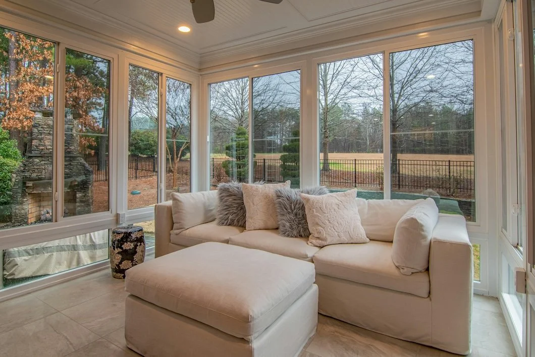
The Sunroom Reimagined: Designing For Light, Season, And Sensory Living
Reimagine the sunroom as a modern design essential where natural light, nostalgia, and seasonal stillness meet. This blog explores the architectural history of sunrooms, interior design strategies, and the best paint colors from Benjamin Moore, Sherwin-Williams, and Farrow & Ball.
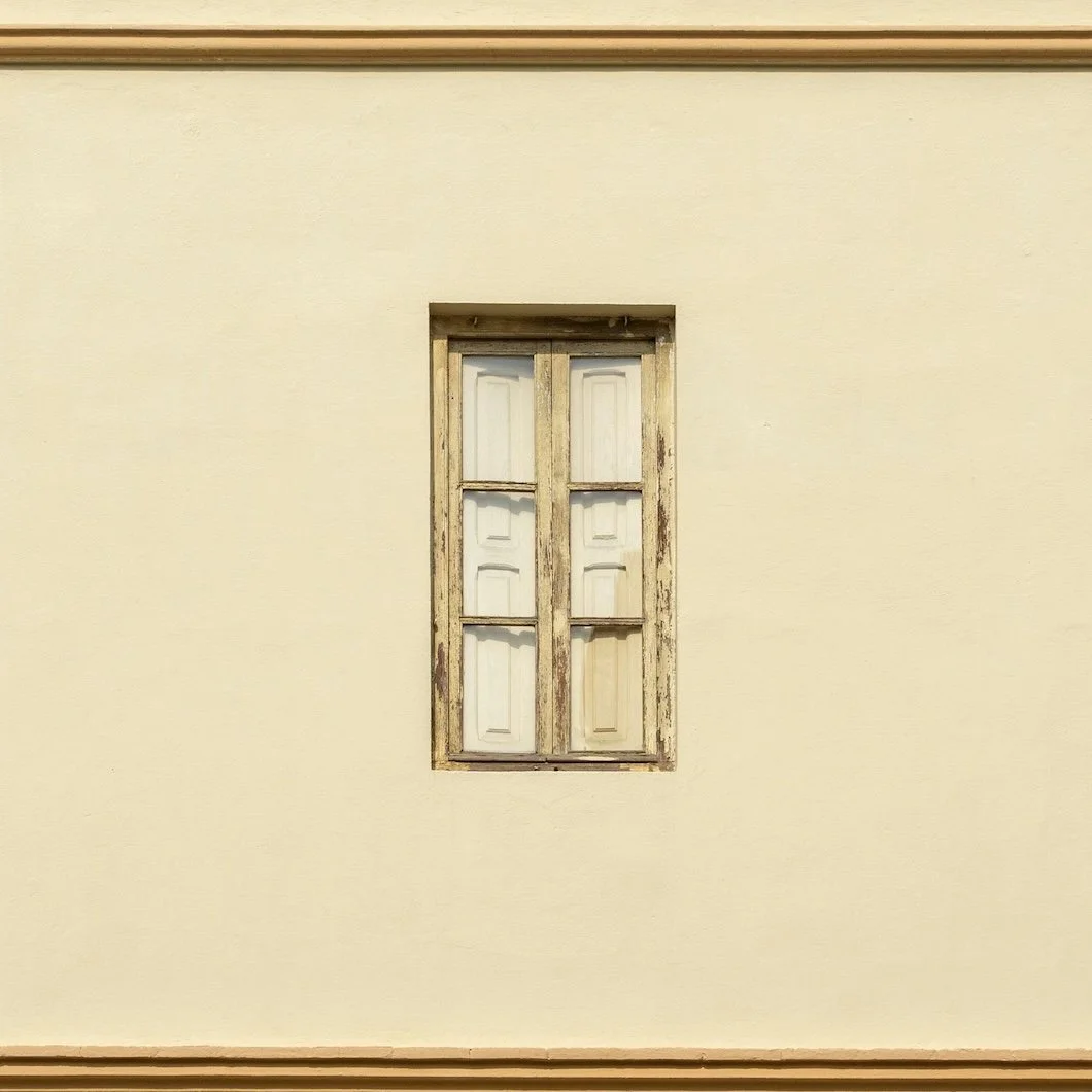
Stone To Surface: Why Mineral Paints Are The Next Frontier In Luxury Wall Finishes
Explore the rise of mineral paints: natural, breathable finishes made from lime, silicates, and earth pigments. From timeless interiors to masonry exteriors, discover where they work best, where they don’t, and why Stanwich Painting is Fairfield County’s trusted source for expert mineral paint application.
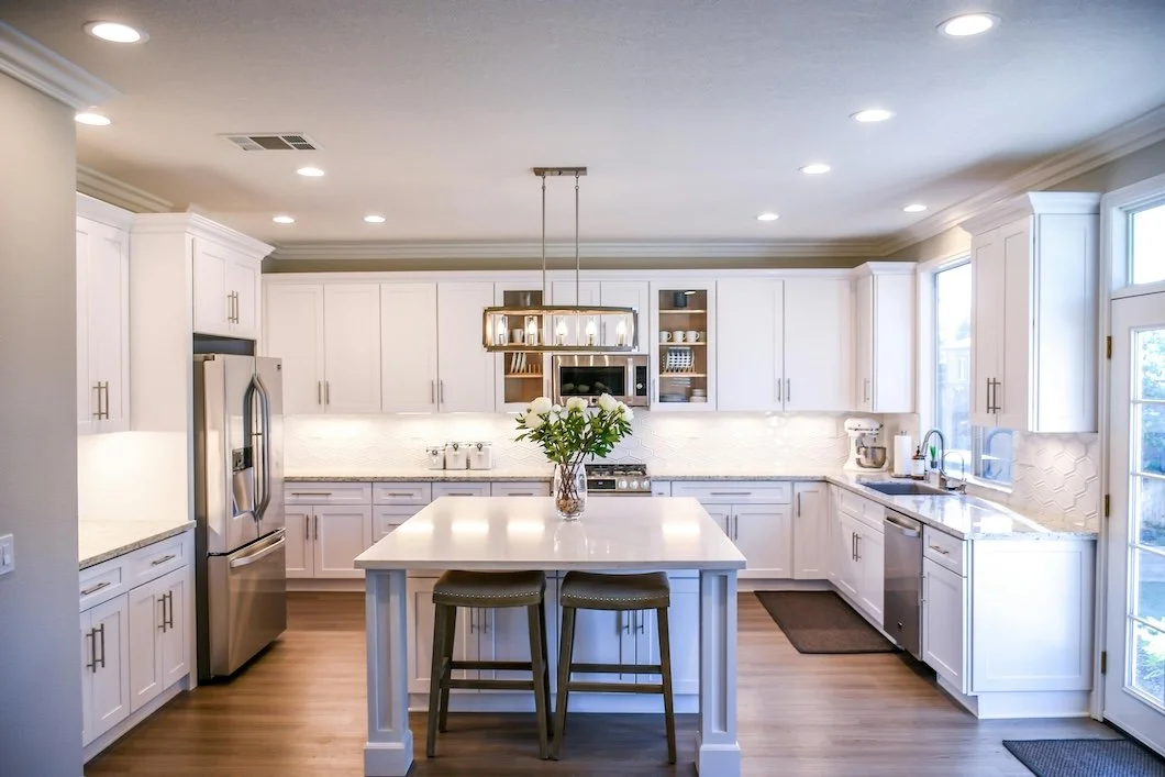
The Cold Kitchen: How High-End Design Forgot The Warmth Of Living
Over the past decade, kitchens have grown bigger, brighter and colder. This post explores the cultural shift from cooking to curating, how real estate logic replaced ritual, and why paint remains one of the most powerful ways to bring warmth, memory, and human presence back into the most designed room in the house.
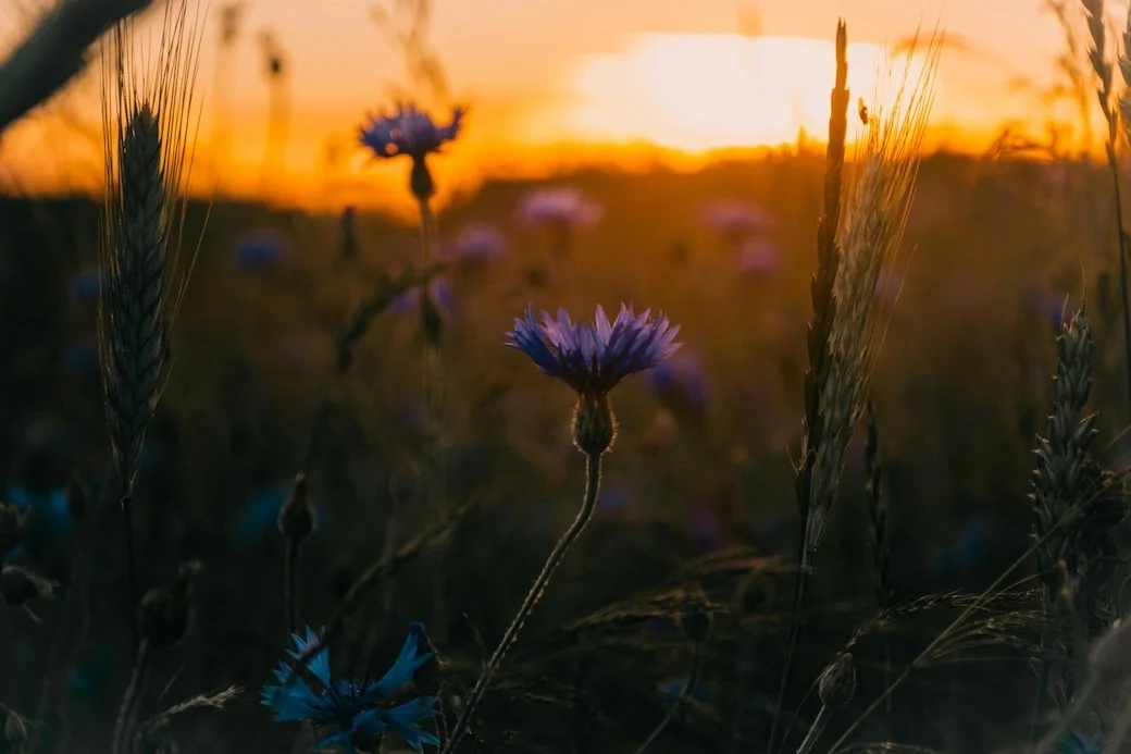
The Late Summer Palette: How Color And Scent Shape The Season’s Mood
As August unfolds, the mood of summer shifts: slower light, earthier scents, and a craving for spaces that feel grounded and lived-in. At Stanwich Painting, we believe paint should capture those feelings. In this expert guide, we explore the colors, finishes, and sensory cues that define the late-summer palette. From muted plums to herbal greens and soft whites, these paint picks are inspired by both design trends and the emotional landscape of the season. Whether you’re refreshing one room or rethinking your whole palette, these 2025 selections will help you create a home that feels warm, timeless, and deeply personal.

From Overwhelmed To Decided: A Simple Path Through Benjamin Moore’s Colors
Too many paint swatches, not enough certainty? Learn how Benjamin Moore’s ready‑made palettes and a practical three‑step Color Compass shrink thousands of options to two perfect hues.

Inside The 2025 Benjamin Moore Color Trends Palette: Psychology, Application, And Atmosphere
Benjamin Moore’s 2025 palette isn’t just a trend—it’s a tonal shift toward emotional resonance, architectural calm, and subtle complexity. In this expert breakdown, Stanwich Painting explores all ten forecasted colors, including the moody elegance of Cinnamon Slate and the botanical softness of Rosepine. From ideal room usage to finish selection, this guide reveals how to design with color that doesn’t shout—but shapes how a space feels, lives, and glows over time.

Color As Heirloom: Inherited Palettes And Generational Design
Inherited paint colors are more than just outdated trim—they’re emotional time capsules. In this thoughtful, lightly humorous post, Stanwich Painting explores how family palettes influence modern design decisions and how today’s homeowners can honor the past while creating new heirlooms. From sentimental interiors to updated exteriors, this is color with a story to tell.
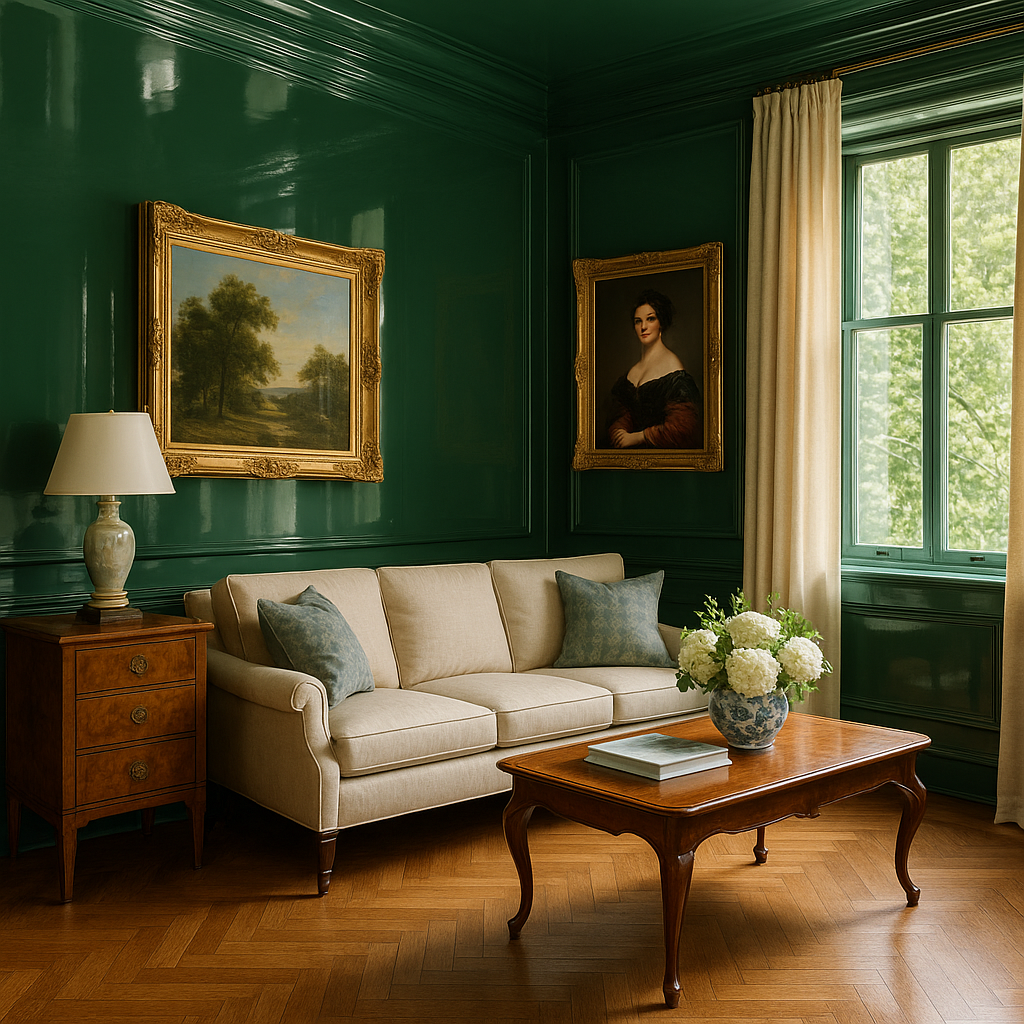
High Gloss, High Drama: Is The Sheen-Obsessed Design Trend Already Peaking?
High-gloss paint has become a symbol of luxury in today’s interiors: glimmering stairwells, lacquered powder rooms, and ultra-reflective doors are everywhere. But behind the surface lies a more complex truth. This blog explores the rise of high-gloss paint, what it takes to do it well, why it affects our mood, and where it’s most effective. If you’re considering gloss for your home, this is the expert perspective you need before you commit.
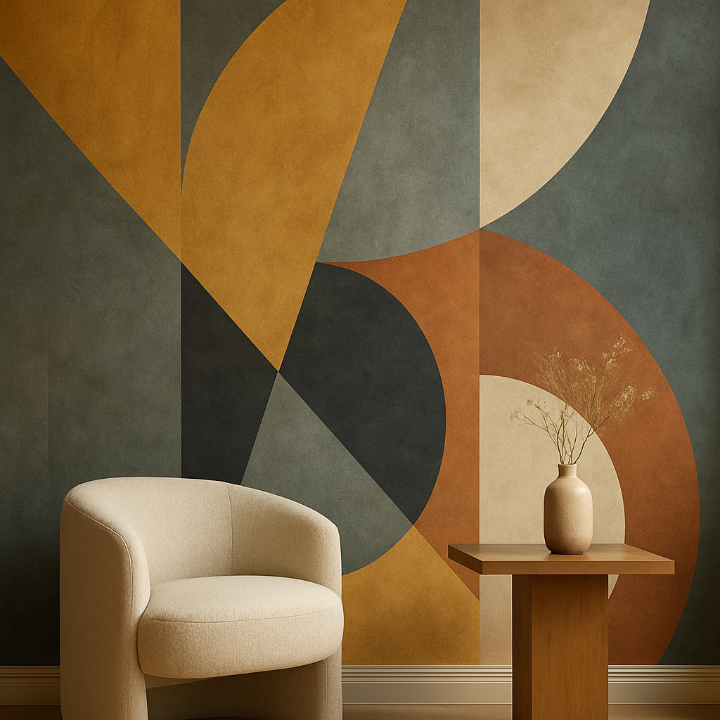
The Wallpaper Comeback: Why Walls Are Getting Dressed Again
Wallpaper is back—and it’s bolder, smarter, and more personal than ever. From historic hand-printed panels to modern artisanal designs, today’s wallpaper blends heritage with high style. In this in-depth guide, we explore the rise of bespoke wallpaper, its artistic roots, and how it transforms walls into curated storytelling surfaces. Discover how color, pattern, and texture are reshaping interiors—and why this design revival is more than just a trend.
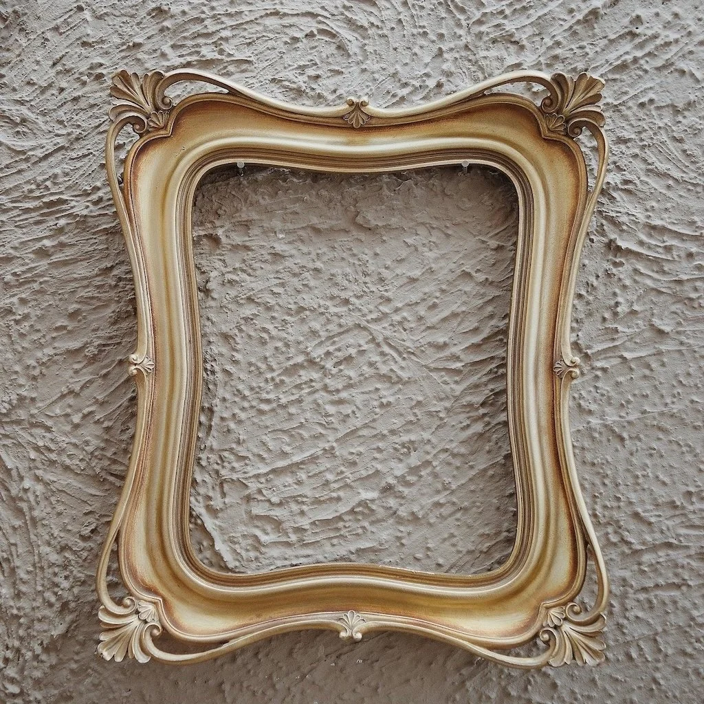
Texture, Time, And Taste: A Guide To Your Home’s Most Misunderstood Surfaces
Textured ceilings and walls—from stippled plaster to popcorn—have long shaped American homes. This guide explores their forgotten history and how paint can turn “dated” into “designed.” Whether you want to keep, cover, or celebrate those textures, we offer expert insights, paint recommendations, and a touch of nostalgic charm.

Beyond IKEA: The Soul Of Scandinavian Design Isn’t What You Think
Scandinavian design may be best known for its clean lines and IKEA’s mass appeal—but its true essence runs much deeper. Rooted in the natural world, cultural restraint, and emotional intelligence, Nordic interiors were never about trend—they were about atmosphere. In this post, we explore the soulful origins of Scandinavian design, spotlight the artisans and architects who shaped it, and look at how today’s quiet luxury movement is bringing its principles back into focus. From limewash walls to soft matte paint and sensory minimalism, this is Scandinavian design as it was meant to be felt.
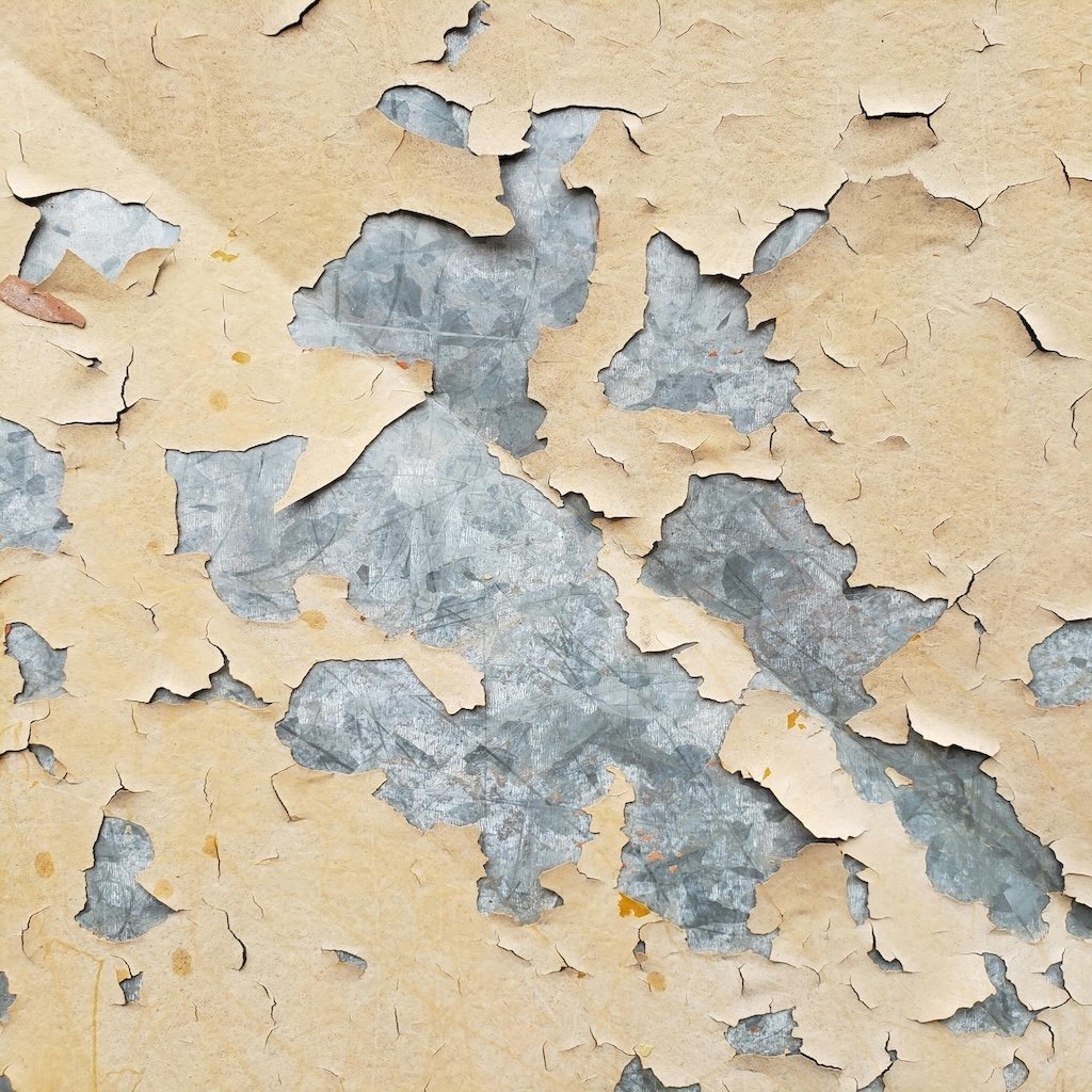
Why Paint Bubbles—And What Your Walls Are Trying To Tell You
Bubbling or blistering paint isn’t just cosmetic—it’s a signal your walls may be holding moisture, aging coatings, or deeper prep issues. Learn what your paint is trying to say—and how Stanwich Painting restores more than just surface beauty.
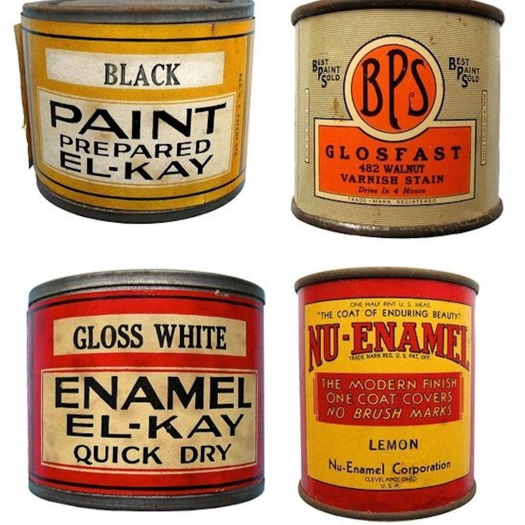
The Art Of The Label: How Vintage Paint Cans Branded The American Dream
Before Instagram-perfect palettes and minimalist branding, paint cans sold more than color—they sold the American Dream. This deep dive into vintage paint labels uncovers how companies like Dutch Boy and Sherwin-Williams built trust, aspiration, and identity through bold packaging. At Stanwich Painting, we still believe design tells a story.

The Black House: Fear, Elegance, And The Psychology Of Going Dark
Black homes once felt bold or rebellious—but in 2025, they reflect restraint, refinement, and deeply considered design. From the moody matte façades of Fairfield County to the poetic black cabins of Scandinavia, this blog explores how going dark is less a trend and more a movement. Discover the emotional resonance, psychological depth, and expertly curated paint options from Sherwin-Williams, Benjamin Moore, and Farrow & Ball that are helping homeowners embrace a new kind of architectural clarity.
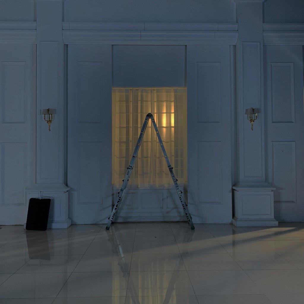
The Dust That Makes It Glow: How Imperfection Creates Radiance
In today’s world of curated perfection and Instagram-ready interiors, true beauty often lives where you least expect it—within the worn textures, faded corners, and irregular details of older homes. This blog explores how embracing imperfection through thoughtful paint choices and finishes can transform a space into something deeply radiant and emotionally grounded. Inspired by wabi-sabi design, environmental psychology, and color theory, it’s a guide to letting your home glow from the inside out.
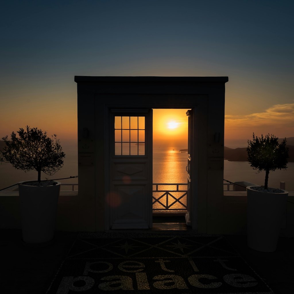
The Threshold Effect: What Door Colors Are Really Inviting In
A front door is more than a design choice—it’s a psychological threshold. In this blog, we explore how door color speaks to identity, boundaries, and emotional tone. Drawing on Jungian theory, color psychology, and expert paint palettes, discover what your threshold might be revealing—about your home and about you.
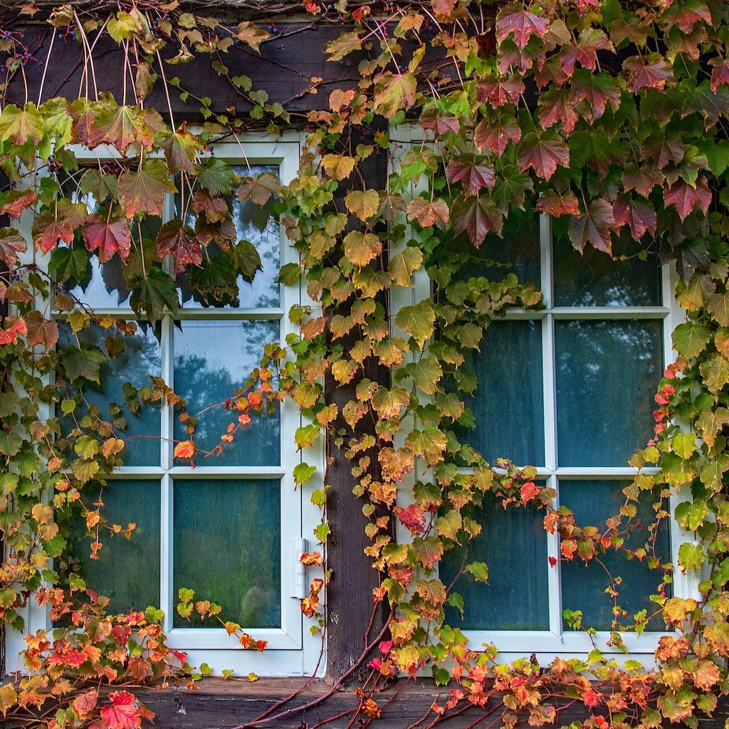
What Color Consultants Know (That Trends Forgot): Why Rich, Traditional Color Is Back
After years of cool grays and trend-driven minimalism, homeowners and color consultants alike are embracing the return of warm, traditional tones. This blog explores why the gray era is fading, what colors are replacing it, and how rooted palettes from Benjamin Moore and Farrow & Ball are redefining timeless design for Fairfield County homes.
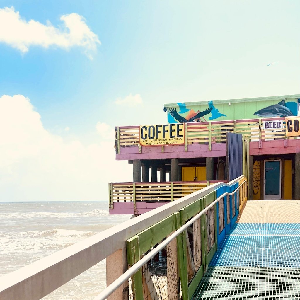
The Colors of A Refined Summer: Interior And Exterior Paints That Carry The Season All Year
Not every summer color needs to be bold. Discover curated, designer-approved shades from Sherwin-Williams, Benjamin Moore, and Farrow & Ball that bring elegance, calm, and warmth to your home—long after the season fades.
