
From Overwhelmed To Decided: A Simple Path Through Benjamin Moore’s Colors
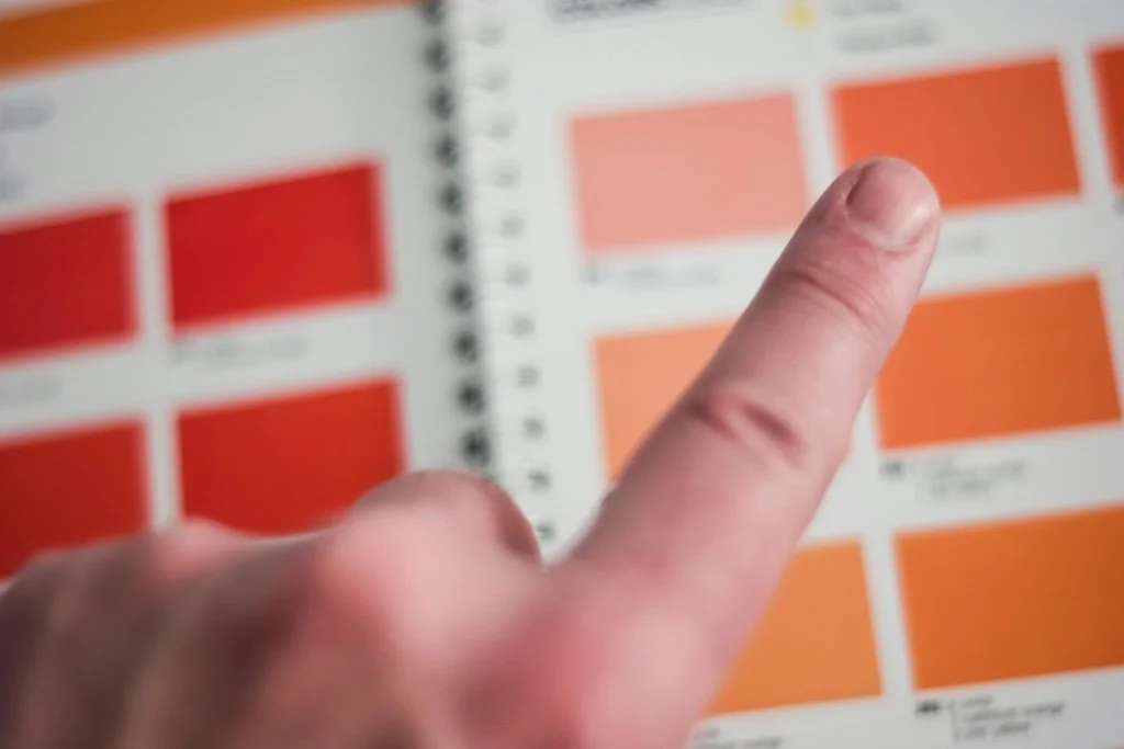
Photo by Steve Johnson
The Heart‑Racing Moment In The Paint Aisle
You’ve measured the room, survived the hardware store parking lot, and now you’re staring at 3,500 tiny squares of color. Your pulse quickens. Did the dining room really feel that green at noon?
What if the trim fights with the floor?
What if you pick the wrong white?
If you’ve felt that tight‑chested swirl, congratulations—you’ve experienced choice overload, a.k.a. the Paradox of Choice (psychologist Barry Schwartz’s term for the stress we feel when the options seem limitless).
At Stanwich Painting, we’ve seen homeowners stall their projects for weeks because the fan deck felt more like a minefield than a muse. Today, we’ll show you how Benjamin Moore’s pre‑curated palettes—paired with a practical three‑step “Color Compass” filter—turn overwhelm into aha.
Why Too Many Colors Feel So Stressful
In a famous 2000 study by Iyengar & Lepper, shoppers presented with 24 jam flavors were ten times less likely to make a purchase than those offered just six. The same cognitive drag applies to paint: the more swatches you juggle, the harder it is for your brain to visualize success—and the more likely you are to second guess the final brush stroke.
Paint anxiety shows up as:
Analysis paralysis: pushing the project start date again… and again.
Decision fatigue: agreeing to a color just to be done with it.
Post‑decision regret: staring at a freshly painted wall and wondering, Should we have gone lighter?
The cure isn’t more color expertise; it’s a smarter filter.
Meet Benjamin Moore’s Built‑In Stress‑Busters
Benjamin Moore may offer thousands of hues, but they also distill those hues into collections designed to play nicely together.
Here are four you’ll see on our job sites across Fairfield County:
| Collection | # of Colors | Why We Love It |
|---|---|---|
| Color Trends 2025 | 10 | Single‑year palette led by Color of the Year Cinnamon Slate 2113‑40; undertones harmonize for whole‑home flow. |
| Affinity® | 144 | Every shade cross‑coordinates—perfect for open‑concept layouts. |
| Historical Collection | 191 | Muted, time‑tested hues that honor Greenwich Colonials & 19th‑century Capes. |
| Designer Classics | 231 | Creamy whites and dignified neutrals favored by traditionalists. |
Pro Tip: If you limit your choices to just one curated collection, you’ve already slashed decision fatigue by 90 percent.
Spotlight: The Color Trends 2025 Palette
Benjamin Moore’s latest trend deck offers ten quietly colorful hues that feel both of‑the‑moment and comfortably familiar:
Cinnamon Slate 2113‑40 – a velvety plum‑brown that reads sophisticated, not sweet.
Sea Salt CSP‑95 – a mineral blue‑gray that calms like shoreline mist.
Leather Saddle Brown 2100‑20 – rich mahogany for heritage libraries and front doors.
Chowning’s Tan CW‑195 – a warm, candlelit neutral perfect for panel‑drenched studies.
Tissue Pink 1163 – soft blush with surprising depth under evening light.
Stained Glass CSP‑685 – saturated teal that sings against brass fixtures.
Ashwood Moss 1484 – a moody green‑black made for matte cabinetry.
Rosepine 461 – complex sage green that flatters both stone and shiplap.
Paris Rain 1501 – silvery lilac that freshens transitional spaces.
Glacier White OC‑37 – a clean backdrop white that respects historic trim.
(See how quickly the fan‑deck chaos calms when the palette is pre‑screened?)
A Practical 3‑Step Color Compass
Think of this as a flexible framework—one you can test on your own fan deck or alongside a trusted painter—to funnel thousands of swatches down to a couple of clear finalists.
Purpose Lens: What’s the room’s emotional job? Recharge, focus, or entertain? A Riverside family room seeking Sunday ease might gravitate toward Sea Salt; a Wilton dining room designed for lively conversation may lean into Stained Glass.
Light Lens: Direction, Kelvin temperature, and time‑of‑day habits. South‑facing Stamford kitchens bathe colors in golden warmth; north‑facing New Canaan bedrooms need a hue with extra chroma to avoid feeling dull at dawn.
Architecture Lens: Ceiling height, millwork detail, age of home. Historic Westport beadboard loves low‑sheen Chowning’s Tan; a modern loft with fourteen‑foot ceilings can carry high‑gloss Ashwood Moss on the accent wall without overwhelm.
How Color Feels: Four Trend Hues In Action
| Hue | Emotional Cue | Ideal Use |
|---|---|---|
| Cinnamon Slate | Cozy confidence; a hug in pigment form | Fireplace surrounds, powder rooms, dramatic dining walls |
| Sea Salt | Meditative clarity | Spa‑like bathrooms, yoga corners, riverside sunrooms |
| Tissue Pink | Soft optimism | Nursery ceilings, reading nooks, vintage dressers |
| Ashwood Moss | Grounded sophistication | Kitchen islands, front doors, built‑in bookshelves |
Remember: finish flips perception. The same Sea Salt in high‑gloss reads chic and glassy; in matte, it whispers serenity.
Beyond Hue: Finish Matters
A quick nod to sheen before you click “Add to Cart.”
Matte & Eggshell blur surface flaws and invite a restful, low‑glare vibe—ideal for bedrooms and heritage plaster.
Pearl & Satin bounce gentle light and wipe clean easily, making them the go‑to for busy kitchens and kids’ spaces.
High Gloss (your recent blog star) is best deployed sparingly—think stair risers or statement cabinetry—where its mirror effect earns every stare.
If you’ve ever felt that a color looked different once dry, odds are the sheen, not the pigment, played tricks on your eye.
Putting The Theory Into Practice
Color confidence builds when you see this framework play out on your own walls. Start small:
Limit the Deck: Select one curated collection (the Color Trends 2025 deck is a great starter) and tape no more than three swatches per wall.
Live With Light: Observe each swatch at breakfast, mid‑afternoon, and after sunset to notice how undertones shift.
Trust the Stand‑Out: The hue that still feels “right” in every light earns the gallon order.
Still feeling unsure? During any standard estimate, our team is happy to walk through these Color Compass lenses with you—no separate consultant, no pressure. Paint ought to feel empowering, not paralyzing.
Questions about sheen or surface prep? Call 475‑252‑9500 or request a quote to begin your color consultation today.
Further Reading & ResourcesBenjamin Moore — Color of the Year & Trends 2025Schwartz, B. (2004). The Paradox of Choice. Harper Perennial.