
The Art Of The Label: How Vintage Paint Cans Branded The American Dream
Before the curated palettes, designer collaborations, and the sleek minimalism of today’s sample-size paint kits of today’s premium paint brands, there was something else entirely: the paint can. Bold. Branded. And completely unforgettable.
In the early-to mid-20th century, paint labels were more than packaging. They were a promise: of color, of quality, of a lifestyle that aligned with the American Dream. Names like Dutch Boy, Glidden, and Sherwin-Williams didn’t just sell paint. They sold identity, optimism, and homeownership. And they did it with unforgettable visuals.
This blog is a tribute to that legacy and an exploration of how graphic design, advertising, and emotional appeal turned ordinary cans into cultural icons.
The Dutch Boy Effect
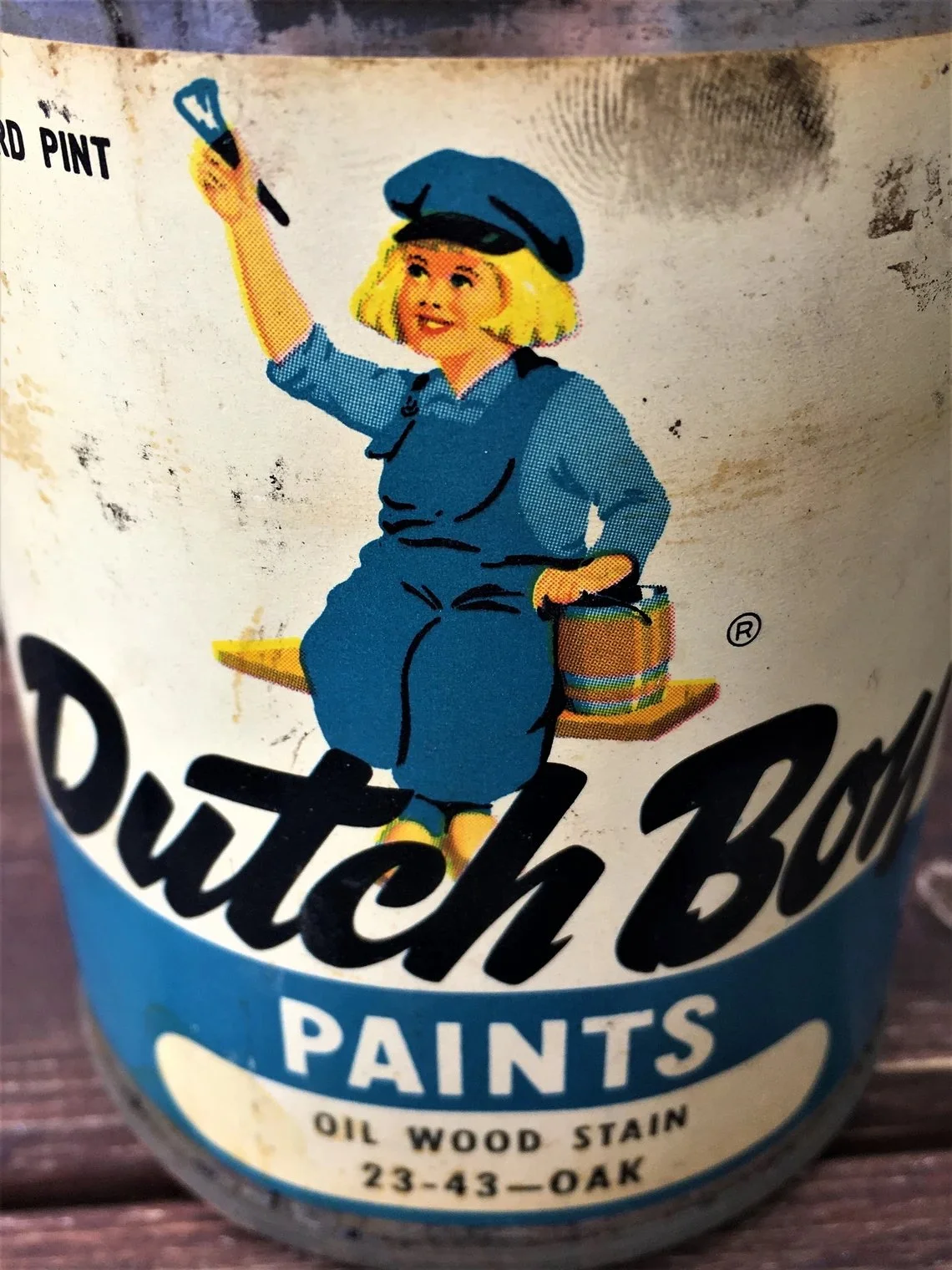
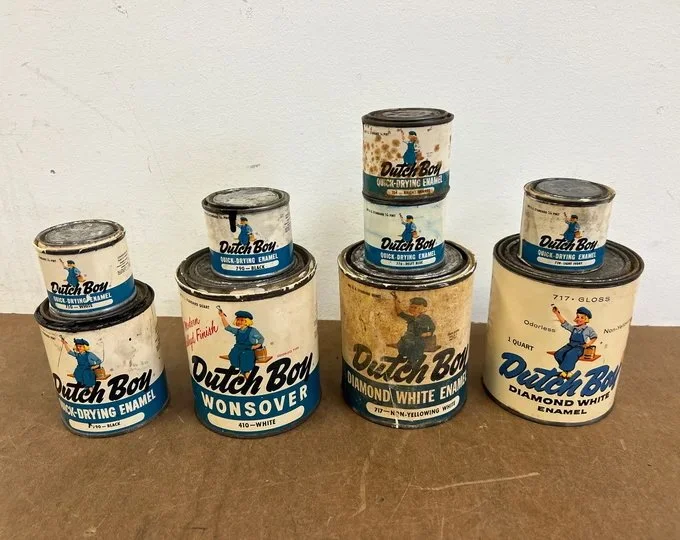
Few figures in branding history are as instantly recognizable as the rosy-cheeked Dutch Boy. Introduced in 1907 by the National Lead Company (later Dutch Boy Paints), the image of a young boy stirring paint wasn’t just whimsical—it was strategic.
Lead-based paints were standard at the time, so the Dutch Boy mascot was more than a friendly face: it was a calculated effort to instill trust in a product that might otherwise raise concern. The image of a cheerful, paint-stirring boy suggested safety, purity, and dependability. At the same time, it evoked Old World craftsmanship and tradition, traits that held deep emotional appeal in an era of fast-paced modernization.
The logo’s staying power—still used today, albeit with updates—is a testament to its emotional effectiveness. It was never just about the paint. It was about the feeling it gave buyers: safe, smart, and stylish.
Sherwin-Williams and the Power of Boldness
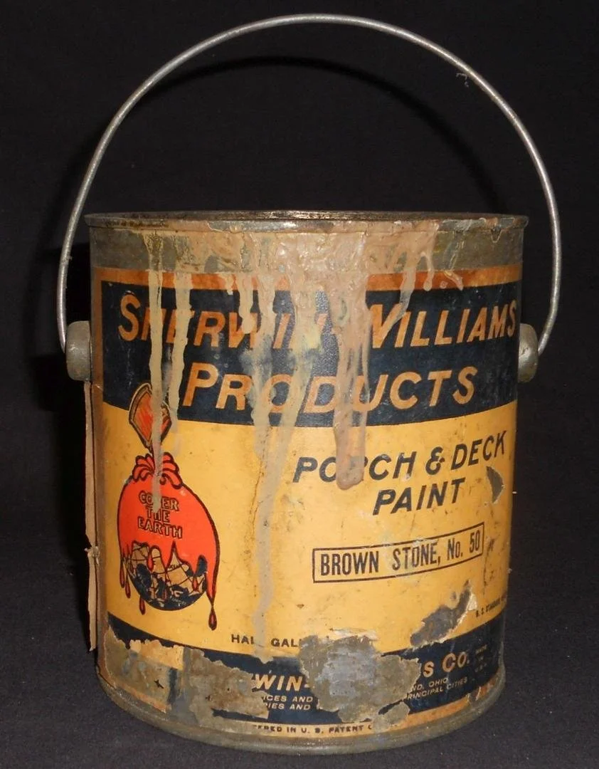
If Dutch Boy was sweet and sentimental, Sherwin-Williams was bold and declarative. Their long-running “Cover the Earth” campaign—showing a can of red paint pouring over a globe—is one of the most aggressive brand visuals ever used in home improvement.
Introduced in 1905, the image communicated global reach, complete coverage, and product confidence. Over the decades, it also courted controversy—especially as environmental awareness grew—but its boldness and audacity made it unforgettable, cementing its place as one of the most iconic visuals in paint branding history.
Combined with blocky typefaces and deep, saturated colors, Sherwin-Williams’ early cans were designed to be seen from across the hardware store—and to be remembered long after.
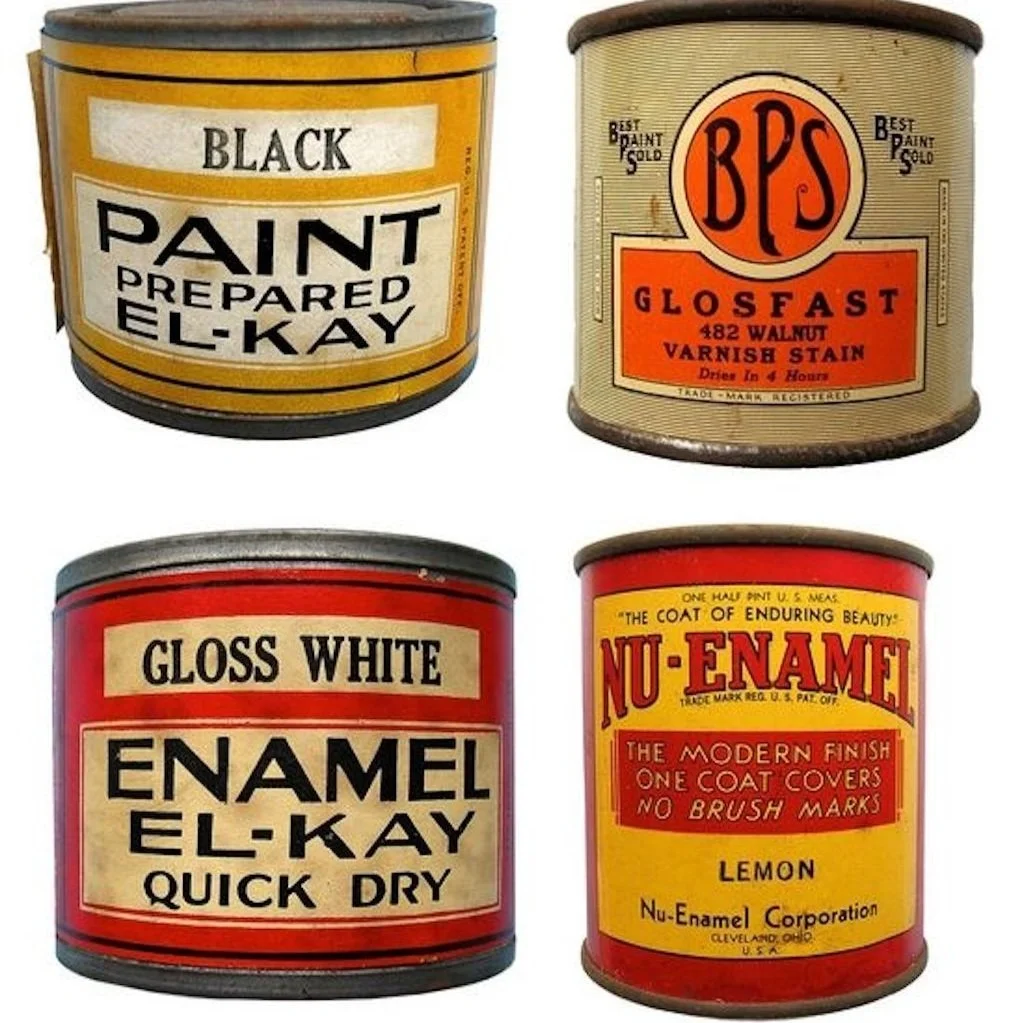
Color Naming Before It Was Cute
Today’s boutique paint brands often use poetic, abstract names—think “Elephant’s Breath” or “Haunted House.” But vintage cans got there first, using evocative names to make color selection emotional rather than technical.
1950s-60s labels might feature names like “Cameo Rose,” “Colonial Green,” or “Tavern Gray”—color as story.
These weren’t just descriptive; they helped homeowners imagine a lifestyle. “Colonial Green” wasn’t just a shade—it was an aesthetic alignment with heritage, tradition, and good taste.
This emotional positioning elevated the paint selection process. Suddenly, you weren’t just painting your home. You were curating your identity.
When the Label Was the Advertisement
Before TV commercials and sponsored Instagram posts, the paint can label had to do the selling on its own. That’s why vintage labels often feel like miniature billboards:
Ornate borders and typography created a sense of luxury.
Vibrant color swatches were printed directly on the can to reduce doubt and increase desire.
Instructional copy was built into the label—paint brands knew the can would be read while in use.
Some cans even featured cross-sell messaging: buy the matching primer, use the brand’s brushes, and follow the company’s “official” preparation method.
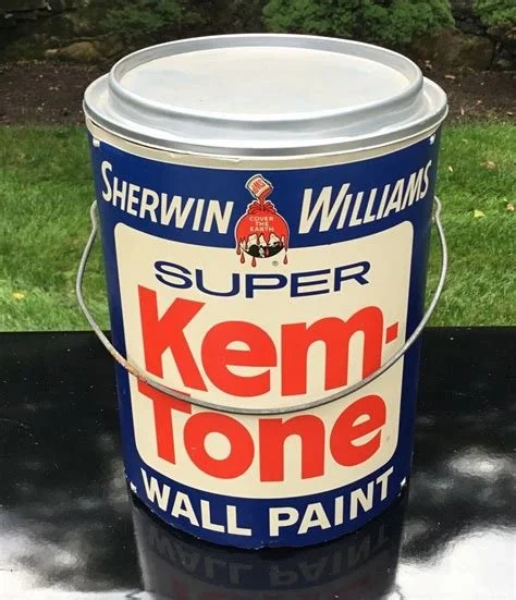
Mid-Century Paint as Lifestyle Branding
As America moved into the post-war housing boom, paint brands positioned themselves not just as products but as partners in progress. The rise of suburban homes and the popularity of DIY meant homeowners were newly empowered. Paint brands responded with labels and marketing that emphasized:
Clean design to mirror modernist aesthetics
Illustrations of ideal homes to stoke aspiration
Smiling homeowners to reinforce pride and joy
Paint wasn’t just a finish—it was a fresh start.
Packaging as Storytelling
In the mid-20th century, a paint can wasn't just a container…it was a narrative. The Dutch Boy's rosy cheeks told you this brand was safe for your family. Elaborate cursive type suggested elegance, progress, or even patriotism. Color palettes weren’t chosen at random; they reflected aspirational ideals: the white-picket-fence dream, the new suburban life, the confidence of modernity.
Today, companies like Backdrop and Clare tap into that same instinct. Minimalist packaging, soft palettes, and clever names are part of a new story: design-forward, accessible, curated. But the impulse is the same. Whether it's a boy with a brush or a pastel rectangle, labels still sell more than paint. They sell identity.

When Labels Go Quiet
In the 1980s and 1990s, branding began to shift. As big box retailers grew and premium paints moved behind counters, the art of the label faded. Utility replaced ornament. Instructional text replaced emotional appeal.
But today, we’re seeing a resurgence:
Niche luxury brands emphasize simplicity with a wink.
Heritage labels are being revived as design objects.
Vintage cans are collectibles—evidence that the visual language of paint still matters.
Why This Matters to Stanwich Painting
At Stanwich Painting, we don’t just put color on walls. We think about color as narrative. About homes as personal mythologies. And about every detail: from the finish you choose to the history behind it as part of your larger story.
So while we’re happy to color match the trendiest new neutral, we’re just as excited to bring an old paint label back to life…if only in spirit.
Because great design doesn’t start with a swatch.
It starts with a feeling.
Looking to bring timeless design—or a touch of nostalgia—to your home?
Call Stanwich Painting at 475-252-9500 or request a free consultation today.
References & Further Reading
Dutch Boy Brand History
Sherwin-Williams official site
https://www.sherwin-williams.com/about-us/company-overview/our-brands/dutch-boyDutch Boy mascot origin & historical context
Tiana Spellman, Student Spotlight: Dutch Boy, The Dieline (2011)
Describes Dutch Boy’s use since 1907 and its design evolution
https://thedieline.com/student-spotlight-dutch-boy-html-2/Our Craft – Farrow & Ball
Overview of craftsmanship, heritage branding, and color storytelling
https://www.farrow-ball.com/about-us/our-craftBackdrop Paint Brand Case Study
How modern paint companies blend nostalgia and minimalism
https://aruliden.com/project/backdrop/The Rebrand Trend of 2021: Acting Your Age – AIGA Eye on Design
Insight into retro branding trends and consumer psychology
https://eyeondesign.aiga.org/the-rebrand-trend-of-2021-acting-your-age/Made to Sell: Packaging Design for Consumer Culture by Charlotte Rivers
https://archive.org/details/cdartinnovationi0000rive/mode/2upHomeward Bound: American Families in the Cold War Era by Elaine Tyler May
https://archive.org/details/homewardboundame02mayeMoMA Exhibition – How Posters Work
Showcasing historic principles of visual persuasion in design
https://www.moma.org/calendar/exhibitions/1492