
Morning Light: How Paint Transforms The First Glimpse Of Your Day
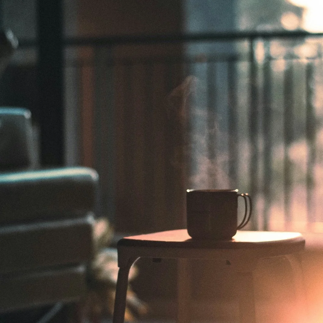
Photo by Prateek Gautam on Unsplash
Morning has a way of telling the truth.
The sun slips in at an angle, grazing walls and ceilings, uncovering every detail you might have overlooked the night before. No filters, no shadows, no disguises. It’s in this delicate, revealing light that you notice the faded trim, the uneven finish, the chips you meant to repair months ago. But morning light doesn’t only reveal…it offers possibility. It whispers of freshness, of beginnings, of the promise that a space can feel different if only it’s given the right care.
At Stanwich Painting, we believe the way your home looks in the morning sets the tone for the day ahead. That first glimpse matters. Here’s how morning light interacts with your home — and how paint, thoughtfully chosen and expertly applied, can transform it.
Morning Light Reveals Imperfection
Early light is ruthless in its honesty. It doesn’t soften or blur; it slides across plaster and woodwork like a magnifying glass, uncovering seams, uneven brushstrokes, and the quiet wear that accumulates in a lived-in home. The walls you passed without noticing at night suddenly appear tired, almost weary in the unforgiving glow of dawn.
Yet, there’s beauty in that exposure.
What morning light reveals isn’t a failure of your home but a conversation with it: the story of breakfasts cooked, children’s artwork taped to walls, furniture shifted, and seasons passing. Those hairline cracks and faded patches are markers of life, not flaws. But when the balance tips, and imperfections start to dominate what you see, morning light becomes a daily reminder of neglect rather than comfort.
A fresh coat of paint can restore that balance. Professional prep work ensures surfaces don’t just look “covered,” but truly renewed. The very same light that once revealed fatigue will instead highlight craftsmanship: smooth trim, seamless walls, corners that look intentional. In this sense, paint isn’t just aesthetic — it’s a reset button for the way your home greets you each morning.
Design Touch: Crisp whites are often the hero here. Benjamin Moore’s “Chantilly Lace” (OC-65) offers a clean, luminous white that reflects morning light like polished porcelain. For something softer, Farrow & Ball’s “Slipper Satin” (2004) absorbs brightness with a velvety, chalk-like quality, disguising minor imperfections while evoking quiet elegance.
Lifestyle Bridge: Imagine pouring your first cup of coffee and walking into a space that feels new every day, not weary. Morning becomes less about seeing what needs fixing and more about appreciating a home that reflects care.
A Psychological Reset
Morning is more than a time on the clock. It’s a threshold, a chance to reorient yourself before the day unfolds. The colors surrounding you influence that reset in ways most people underestimate.
Imagine waking to a ceiling painted in a serene matte white, clearing mental clutter before the first sip of coffee. Or stepping into a bedroom wrapped in misty green, the walls acting like a quiet inhale. Color psychology tells us that blues and greens can lower stress, while softer neutrals encourage clarity. The interaction of morning light with these tones amplifies their effect, creating an environment that supports—not sabotages—your state of mind.
This is where the artistry of paint selection comes in. Certain hues are transformative only when paired with light at specific times of day. A color that feels subdued at night may bloom under sunrise, giving you an atmosphere of optimism before you’ve even opened your laptop.
Design Touch: Benjamin Moore’s “Palladian Blue” (HC-144) is a perfect example — a serene, blue-green that feels like morning air through an open window. For those drawn to nature’s grounding presence, Farrow & Ball’s “Vert de Terre” (234) provides a soft, earthy green that harmonizes beautifully with the optimism of early light.
Lifestyle Bridge: Think of this as an emotional architecture for your day. A room that calms you in the morning becomes more than a space; it becomes a tool for navigating stress, for starting balanced, and for choosing clarity over chaos.
Fairfield County’s Morning Light
Here in Fairfield County, no two homes receive the same morning light. Geography and architecture shape the way the sun enters, and with it, how paint reads in those first hours.
In Riverside, dining rooms are kissed by water-reflected light, making pale yellows and creams glow with unexpected warmth. These spaces seem to drink in the morning sun, ideal for families who gather early around the breakfast table.
Along the Greenwich waterfront, sunrise strikes with intensity, amplifying undertones: a cool gray may turn icy, a beige may shimmer with gold. Choosing the wrong neutral can mean a kitchen that feels sterile instead of serene.
In Wilton farmhouses, morning light is softened by trees, casting leafy shadows that deepen cooler hues and lend rustic rooms a hushed, almost romantic quality.
Understanding these nuances isn’t just design trivia. It’s essential for choosing colors that look intentional from sunrise to sunset. Paint should work with your geography, not against it.
Design Touch: For sunny, water-reflected rooms, Benjamin Moore’s “Hawthorne Yellow” (HC-4) offers cheerful warmth without tipping into brightness overload. In contrast, Farrow & Ball’s “Pointing” (2003) delivers a creamy, traditional white that seems to cradle the sunrise, making spaces glow without glare.
Lifestyle Bridge: Morning light becomes the daily rhythm-setter. A dining room that glows warmly at breakfast creates connection. A kitchen that feels balanced instead of cold makes routines smoother. Light and color aren’t background — they’re part of how you live.
Contrast at Dawn
The first light of day exaggerates everything. Gloss shimmers like glass. Matte drinks in shadow. Warm tones glow; cool ones sharpen. To the untrained eye, this might seem unpredictable. To designers and painters, it’s a tool: a way to choreograph mood.
Contrast can feel invigorating. A bold navy accent wall in eggshell finish can transform a living room into a space of focus and energy at dawn. But for those who crave softness, matte finishes in muted tones temper the sun’s intensity, creating interiors that feel cocoon-like instead of jarring.
It’s not just about color but also about sheen. Morning light catches a satin trim differently than a matte wall, creating interplay that feels layered and thoughtful rather than flat.
Design Touch: Benjamin Moore’s “Hale Navy” (HC-154) delivers timeless drama, looking velvety in the morning while holding sophistication throughout the day. Farrow & Ball’s “Railings” (31) — a nuanced blue-black — offers contrast that’s bold but never harsh, giving interiors a sense of depth that feels modern yet grounded.
Lifestyle Bridge: For homeowners, this isn’t just a design choice; it’s about how you want to feel first thing in the morning. Do you want to be energized by contrast, or eased into your day by harmony? The right balance makes mornings feel intentional instead of accidental.
Morning Rituals Matter
For most of us, the early hours are defined by ritual: coffee brewing, children at the breakfast table, a few quiet minutes before work begins. These moments are tethered to place. The walls that surround you, the trim you glance at absentmindedly, even the ceiling above your bed all carry weight.
If those surfaces feel tired, they quietly color your day with fatigue. If they feel fresh, beautiful, intentional, they add energy to your routine. A new palette can elevate the most ordinary moments — buttering toast, folding laundry, tying shoelaces — into experiences framed by beauty.
This is where paint transcends décor. It becomes lifestyle design, setting the mood for rituals that happen every single day.
Design Touch: For versatile warmth, Benjamin Moore’s “Edgecomb Gray” (HC-173) strikes the perfect balance between beige and gray, making it ideal for kitchens and gathering spaces. Farrow & Ball’s “Peignoir” (286) — a smoky, romantic rose-gray — lends bedrooms and quiet nooks an air of sophistication that feels indulgent even in the simplest routines.
Lifestyle Bridge: Imagine sipping your morning coffee against walls that glow softly, or stepping into a kitchen where the color feels like part of the ritual itself. When your space supports your habits, mornings become not just functional, but joyful.
Morning Light Doesn’t Lie
Morning light doesn’t flatter, but it doesn’t condemn either. It shows you your home as it truly is. And with the right paint, it can transform that honesty into joy. A room that once felt weary at dawn can become a place of inspiration. A hallway that once looked scuffed and shadowed can glow.
At Stanwich Painting, we help homeowners across Greenwich, Stamford, New Canaan, and Wilton fall in love with their mornings again.
Call us at 475-252-9500 for a free consultation, and let us turn the first view of your day into something extraordinary.
References & Further ReadingColor & Light Psychology“Understanding the Psychology of Color in Spaces” — Explores how hues influence mood and atmosphere in interior design. https://www.stoneside.com/resources/articles/interior-design-understanding-the-psychology-of-color-in-spaces“How Paint Color Changes with Light” — Explains how light conditions significantly alter our perception of paint colors. https://www.tcpi.com/how-paint-color-changes-with-light/“Natural and Artificial Light, and How We Perceive Color” — A lighting-design overview of how illumination impacts emotional and visual perception. https://boca.lighting/natural-and-artificial-light-and-how-we-perceive-color/
Design + Lighting in Practice“AD PRO Color Trend Report 2025” (Architectural Digest) — Highlights the resurgence of expressive color and techniques like color drenching in modern interiors. https://www.architecturaldigest.com/story/color-trend-report-2025“Are Neutral Paint Colors Finally Out of Style?” (The Spruce, Sept 4, 2025) — Looks at the evolution of neutrals toward warmer, more textured tones. https://www.thespruce.com/are-neutral-paint-colors-out-of-style-11799597“The First 5 Questions Designers Always Ask—Before Picking a Paint Color” (The Spruce) — Offers practical design guidelines for choosing color based on light, mood, and lifestyle. https://www.thespruce.com/questions-designers-ask-before-picking-paint-colors-11763091
Interior Design as Well-Being“Interior Design as Therapy: A Verywell Mind Perspective” — Discusses how strategic use of color, natural light, and organized spaces promotes mental wellness. https://www.verywellmind.com/interior-design-as-therapy-tool-anita-yokota-7969476“How Spaces Shape You: A Health-Forward Approach” (New York Post / Diana Mui) — Showcases how light, calming color, and decluttered décor support healing and stress reduction. https://nypost.com/2025/02/04/health/interior-design-choices-that-will-make-you-happier-and-healthier/