
The Traditional House, Reimagined: Room-By-Room Color Inspiration
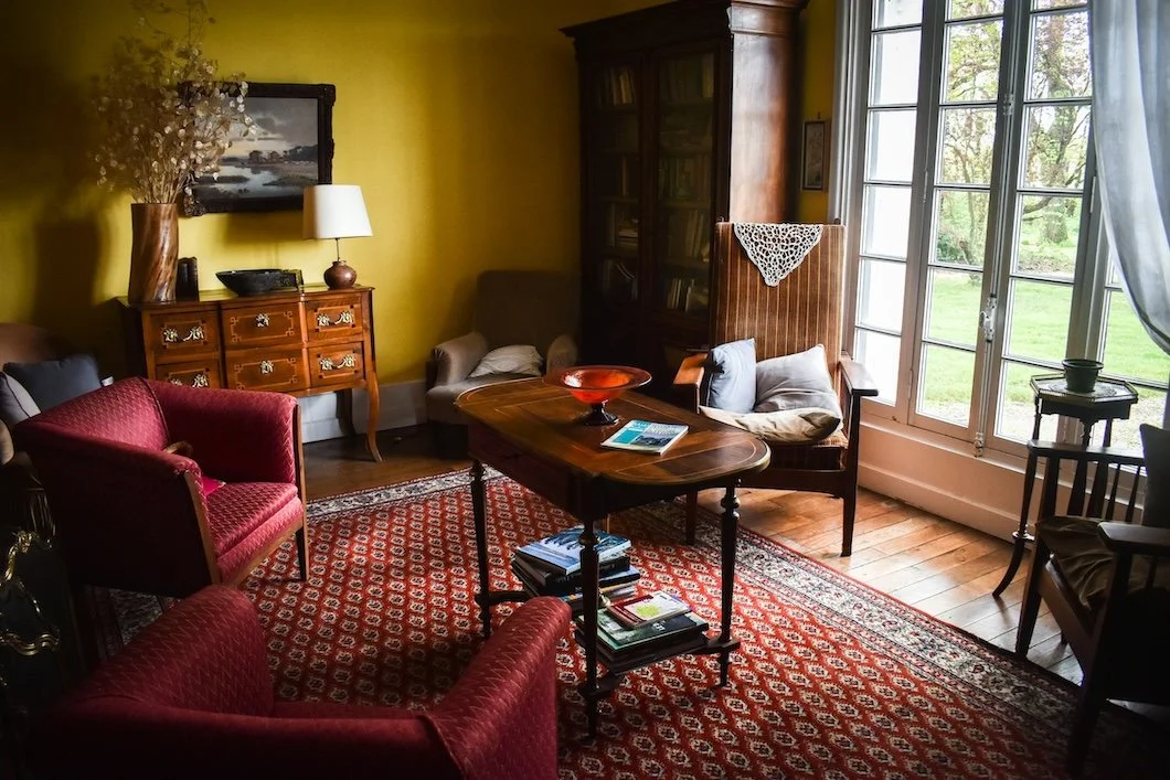
Photo by Grace Tetley on Unsplash
For much of the last decade, interiors leaned into a stark palette of whites and greys. These shades promised simplicity, but too often left homes feeling cold and characterless. Today, the pendulum is swinging back: homeowners are rediscovering the richness of color, especially in traditional houses where architectural details, antique furnishings, and craftsmanship deserve something warmer than “builder’s beige” or “millennial grey.”
At Stanwich Painting, we’ve seen this transformation firsthand across Fairfield County. Clients are choosing hues that celebrate their home’s history while still feeling fresh and modern. The goal isn’t to recreate the past, but to reimagine it—layering time-tested palettes with contemporary touches that make each room sing.
Let’s walk through a traditional home room by room, exploring the colors, finishes, and treatments that bring timeless charm into modern living.
The Living Room: Hospitality and Warmth
The living room is often the heart of the home, a space meant for connection and conversation. In historic New England houses, this was where guests were welcomed, and color played a crucial role in setting the tone.
Colors to Consider: Deep greens like Benjamin Moore’s Saybrook Sage, or classic navy such as Sherwin-Williams’ Naval. Both shades have roots in historic design yet feel fresh against modern upholstery.
Psychology: Green promotes harmony and balance, perfect for a space where family gathers. Navy lends depth and authority, without feeling formal to the point of stiffness.
Finish Details: Walls in matte or eggshell keep the space soft, while trim in a satin finish (try Farrow & Ball’s Pointing) adds definition. Ceilings painted a lighter shade of the wall color can create an intimate, cocoon-like effect.
Blending antiques with modern art or contemporary lighting creates a living room that feels both rooted and forward-looking.
The Dining Room: Appetite and Ritual
Dining rooms once carried the formality of ritual: holiday meals, candlelight, the display of fine china. Historically, bold reds and greens were used to stimulate appetite and conversation.
Colors to Consider: Benjamin Moore’s Dinner Party (a rich red), Sherwin-Williams’ Rookwood Red, or a moodier tone like Farrow & Ball’s Studio Green for an unexpected but luxurious twist.
Psychology: Red enlivens appetite and social energy, while green balances indulgence with grounding.
Finish Details: Glossy or satin finishes on wainscoting reflect candlelight beautifully, while a matte finish above adds sophistication.
Pair with brass hardware, wood dining tables, and antique sideboards for a space that bridges tradition with today’s entertaining style.
The Study or Library: Gravitas and Focus
In the days when home libraries were common, dark, saturated colors created an environment of contemplation. These hues still excel in studies and dens, where focus and quiet productivity are valued.
Colors to Consider: Farrow & Ball’s Green Smoke, Sherwin-Williams’ Iron Ore, or Benjamin Moore’s Hale Navy.
Psychology: Dark greens and blues promote concentration, while near-blacks suggest sophistication and intellectual depth.
Finish Details: Satin on trim highlights millwork, while a flat wall finish prevents distracting reflections. For bookshelves, a slightly higher sheen creates subtle contrast.
Imagine antique wood desks paired with modern leather chairs—old and new in dialogue through color.
The Bedroom: Calm Retreat
Bedrooms thrive on colors that restore and comfort. Traditional homes often leaned on gentle blues, creams, and dusty pinks to create restful sanctuaries.
Colors to Consider: Benjamin Moore’s Palladian Blue, Sherwin-Williams’ Malted Milk, or Farrow & Ball’s Calamine (a soft rose).
Psychology: Blue lowers heart rate and promotes relaxation; pink tones encourage warmth and emotional ease.
Finish Details: Flat or matte finishes absorb light, creating softness. A ceiling painted in a whisper-lighter shade adds subtle dimension and a cocooning feel.
Paired with antique headboards or quilts, these colors feel deeply rooted in tradition, but layered with crisp white linens or contemporary lighting, the look becomes fresh.
The Bathroom: Freshness and Light
Bathrooms in older homes often feature classic tile or clawfoot tubs, details that deserve colors with staying power. Historically, pale blues and clean whites dominated for their association with hygiene and water.
Colors to Consider: Farrow & Ball’s Borrowed Light, Benjamin Moore’s Simply White, or Sherwin-Williams’ Sea Salt for a spa-like twist.
Psychology: Light blues and greens evoke freshness, clarity, and renewal.
Finish Details: Semi-gloss or satin finishes withstand humidity and reflect light, keeping smaller rooms bright.
A soft aqua wall against white trim creates a timeless, crisp pairing that never feels dated.
The Sitting Room or Parlor: Quiet Elegance
Many older Fairfield County homes include parlors or sitting rooms, historically used for guests or private relaxation. These are perfect spaces for nuanced, understated hues.
Colors to Consider: Benjamin Moore’s Hawthorne Yellow, Sherwin-Williams’ Oyster Bay, or Farrow & Ball’s Joa’s White.
Psychology: Yellow fosters cheerfulness and optimism, while muted neutrals allow antiques or artwork to take center stage.
Finish Details: A satin trim in a creamier shade than the walls draws out woodwork and paneling without overwhelming.
In a parlor, restraint often speaks louder than boldness—creating intimacy and comfort through color.
Hallways and Transitions: Cohesion and Continuity
Hallways tie the home together, offering opportunities for subtlety or surprise. In older homes, transitional spaces were often painted lighter to reflect available light, but they can also carry bold choices to create drama.
Colors to Consider: Sherwin-Williams’ Alabaster for timeless brightness, or Benjamin Moore’s Revere Pewter for a grounded neutral. For adventurous homeowners, a darker shade like Farrow & Ball’s Railings can create a gallery-like feel.
Psychology: Neutrals establish flow; darker tones add intrigue and sophistication.
Finish Details: Consider matte on walls for softness, with semi-gloss on stair spindles and banisters for durability.
Hallways are also excellent for patterned wallpaper, a nod to tradition that reads as design-savvy today.
Why Tradition Feels Modern Again
The shift away from stark greys and whites reflects something bigger than taste: it reflects a longing for connection, comfort, and continuity. In Fairfield County, where many homes carry history in their beams and trim, traditional palettes simply make sense. They highlight craftsmanship, bring antiques into harmony, and create rooms that feel both rooted and livable.
What makes these colors modern is how they’re layered. A deep navy paired with a mid-century sofa, a historic sage green offset by abstract artwork—this is the dance between old and new. Tradition offers the palette; imagination makes it yours.
Final Brushstroke
Painting a traditional home is about more than color: it’s about honoring history while creating spaces for modern life. Each room tells a story of welcome, of ritual, of rest, of quiet work. With the right colors and finishes, those stories feel timeless yet entirely personal.
At Stanwich Painting, we specialize in this balance. From Greenwich to Westport, we help homeowners reimagine traditional spaces with hues that resonate deeply and last beautifully. If you’re ready to move beyond flat neutrals and embrace the character of your home, let’s talk about how the right palette can make your house feel alive again.
Ready to reimagine your own traditional home?
Contact Stanwich Painting today for a personalized color consultation.
Further Reading Citations
National Park Service — Preservation Brief 28: Painting Historic Interiors
 A detailed guide on selecting historically appropriate paints and finishes for interiors in preservation projects.
 https://www.nps.gov/orgs/1739/upload/preservation-brief-28-painting-interiors.pdf
National Park Service — Preservation Briefs (index)
 A comprehensive index of briefs covering a wide range of preservation topics, including historic paint techniques and materials.
 https://www.nps.gov/orgs/1739/preservation-briefs.htm
Historic New England — Historic Colors of America An overview of traditional color palettes used throughout American history, perfect for homeowners restoring period interiors. https://www.historicnewengland.org/preservation/for-homeowners-communities/your-old-or-historic-home/historic-colors-of-america/Historic New England — 20th Century Paint Palette A visual repository of widely used paint shades from early to mid-20th century homes in New England. https://www.historicnewengland.org/preservation/for-homeowners-communities/your-old-or-historic-home/20th-century-paint-palette/This Old House — Historic Paint Colors: The Best Palettes for Traditional Houses Inspiration and practical advice for choosing paint colors that complement older architectural styles. https://www.thisoldhouse.com/painting/21019025/best-paint-colors-for-historic-housesThis Old House — Paint-Color Ideas for Ornate Victorian Houses Elegant and expressive palettes tailored for richly detailed Victorian homes. https://www.thisoldhouse.com/painting/21018359/paint-color-ideas-for-ornate-victorian-housesSmithsonian Magazine — This 300-Year-Old Book Is a Guide to Every Paint Color Imaginable A fascinating dive into historical color standards documented over three centuries ago. https://www.smithsonianmag.com/smart-news/beautiful-guide-paint-color-over-300-years-old-180951354/The Metropolitan Museum of Art — Interior Design in England, 1600–1800 A scholarly essay exploring the evolution of interior aesthetics in early modern England. https://www.metmuseum.org/essays/interior-design-in-england-1600-1800The Metropolitan Museum of Art — Representing the Complicated History of American Interiors Insightful reflections on the cultural narratives captured in period-room design over U.S. history. https://www.metmuseum.org/perspectives/period-rooms-history-of-american-interiorsV&A Museum — A Brief History of Wallpaper A concise history of wallpaper design trends and their impact on interior décor through the ages. https://www.vam.ac.uk/articles/a-brief-history-of-wallpaperArchitectural Digest — 4 Color Palettes to Try, According to Color Psychology A modern take on how different color combinations affect mood and ambiance—great for blending tradition with today. https://www.architecturaldigest.com/story/color-psychology-palettesColor Psychology ReferencesCherry, Kendra. Color Psychology: Does It Affect How You Feel? Verywell Mind. Updated April 2024.
https://www.verywellmind.com/color-psychology-2795824Elliot, Andrew J., and Markus A. Maier. Color Psychology: Effects of Perceiving Color on Psychological Functioning in Humans. Annual Review of Psychology, Vol. 65, 2014, pp. 95–120.
https://doi.org/10.1146/annurev-psych-010213-115035Whitfield, T.W.A., and T.J. Wiltshire. Color Psychology: A Critical Review. Genetic, Social, and General Psychology Monographs, Vol. 116, No. 4, 1990, pp. 385–411.
Jacobs, K.W., and Frank E. Hustmyer Jr. Effects of Four Psychological Primary Colors on GSR, Heart Rate, and Respiration Rate. Perceptual and Motor Skills, Vol. 38, 1974, pp. 763–766.
https://doi.org/10.2466/pms.1974.38.3.763