
Color Notes: This Week at Stanwich Painting
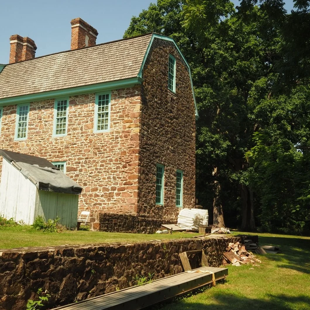
Photo by Gene Samit
A Sunday recap of paint, perception, and the quiet details that make a house feel timeless.
Good Morning, Fairfield County
Welcome back to Color Notes. This week's posts ask us to look a little more…carefully. Our opening blog explores why the weathered colors of Nantucket continue to inspire homeowners generation after generation. While second post tackles a question nearly everyone has asked at some point: Why does this room just feel... off? The answer, as it turns out, is rarely a single paint color. More often, it's the relationship between light, trim, architecture, and the way every element in a room works together.
This Week's Highlights
The Nantucket Palette: Why Weathered Color Feels So Timeless
Nantucket has long been admired for its soft grays, faded blues, sandy neutrals, and weathered whites—but those colors aren't accidental. They're the result of salt air, bright coastal light, cedar shingles, and decades of graceful aging. This post explores why these naturally muted palettes continue to resonate and how homeowners can borrow their quiet elegance without simply trying to recreate a coastal cottage. Weathered color succeeds because it feels authentic rather than manufactured.
https://www.stanwichpainting.com/blog/the-nantucket-palette-why-weathered-color-feels-so-timeless
Why a Room Feels Wrong: Paint, Light & Trim
Sometimes a room doesn’t need a full redesign, instead it just needs its elements to speak to one another more clearly. Paint color, natural light, trim color, sheen, ceiling height, flooring, and architectural proportion all influence how a space is experienced. This post explores why a room can feel unsettled even when every individual choice seems correct, and how understanding those relationships leads to spaces that feel balanced, comfortable, and complete.
https://www.stanwichpainting.com/blog/why-a-room-feels-wrong-paint-light-trim
Why These Themes Matter
Both posts revolve around harmony. The Nantucket palette demonstrates how architecture, landscape, weather, and color naturally belong together. Likewise, a successful interior isn't created by selecting the "perfect" paint color, but rather how it emerges when light, trim, proportion, and color work together as a single composition.
The best homes don't rely on dramatic gestures. They rely on thoughtful relationships.
Serving Fairfield County
Stanwich Painting proudly serves homeowners throughout Greenwich, Stamford, Darien, New Canaan, Wilton, andRiverside. Whether you're inspired by timeless coastal palettes or searching for the subtle adjustment that finally makes a room feel right, thoughtful painting begins with understanding the home itself.
Ready to Refresh Your Home?
Whether you're drawn to weathered coastal color or trying to solve a room that never quite feels finished, Stanwich Painting is here to help you make thoughtful, lasting decisions.
Call 475-252-9500 or request a consultation.