
The Nantucket Palette: Why Weathered Color Feels So Timeless
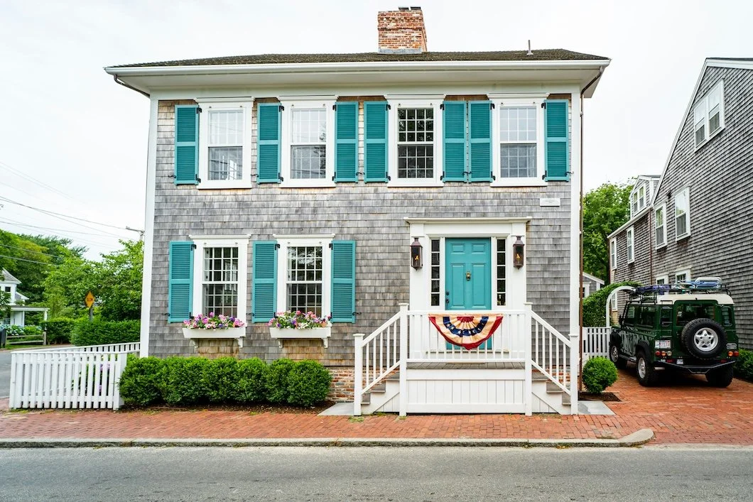
Photo by Benjamin R. on Unsplash
Nantucket color is often misunderstood. It gets blended into the larger idea of “coastal color,” which usually means bright whites, aqua blues, sea glass greens, navy stripes, sandy neutrals, and something somewhere involving a rope basket. There is nothing wrong with that palette when it is handled well. A coastal home can be fresh, relaxed, and beautiful. But Nantucket color is doing something quieter.
Nantucket color is not beach color in the obvious sense. It comes from the island’s materials and atmosphere: cedar shingles, salt air, fog, brick paths, dune grass, old shutters, softened whites, and colors that feel as if they have already lived through a few seasons.
Think of cedar shingles silvered by salt air. White trim softened by fog. Old black shutters that feel less like contrast and more like punctuation. Brick walks, gray skies, hydrangeas just past their brightest moment, dune grass, worn brass, canvas, rope, stone, and wood that has been allowed to age with dignity.
The Nantucket palette does not feel timeless because it is plain. It feels timeless because it is restrained, textural, and deeply connected to place. The colors seem to belong to the house, the house seems to belong to the landscape, and nothing feels as if it arrived only because a trendy influencer gave it recognition.
That is what makes the palette so useful, even for homes that are nowhere near the island.
You do not need a Nantucket address to borrow from its color language, but…the translation does matters. The goal is not to turn a Greenwich living room, Fairfield County Colonial, or modern coastal-inspired home into a themed vacation rental. The goal is to understand why those colors work: they are softened, weathered, architectural, and calm.
Nantucket Color Begins Outside
The most recognizable Nantucket palette begins with the exterior.
The island’s architecture is strongly associated with weathered gray shingles, white or off-white trim, dark shutters, muted doors, brick paths, and natural landscaping that never feels overly polished. The beauty is not in high contrast alone, but in the way the contrast has been softened by atmosphere.
A bright white house with navy shutters can feel coastal. A weathered shingle home with softened white trim and black-green shutters feels more specific. It has less shine and more memory. It feels less designed from a catalog and more formed by salt, fog, sun, and time.
Nantucket colors tend to avoid anything too clean, too tropical, or too sharp. The blues are often grayed. The greens have a little brown or sage in them. The whites are warm enough to avoid looking icy. The darks are often blue-black, green-black, or charcoal rather than pure, hard black. Even the brighter colors, when they appear, usually feel slightly faded, as if the weather has already had a conversation with them.
For an exterior, that restraint matters. A house outside has to live with the roof, the stone, the walkway, the landscape, the neighboring homes, and the changing sky. A color that feels charming on a small sample can become too bright once it is spread across siding, shutters, or a front door in full daylight.
Nantucket color works because it rarely shouts back at the landscape.
Why Weathered Color Feels Timeless
Weathered color has a different kind of beauty from fresh color.
Fresh color can be crisp and satisfying, especially right after a paint project is completed. But weathered color has depth because it feels as though it has already learned how to live in the world. It suggests natural materials, old buildings, soft light, and surfaces that have been touched by time.
That is why so many Nantucket-inspired colors feel enduring. They are not invented for a season. They come from things that age well: cedar, stone, sand, rope, canvas, brick, old wood, linen, oxidized metal, and garden greens.
This is also why the palette adapts so well indoors. A soft gray-blue wall can feel like fog without being gloomy. A warm white can feel clean without becoming stark. A green-gray can bring in the landscape without turning the room into a beach theme. A deep blue-black on built-ins or doors can give the room structure without making it feel severe.
The colors are useful because they have restraint built into them. They make a home feel collected rather than decorated.
Bringing the Palette Indoors
A Nantucket-inspired interior should not feel like a set.
That is where people can go wrong. Too much bright blue, too much white, too many nautical references, and suddenly the room feels less like Nantucket and more like a gift shop with excellent throw pillows.
The better approach is quieter. Use the palette as atmosphere, not theme.
Indoors, Nantucket color works beautifully when paired with natural materials: wood floors, woven textures, linen, stone, cane, aged brass, simple ceramics, and relaxed upholstery. The paint should support those materials instead of competing with them.
A living room might use a warm white or stone neutral on the walls, with a deeper blue-black on built-ins. A bedroom might lean into pale blue-gray or soft green-gray, creating a calmer version of coastal color. A mudroom might carry a weathered green or charcoal door color. A kitchen might use softened white walls with blue-gray or green-gray cabinetry. A powder room can go deeper, borrowing from stormier water, old shutters, or aged paint.
The point is not to make every room look the same. It is to let the colors feel related.
A Nantucket palette often works through controlled contrast: soft walls, clean trim, natural texture, and one deeper anchor. That deeper note might be a door, a cabinet, a built-in, a vanity, or a stair rail. Without that anchor, the palette can become too pale and washed out. With too much contrast, it can lose its quietness.
The balance is everything.
Paint Colors to Consider
For homeowners interested in a Nantucket-inspired palette, the best starting point is not a long list of beachy colors. It is a smaller group of colors that feel weathered, restrained, and livable.
A few Benjamin Moore colors to consider:
White Dove OC-17 — a warm, reliable white for trim, walls, ceilings, and interiors that need softness rather than sharpness.
Boothbay Gray HC-165— a weathered blue-gray that can work beautifully on cabinetry, shutters, doors, or interior walls.
Woodlawn Blue HC-147 — a soft historic blue-green that feels calm, coastal, and classic without becoming too sweet.
Saybrook Sage HC-114 — a muted green that suggests dune grass, old gardens, and traditional exteriors.
Kendall Charcoal HC-166 — a strong charcoal for shutters, doors, built-ins, or interior accents that need grounding.
Hale Navy HC-154 — a deep, restrained navy for doors, cabinetry, or accents where a richer blue is needed without going too bright.
A few Farrow & Ball colors to consider:
Wimborne White — a soft white that feels warm and clean without becoming cold.
Skimming Stone — a relaxed stone neutral for interiors that need quiet warmth.
Pigeon — a blue-green-gray with depth, especially strong for cabinetry, built-ins, mudrooms, or rooms that need character.
French Gray — a green-gray with heritage softness, useful for both traditional and updated interiors.
Borrowed Light — a pale, airy blue that brings a gentle coastal feeling without becoming obvious.
Railings — a deep blue-black for doors, shutters, built-ins, or refined contrast.
These colors are not meant to recreate Nantucket literally. They are starting points for a feeling: weathered, softened, architectural, and quietly elegant.
Where the Palette Can Go Wrong
The Nantucket palette loses its power when it becomes too literal.
If every room gets a pale blue wall, white trim, and nautical accessories, the effect can feel staged. If the exterior color is too bright, the house may feel more resort-themed than timeless. If every surface is white, the home can lose warmth. If the dark accents are too harsh, the restraint disappears.
A few common mistakes include:
Choosing bright aqua when the home really needs a grayed blue.
Using stark white where a warmer white would better suit the architecture.
Treating navy as the only “coastal” dark when green-black, charcoal, or blue-black may be more refined.
Forgetting that weathered palettes still need contrast.
Ignoring the roof, brick, stone, landscaping, and natural light.
Using vacation memory as the whole design plan.
That last one matters…
A color that felt perfect on a July afternoon near the water may not behave the same way in a suburban living room in February. The memory may be beautiful, but the house still gets a vote.
A Palette That Belongs
The best Nantucket-inspired colors do not feel imported. They feel as though they could have grown into the house over time.
That is why this palette has such lasting appeal. It does not depend on novelty. It does not need to be loud or try to make every room announce itself. It gives a home a sense of calm, age, texture, and belonging.
For Fairfield County homes, that can be especially useful. Many houses in Greenwich, Darien, New Canaan, Westport, Wilton, and Stamford already have the ingredients that work well with this palette: mature landscaping, traditional architecture, stone walls, older trim, wood floors, shaded rooms, exterior details, and enough seasonal light to make color feel different from morning to evening.
A Nantucket palette can soften a formal home. It can bring structure to a casual one. It can make a newer house feel more settled and an older house feel more cared for. It can suggest the coast without dressing the house in costume.
That is the real strength of weathered color. It feels calm because it has nothing to prove and it feels timeless because it was never trying to be trendy.
And when it is chosen carefully, prepared properly, and applied with restraint, it can give a home something deeper than a beach-inspired look. It can give the home a sense that its colors belong to the architecture, the landscape, and the life being lived inside.\
Drawn to the quiet, weathered elegance of a Nantucket-inspired palette? Stanwich Painting can help you choose the right colors, finishes, and placement for an interior or exterior that feels timeless, restrained, and beautifully suited to your home. Schedule a painting consultation today.
Stanwich Painting proudly provides top-quality residential painting services throughout Fairfield County, including: Greenwich, Cos Cob, Riverside, Old Greenwich, Stamford, Darien, New Canaan, and Wilton