
An Unobvious Christmas Palette: Refined Winter Colors Inspired By Farrow & Ball
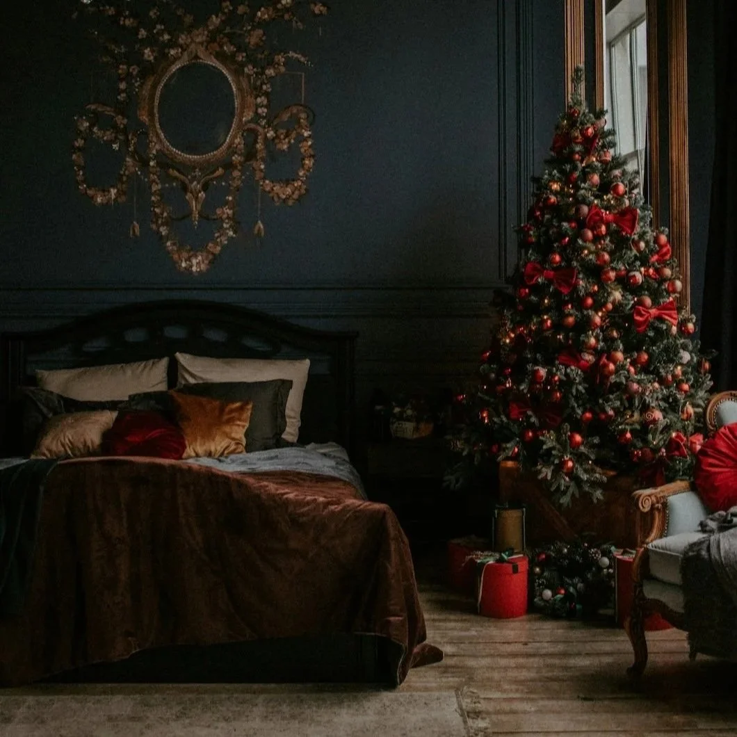
Photo by Alsu Vershinina on Unsplash
There’s a familiar impulse that returns every December: the idea that a home needs to look like Christmas in order to feel appropriate for the season. Walls are suddenly expected to carry symbolic weight—red for festivity, green for tradition, bright whites for cheer—as if color must announce the holiday rather than support the life unfolding within it.
In refined interiors, the opposite approach tends to prevail. Instead of amplifying the season, well-considered spaces are designed to receive it. They allow greenery, candlelight, glassware, textiles, and people to animate the room without visual competition. Paint, in this context, becomes less about messaging and more about behavior: how a color settles in low winter light, how it absorbs warmth in the evening, and how gracefully it carries the house through a period of heavier use and longer nights.
That distinction matters most in December, when interiors are tested in ways the rest of the year rarely demands.
Why Literal Holiday Colors Often Undermine Good Rooms
Seasonal palettes tend to rely on immediacy. Red signals celebration. Green suggests tradition. The message is clear, but clarity is not always the same thing as sophistication. When these colors move from accents into architectural surfaces, they often overwhelm the very elements that give a room its character.
Under winter conditions—shorter days, cooler daylight, and layered artificial lighting—highly symbolic colors can become visually insistent. They flatten depth, compete with furnishings, and leave little room for variation once decorations are introduced. What feels festive at first can quickly feel fixed, even heavy, particularly after the holiday itself has passed.
Upscale interiors avoid this rigidity by choosing colors that are structurally flexible. Instead of narrating the season, they create a stable backdrop that allows it to arrive and depart without disruption.
The Psychology Behind a Quieter Winter Palette
Winter light is revealing in its own way. In the Northeast especially, overcast skies and reflective ground conditions introduce cooler tones into the home, while evenings rely almost entirely on artificial sources. Colors that succeed under these circumstances tend to share certain qualities: muted undertones, sufficient depth to absorb light rather than scatter it, and a warmth that reads as material rather than decorative.
These are not colors chosen for instant impact. They’re chosen for endurance—for their ability to support extended use, shifting décor, and the visual density that naturally accompanies the holidays. Rather than commanding attention, they stabilize the room, allowing everything else to come forward with greater clarity.
Five Unobvious Winter Anchors, Inspired by Farrow & Ball
Brinjal
A deeply restrained aubergine, Brinjal occupies a space that feels both historical and contemporary, without leaning theatrical. Its red-brown undertones soften what might otherwise feel dramatic, particularly under candlelight or warm evening lamps. During December, Brinjal lends dining rooms and studies a sense of occasion that feels grounded rather than performative, allowing conversation and ritual to take precedence over surface-level spectacle.
Psychologically, it introduces gravitas and intimacy, making gatherings feel intentional without closing the room in.
Bancha
Bancha offers a compelling alternative to traditional holiday greens. Earthy, smoked, and quietly architectural, it reads as a neutral first and a color second. In kitchens, entryways, or rooms with significant wood and stone, Bancha provides a grounded backdrop that supports seasonal greenery rather than competing with it.
Its strength lies in restraint. There is no decorative urgency here, which allows the room to remain composed long after the decorations are gone.
Drop Cloth
Drop Cloth is often underestimated because it resists drama. In practice, that resistance is precisely what makes it valuable in winter. This soft taupe absorbs light gently, preventing the glare and coolness that brighter neutrals can introduce during darker months.
In open-plan homes or spaces that host frequent holiday activity, Drop Cloth offers visual continuity without becoming inert. It allows furniture, artwork, and people to register clearly while maintaining a calm, cohesive atmosphere throughout the home.
London Clay
Dense, earthy, and unapologetically serious, London Clay creates a sense of containment that proves especially effective during the holidays. In rooms designed for evening us—dining rooms, libraries, sitting rooms—it holds warmth and visual weight, allowing the space to feel settled even when busy.
Often overlooked because it defies easy categorization, London Clay pairs naturally with leather, dark woods, iron, and aged finishes, reinforcing a sense of permanence that feels appropriate for winter.
Peignoir
Peignoir occupies a rare middle ground. Neither cold nor overtly expressive, it introduces subtle complexity without announcing itself. In bedrooms, transitional spaces, and quieter sitting rooms, it softens winter light while maintaining a refined neutrality.
Its appeal lies in nuance. For homeowners seeking something beyond standard greys and beiges, Peignoir offers distinction without distraction—an ideal quality during a visually saturated season.
How These Colors Support the Season Without Competing With It
The advantage of a restrained winter palette becomes most apparent once decorations are introduced. Against these nuanced backdrops, evergreen branches read deeper, metallic accents feel intentional rather than flashy, and candlelight becomes atmospheric instead of ornamental. Texture—linen, wool, ceramics, glass—gains presence because the walls are not demanding attention.
Good paint doesn’t merely decorate the holiday; it frames it, giving temporary elements a sense of purpose rather than mere performance.
Why These Choices Still Feel Right in January
The true test of seasonal design arrives after the season itself has passed. None of these colors rely on Christmas symbolism, which means there is no visual hangover once decorations are removed. The rooms remain coherent, grounded, and flexible, ready to support everyday life without the urge for immediate change.
These are not holiday colors. They are winter-competent colors, chosen for how they behave under pressure, not for how quickly they signal celebration.
A More Considered Approach to Holiday Color
Refined homes are rarely defined by what they announce. Instead, they are shaped by what they allow to unfold naturally within them. In December, when light is scarce and use is high, paint succeeds when it stabilizes rather than competes.
When color is chosen with this level of intention, it doesn’t need to perform.
It simply holds the room steady…season after season.
Ready For Your Winter Consultation?
Call 475-252-9500 or Online