
The Tonal Layered Room: A More Sophisticated Way to Choose Paint
There was a time when choosing paint for a room meant choosing one color for the walls and calling the decision finished. Maybe the trim stayed white. Maybe the ceiling stayed white. Maybe the furniture, rug, lighting, and fabrics were considered later, as separate design choices. The room might have looked fresh, but it did not always feel…complete.
That is where tonal layering has become such an important interior design idea.
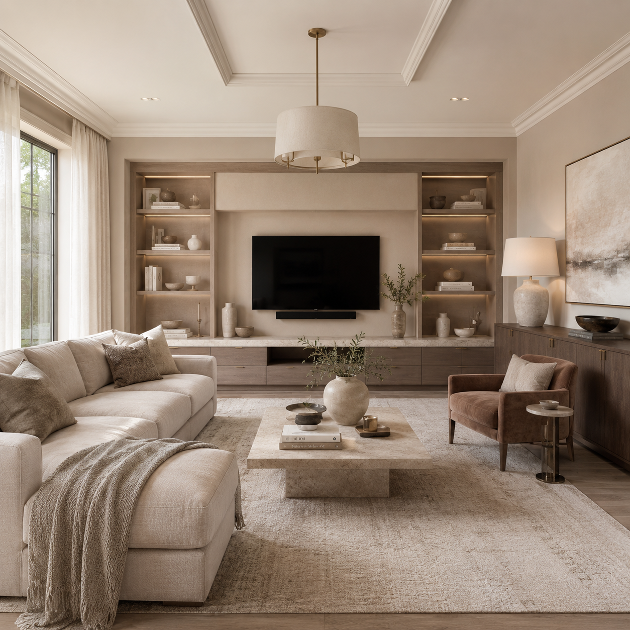
Tonal layering is the practice of building a room around related colors, rather than isolated color choices. Instead of asking, “What color should this room be?” the better question becomes, “What color family should this room live inside?” That shift may sound subtle, but it changes the entire feeling of a space. The walls, trim, ceiling, millwork, lighting, rugs, textiles, upholstery, and even adjacent rooms begin to speak the same visual language.
The result is not necessarily a monochromatic room. Tonal layering does not mean everything has to match. In fact, the most successful tonal rooms rarely feel flat or overly coordinated. They feel dimensional, calm, intentional, and deeply finished. A soft neutral wall may be paired with slightly warmer trim, a deeper painted cabinet, a textured rug in a related undertone, and lighting that reinforces the warmth of the palette. A green-gray built-in may be echoed through linen, stone, ceramic, or drapery. A blush-toned wall may feel more grown-up when grounded by clay, taupe, warm white, and deeper mauve.
That is the beauty of tonal layering: it gives a room atmosphere.
For homeowners, especially in homes with strong architectural details, older millwork, open floor plans, or rooms that connect visually to one another, tonal layering offers a more refined way to think about paint. It allows color to move through a home with intention, rather than stopping abruptly from room to room. It also helps avoid one of the most common interior design problems: a room where each individual element is attractive, but the whole space never quite settles.
Paint is often the best place to begin because it sets the room’s visual temperature: walls form the envelope, trim frames the architecture, and ceilings influence how light reads the space. Doors, cabinetry, built-ins, and fireplace surrounds introduce depth and rhythm. Considered together, these surfaces give the room a cohesive sense of design even before a single pillow or rug is added.
This is especially useful in homes where the goal is not to chase a trend, but to create a more elevated feeling. Tonal layering can be quiet or dramatic, traditional or modern, coastal or tailored. A tonal room can feel relaxed and sun-washed, or it can feel moody and enveloping. The common thread? Control. The color story has been edited. The surfaces have been considered and the transitions have been softened.
One of the best ways to understand tonal layering is to think in terms of depth.
A room needs more than one note. It needs a light value, a mid-tone, and sometimes a deeper anchor. It may also need a balancing neutral that prevents the palette from becoming too sweet, too cold, too yellow, too gray, or too heavy. This is where professional paint selection matters. Two colors may look similar on a fan deck and behave very differently in a room depending on the light, ceiling height, flooring, and surrounding materials.
A tonal palette should also consider finish. Matte or eggshell walls create softness. Satin or semi-gloss trim introduces a quiet shift in reflection. Cabinetry and built-ins may need a more durable finish, especially in kitchens, mudrooms, libraries, bathrooms, or high-touch family spaces. The sheen becomes part of the layering. A single color can look different across walls, trim, and millwork simply because of how the surface catches light.
This is also why preparation matters. Tonal layering often relies on subtle transitions. When colors are closely related, the quality of the finish becomes more visible, not less. Uneven walls, rough trim, failing caulk, poor cut lines, or improperly primed surfaces can interrupt the very sophistication the palette is trying to create. The quieter the color story, the more important the craftsmanship becomes.
For homeowners considering this approach, Benjamin Moore’s 2026 Color Trends palette offers several useful examples of how tonal layering can work in real interiors. The palette includes soft, lifted hues as well as deeper, more grounded shades, which makes it especially helpful for creating rooms that feel layered instead of simply painted.
A few color families to consider:
Use Swiss Coffee OC-45 as a soft trim, ceiling, or wall color; Sherwood Tan 1054 for walls, millwork, or cabinetry; and Silhouette AF-655 for interior doors, built-ins, a study, powder room, or dining room. This combination feels refined without becoming cold. It works especially well with natural wood, brass lighting, linen textiles, stone, and older architectural details.
Use First Crush CSP-310 as a gentle wall color; Batik AF-610 for a deeper adjoining space, bedroom, or painted furniture moment; and Southwest Pottery 048 as a clay-toned anchor. This palette can feel warm, feminine, and sophisticated when balanced with natural textures, antique wood, woven shades, or creamy upholstery.
Use Raindance 1572 for cabinetry, built-ins, a mudroom, or soft gray-green walls; Narragansett Green HC-157 for a library, powder room, dining room, or dramatic accent space; and a warm off-white trim to keep the palette fresh and breathable. This is a strong choice for homes that want color and depth without feeling overly formal.
Use Southwest Pottery 048 as the main color direction for a den, guest room, mudroom, or richly layered living space; pair it with warm neutral textiles, natural stone, woven shades, aged wood, and matte black or antique brass accents. Instead of relying on sharp contrast, this palette works through warmth, texture, and quiet saturation. It is especially effective in rooms with leather, terracotta, patterned rugs, or exposed natural materials.
The most important part of using these colors is not simply placing them side by side. It is deciding where each one belongs. A deeper shade may be too much on every wall, but perfect on a built-in. A soft blush may feel beautiful in a bedroom, but more sophisticated when paired with warm white trim and a clay-toned textile. A green-gray may feel subtle in daylight and richer at night. A warm neutral may carry an entire hallway, allowing deeper rooms to branch off with more confidence.
This is where tonal layering becomes practical. It helps homeowners make decisions across the whole room, and often across the whole home. The living room no longer competes with the foyer. The hallway no longer feels forgotten. The powder room can be dramatic without feeling random. The bedroom can be quiet without feeling unfinished.
It also helps with open spaces, which can be difficult to paint well. In an open floor plan, a single wall color may feel too repetitive, but too many unrelated colors can make the home feel chopped up. Tonal layering creates variation without visual noise. The kitchen cabinets may sit in one shade, the walls in another, the trim in a third, while all of them remain connected through undertone and temperature.
For older homes, tonal layering can be even more powerful. Historic trim, paneled doors, built-ins, staircases, and plaster walls often respond beautifully to layered paint. Instead of forcing every detail into sharp contrast, a tonal palette can soften the architecture while still honoring it. A hallway painted in a warm neutral, with slightly deeper doors and creamy trim, can feel more elegant than a high-contrast scheme. A dining room with deeper walls and related trim can feel intimate without feeling heavy.
For newer homes, tonal layering can add character. Many newer interiors begin with clean lines, open spaces, and neutral finishes. Paint can bring in the warmth and depth that the architecture may not yet have. A tonal palette helps the room feel designed, not decorated after the fact.
The key is restraint. Tonal layering works because it edits the room. It does not ask every element to compete for attention. Instead, the paint creates a foundation for everything else to belong. The rug does not have to match the wall exactly. The lamp does not have to repeat the trim. The sofa does not need to disappear into the palette. But each element should feel related enough that the room has a clear point of view.
That is the difference between a painted room and a composed room.
A painted room may look new, but composed room feels resolved.
For homeowners planning an interior refresh this summer, tonal layering is a sophisticated place to begin. It can be subtle enough for everyday living, but thoughtful enough to transform how a room feels. It gives paint a larger role than color alone. It allows the architecture, furnishings, and finishes to work together instead of separately.
Whether the goal is a softer bedroom, a richer dining room, a more finished living space, or a hallway that finally feels connected to the rest of the home, tonal layering offers a way forward. Start with the color family. Consider the light. Look at the trim, ceiling, cabinetry, and adjoining spaces. Then let the palette build slowly, with depth, texture, and intention.
The most beautiful rooms rarely happen because of one perfect color. They happen because every choice knows what it is in conversation with.
Planning an interior refresh? Stanwich Painting can help you choose a color direction that works with your home’s light, architecture, furnishings, and finishes.
Call 475-252-9500 Or Online.
Stanwich Painting proudly provides top-quality residential painting services throughout Fairfield County, including: Greenwich, Cos Cob, Riverside, Old Greenwich, Stamford, Darien, New Canaan, and Wilton