
The Haunted Palette: How Darkness Holds Warmth
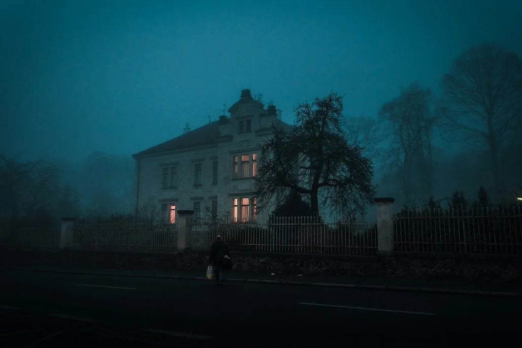
Photo by Ján Jakub Naništa on Unsplash
October Light and the Lure of Shadow
October has a way of revealing what summer hides. The sun lowers, the air stills, and the light turns golden and directional, brushing past surfaces instead of flooding them. It’s the season when homes seem to exhale, when corners darken softly and the glow of lamps begins to matter again.
While Halloween décor shouts in orange and black, real interiors whisper something subtler. The truest October palette isn’t about fright—it’s about atmosphere: a warmth drawn from darkness, a beauty born of restraint.
At Stanwich Painting, we’ve come to see shadow not as the enemy of color but as its keeper. When light fades, pigment deepens, and the room breathes differently. A well-painted wall doesn’t vanish into night; it hums quietly under it. A haunted palette isn’t about fear…it’s about recognition, the sense that something ancient still lives quietly in the room.
Haunted, Not Spooky: The Psychology of Shadow
Darkness is misunderstood. We associate it with mystery, melancholy, sometimes danger…but inside a home, it behaves differently. Psychologically, deep color calms the nervous system. It slows perception, encourages focus, and restores a sense of privacy.
White walls expand energy outward; dark walls pull it inward—a necessary balance in a world that feels perpetually overexposed. That’s why moody interiors resonate so deeply right now. They’re not about gothic excess or trend-driven drama. They’re about emotional gravity, about creating a place where the eye can rest.
In older homes especially, dark color feels honest. It acknowledges time and texture rather than pretending perfection. You see this in century-old studies, paneled dining rooms, or stairwells brushed in deep pigment. They aren’t dark because they lack light; they’re dark because they’ve learned to live with it.
The Temperature of Darkness
Not all dark colors behave the same way. Some absorb light until they feel velvety and warm; others hold a cool distance like fog before dawn. Warm darks—oxblood, bronze, coffee, and plum—create a candlelit intimacy that recalls aged leather, polished wood, or the amber glow of lamplight. Cool darks—navy, charcoal, pine green—evoke stillness and intellect, making rooms contemplative rather than cozy.
Finish plays a role too. Matte walls absorb light, deepening color and creating mysterious softness. Satin sheens reflect just enough to define trim and texture, while high-gloss is theatrical—a mirror of movement, elegant and unflinching. Choosing the right darkness isn’t about boldness; it’s about temperature, about how the color feels rather than how it looks.
The Modern Gothic Home
In design, the word gothic no longer means medieval. It means romantic, an architecture style that holds emotion in its bones. Today’s modern gothic interiors borrow that feeling through restraint: clean-lined spaces layered with dark tones, natural textures, and low, thoughtful light.
A charcoal kitchen feels grounded; a plum library feels quiet and private; a dark olive bedroom becomes cocoonlike. Fairfield County homes, with their mix of colonial craftsmanship and modern additions, wear this look beautifully. Deep color reveals molding profiles, frames light from small-paned windows, and softens transitions between old and new. Add materials like brass, velvet, walnut, and aged marble, and you get a palette that feels not haunted by fear but by memory.
The Haunted Palette: Five Colors That Hold Warmth
Benjamin Moore Twilight Zone (2127-10) is a charcoal-blue that reads like fog at dusk—calm, grounded, and quietly sophisticated, ideal for studies and hallways.
Farrow & Ball Paean Black (No. 294) carries a plum tint with surprising softness; in lamplight it feels velvety, almost romantic.
Sherwin-Williams Iron Ore (SW 7069) offers a deep mineral darkness that holds warmth like sun-soaked stone, perfect for cabinetry or accent walls.
Benjamin Moore Wenge (AF-180) is a rich espresso brown with red undertones that glow against brass, leather, and warm oak.
Farrow & Ball Dead Salmon (No. 28), a muted rose-beige, feels like faded velvet and timeworn plaster. Each of these tones has weight without heaviness; they don’t shout—they linger. In the right light, even the darkest walls hum.
Crafting the Glow Within the Gloom
Painting with dark colors is both art and discipline. To make shadow beautiful, the painter must understand light: where it lands, where it hides, and how it moves across a surface.
At Stanwich Painting, we balance sheens intentionally: matte for walls, satin or semi-gloss for trim, soft gloss for detail. The subtle differences allow architecture to breathe as light finds the edges, glances off a doorframe, and catches the grain of a brushstroke.
Lighting itself becomes part of the palette. We recommend layered illumination—sconces, shaded lamps, and dimmers that sculpt mood rather than erase it. The goal isn’t brightness; it’s atmosphere.
In fall and winter, Fairfield County light runs cooler, so we select paints with warm undertones to counterbalance that tone shift. A gray that feels serene in July might feel cold in January. The right darkness absorbs that chill and turns it into glow. The craft of a haunted palette isn’t about darkness; it’s about the dance between what light reveals and what it lets rest.
The Emotional Pull of October Rooms
There’s a reason people crave darker spaces this time of year. As nature contracts, we do the same through nesting, slowing and seeking enclosure. October rooms are about stillness. The season invites inwardness: a book, a blanket, a lamplight reflection on painted plaster.
These spaces become extensions of the self—protective, private, and quietly beautiful. In a world where so much design feels performative, darkness offers relief. It doesn’t ask to be photographed; it asks to be felt. The haunted palette is the antidote to aesthetic fatigue, a reminder that design isn’t just seen—it’s lived in. The colors we choose in October are rarely chosen with reason; they’re chosen with memory.
When Darkness Feels Like Home
A well-painted dark room doesn’t swallow you; it holds you. Its edges blur, its light deepens, and time slows just enough to notice the details—the way color bends around a candle flame, the way silence gathers near the floorboards. This is the true spirit of October, not plastic skeletons and flashing lights but the quiet, dignified warmth of shadow.
We paint in darkness not to hide what’s there but to reveal what endures: texture, craftsmanship, and the intimacy of lived space. Darkness, done well, isn’t absence…it’s invitation.
Ready to explore your home’s darker side? Let’s create warmth from shadow.