
Afterglow: Designing With Shadow, Sheen, And the Subtle Art of Dim Light
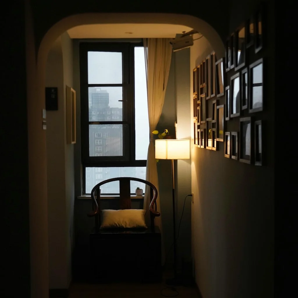
Photo by travelers_tw
We talk often about the importance of natural light—how it reveals undertones, brightens corners, and interacts with color across the seasons. But what about the absence of light? What about the hours after sunset, the moments before dawn, or the rooms designed not to shine, but to glow?
A quiet trend is emerging in high-end interiors across Fairfield County and beyond: designing for dimness. Not just with lighting, but with paint—colors and sheens that respond to shadow, soften the edges of a room, and create atmosphere in ways bright light never could. Think moody bedrooms, soft-lit entryways, lacquered powder rooms, and living rooms that feel like velvet.
This isn’t about darkness. It’s about intention—a curated, sensual experience of space and color that begins when the overheads go off.
The Psychology of Low Light: Comfort, Safety, and Seduction
We often think of light as energizing—and it can be. But dimness plays an equally vital role in our emotional landscape. Low light signals to the nervous system that it’s safe to slow down, initiating what psychologists call the “parasympathetic response”: heart rate lowers, stress diminishes, and the body prepares to rest.
Designers have long understood that lighting shapes emotion. Theaters, spas, upscale restaurants—none are overlit, and for good reason. Paint can act as a partner in this psychology. Warm, shadow-friendly hues help foster intimacy, quiet, and introspection.
In the home, dim spaces encourage everything from better sleep to deeper conversation. A softly lit bedroom in a matte olive tone doesn’t just look beautiful—it feels safe. A library bathed in deep green or umber invites stillness. And a richly painted dining room encourages guests to linger long after the last glass is poured.
Low light isn’t just an aesthetic—it’s a tool for emotional wellbeing. And paint is one of its most effective allies.
Why Sheen Matters More Than Ever
In dim spaces, sheen becomes a design tool as powerful as color.
Matte finishes absorb light, reducing glare and offering a soft, velvety look that’s ideal for cozy rooms.
Eggshell or satin reflects just enough light to make walls feel alive—perfect for dining rooms, hallways, or bedrooms with layered lighting.
Gloss (especially high gloss) turns walls into mirrors for candlelight and sconces, adding drama, depth, and elegance.
One growing trend in daring homes? Monochrome, high-gloss powder rooms—a single, saturated color on walls, trim, and ceiling, finished in mirror-like lacquer. The result is theatrical, jewel-box intimacy.
Colors That Come Alive in the Shadows
Not every color thrives in dim light. Many popular brights or cooler grays can feel washed out or flat as daylight fades. What works best are pigment-rich, complex tones—colors that seem to breathe with the room’s mood.
Here are a few standout colors from Sherwin-Williams and Farrow & Ball that transform beautifully as the sun goes down:
Sherwin-Williams:
SW 9178 In The Navy – A crisp yet mysterious navy that feels rich at night; especially striking in eggshell or satin.
SW 7054 Oak Leaf Brown – A warm, chocolatey brown with surprising depth in shadow; elegant in dining rooms or studies.
SW 9140 Blustery Sky – A complex blue-gray that softens into a smoky, nostalgic haze when lights are dimmed.
SW 6038 Truly Taupe – A refined, pink-tinged taupe that feels like warm clay in low light. Elegant for living rooms or hallways.
SW 9171 Felted Wool – A mid-tone gray with a touch of olive; grounding, subtle, and ideal for bedrooms or offices.
SW 9511 Warm Oats (Emerald Designer Edition) – A gentle, earthy neutral that shifts between beige and soft amber—stunning by lamp or candlelight.
Farrow & Ball:
Hague Blue – Not quite a secret anymore, but still unmatched in low light for its inky elegance and green undertone flickers.
Brinjal – A regal, aubergine tone that shifts from deep purple to earthy warmth with changing light.
Treron – An earthy green-gray that feels like stone by day, and velvet by night—especially in matte.
Preference Red – Deep, historic, and plush; it feels velvet-soft under warm bulbs. Excellent for accent walls or intimate spaces.
Green Smoke – A smoky, blue-toned green that evokes dusk and depth. Pairs beautifully with brass or walnut finishes.
De Nimes – A moody, French-inspired blue that turns dusty and romantic in the absence of strong light.
When paired with the right finish—typically matte for softness or satin for subtle reflection—these tones don’t fade into the background. They anchor a space, making even the quietest room feel intentional.
Rooms That Thrive in Dimness
Certain rooms are naturally suited to shadow and softness. Use paint intentionally in these spaces:
Bedrooms: Opt for deep, desaturated tones with matte finishes—colors that make the room feel like a retreat.
Powder Rooms: Go bold with color and gloss. These small spaces can handle dramatic impact.
Dining Rooms: Choose a finish with subtle reflectivity, like satin, and tones that bring out candlelight: olive, navy, rust.
Libraries or Studies: Deep greens, charcoal, or browns create a moody stillness that supports focus and quiet.
In larger homes throughout Greenwich, New Canaan, and Westport, we’ve seen a rise in clients requesting mood-forward paint palettes for these very purposes—often paired with warm metallic fixtures and layered textiles.
How to Use Light as a Finishing Touch
Dim design doesn’t mean poorly lit—it means well considered. Once the paint is chosen, it’s worth investing in:
Wall sconces that cast upward glow
Dimmer switches for living rooms and bedrooms
Warm-temperature bulbs (2700K and below)
Accent lighting that bounces softly off walls and ceilings
The trick is to think of light not as a necessity, but as a layer of paint itself—a shifting element that interacts with color and finish.
Why This Matters More Than Trend
Designing with shadow and sheen isn’t just trendy. It’s a response to our need for refuge—a move away from cold, overlit, overexposed spaces into something more human. It’s tactile. Intentional. Emotional.
The right paint can cradle you at the end of the day. It can calm the edges of your thoughts. It can make a room feel alive without being loud.
And that, in our view, is design at its most powerful.
The next time you’re planning a painting project, don’t just consider how a color looks at noon—ask how it behaves at 9 p.m., under a table lamp, with music playing softly in the background.
At Stanwich Painting, we understand how finish, color, and lighting conditions come together to shape a room’s mood. We don’t just paint—we design with atmosphere in mind.
Curious what your home could feel like after dark? Let’s talk.
Call 475-252-9500 or request a consultation. We’ll help you find the right finish for your afterglow.
References:Farrow & Ball. (2024). Color Collection. Retrieved from https://www.farrow-ball.comSherwin-Williams. (2024). ColorSnap® Color System. Retrieved from https://www.sherwin-williams.comAugustin, S. (2009). Place Advantage: Applied Psychology for Interior Architecture. Wiley.Bell, P. A., Greene, T. C., Fisher, J. D., & Baum, A. (2001). Environmental Psychology (5th ed.). Wadsworth.Lightology. (2023). The Science of Warm Lighting. Retrieved from https://www.lightology.com