
The Forgotten Trim: Why Your Moulding Deserves Personality
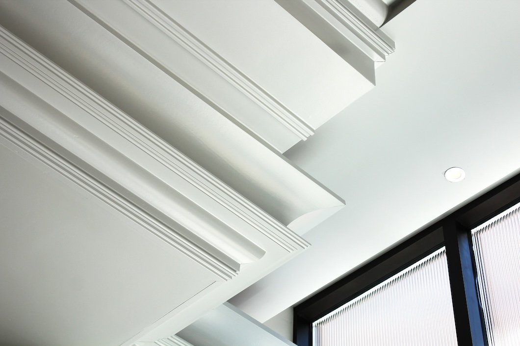
Photo by Kelsey Weinkauf on Unsplash
Most homeowners can recall their wall color in an instant. But ask about their trim and you’ll usually get a pause—a squint toward the baseboards—and a quiet,
“Just… white?”
And yet, trim defines a room more than we realize. It’s the rhythm behind the melody, the punctuation at the end of every visual sentence. It’s where light lands, where your eyes stop, where the architecture finally exhales.
For decades, we’ve treated moulding like background noise. But the truth is: trim has personality and it’s long overdue for a comeback.
The Edge of Everything
Walls are the storytellers, but trim is the frame. It outlines the narrative, the part that makes a space feel finished, not just painted. Whether it’s the crisp edge of a window sash or the soft curve of crown moulding, these elements quietly set the tone.
Historically, homeowners knew this. In early Connecticut homes, casings were layered and expressive, painted in deep, deliberate hues that mirrored the craftsmanship of the time. The details mattered because they reflected pride—not just in ownership, but in observation.
Somewhere between the rise of minimalism and the mass-produced “builder grade” era, we lost that language. Every baseboard became white, every door frame an afterthought. Trim faded into silence.
Now, as design returns to texture, warmth, and heritage, homeowners are rediscovering that edge again…literally.
The Psychology of the Frame
Trim plays a surprisingly emotional role in how a room feels. It’s the subconscious boundary between order and openness, chaos and calm.
White trim signals familiarity and structure; the classic look that frames color confidently.
Tonal trim (where walls and trim share a hue) blurs boundaries, creating softness and unity.
Contrasting trim—deep navy, charcoal, even black—brings precision and drama, a sign of confidence in design.
Paint sheen deepens that effect. A satin finish on trim adds a gentle highlight, drawing light across edges that would otherwise vanish in matte. It’s not glossy. It’s just enough to make architecture breathe.
At Stanwich Painting, we often say trim is where craftsmanship shows. Walls can be forgiving; mouldings are not. Every brushstroke, every edge, every reveal is a small act of discipline and artistry.
A Brief History of Character
Step inside a late-19th-century Colonial or an early 20th-century Craftsman home in Fairfield County, and you’ll see a language of contrast. Walls were often matte and tinted; trim was painted in richer, more saturated tones.
The result? Depth, proportion, identity.
When postwar efficiency met modernism, that complexity vanished. Builders defaulted to white because it was easy, neutral, and photographically clean. For decades, we accepted that sameness as sophistication.
Now, homeowners are looking again at their edges—realizing that neutrality and neglect are not the same thing.
Color Personality: What Your Trim Says About You
Like wardrobes, trim colors say more about a home’s personality than its walls do. Here’s what those choices often reveal—whether you mean them to or not:
The Classicist: Crisp White Dove or Decorator’s White. You value clarity and order. Your home feels intentional, not trendy.
The Naturalist: Soft greens like Farrow & Ball Lichen or Sherwin-Williams Evergreen Fog. You prefer calm to contrast, depth to dazzle.
The Rebel: Deep Railings, Hale Navy, or Iron Ore. You love atmosphere. Your spaces feel like conversation pieces.
The Minimalist: Monochrome trim that dissolves into the wall. You’re drawn to stillness and simplicity, where design disappears and peace begins.
The Dreamer: Dusky mauves or grayed blues. You see rooms as stories, not showrooms—nostalgic, personal, quietly cinematic.
The most successful rooms often borrow a bit from more than one archetype. A soft green baseboard under pale ivory walls, for instance, feels both classic and alive—rooted in tradition, but expressive in tone.
The Power of Finish
Trim doesn’t just color a room; it reflects it…literally.
Matte walls absorb light, while trim catches it, bending it along the edges of a doorway or staircase. That difference in sheen is what makes architecture feel dimensional, even when the colors are nearly identical.
For high-end interiors, Stanwich Painting typically recommends satin or low-lustre finishes for trim. They’re durable, easy to clean, and visually balanced. Semi-gloss, while traditional, can appear too reflective under LED lighting or in newer homes with smoother casings.
Some of the premium lines we trust include:
Farrow & Ball Modern Eggshell for a soft but resilient sheen.
Benjamin Moore Advance Satin ideal for woodwork that needs both beauty and durability.
Sherwin-Williams Emerald Urethane Trim Enamel exceptional for cabinetry and high-touch surfaces.
The goal is a finish that elevates the architecture—not one that competes with it.
When the Room Comes Alive
Imagine this: a 1920s Colonial in Stamford, painted years ago in an all-white palette. The homeowner decides to keep the walls light—a soft Pale Smoke—but the trim shifts from cool white to White Dove.
At first glance, nothing radical changes. But suddenly, the room has temperature and tone. The door casings look defined. The window frames pull the light inward. The ceiling moulding becomes a soft horizon line.
That’s the quiet power of trim. It’s not decoration…it’s definition.
Rediscovering the Details
Trim teaches us that craftsmanship isn’t always loud. Sometimes it’s the shadow line under a chair rail, the delicate contrast of a satin baseboard against a matte wall, or the way a soft gray window frame makes the outdoors feel closer.
We paint these edges every day, and the most rewarding projects are the ones where homeowners start to notice.
Because once you see the difference, you can’t unsee it.
The Quietest Statement
If walls are the story, trim is the punctuation. It’s the quietest part of the sentence, but it makes everything read better.
As Fairfield County’s homes evolve—from the historic to the newly built—that punctuation deserves as much attention as the prose.
A painted wall may refresh a room.
A painted trim can transform it.
If your home feels ready for its own quiet transformation, Stanwich Painting would love to help you rediscover the details that define it.
Call 475-252-9500 or request your free color consultation today.
| Mood | Brand | Color | Note |
|---|---|---|---|
| Classic White | Benjamin Moore | White Dove (OC-17) | Timeless and architectural |
| Deep Accent | Farrow & Ball | Railings (No. 31) | Sophisticated navy-black |
| Earthy Green | Farrow & Ball | Lichen (No. 19) | Natural and soft under low light |
| Statement Blue | Benjamin Moore | Hale Navy (HC-154) | Deep and confident |
| Subtle Neutral | Sherwin-Williams | Drift of Mist (SW 9166) | Elegant backdrop for tone-on-tone trim |
Side Note: Explore the Colors Mentioned
Further Reading
If you enjoyed The Forgotten Trim: Why Your Moulding Deserves Personality, you might also like:
Afterglow: Designing with Shadow, Sheen, and the Subtle Art of Dim Light – How directional light transforms color and finish into quiet drama.
High Gloss, High Drama: Is the Sheen-Obsessed Design Trend Already Peaking? – A deep dive into the psychology and risk of the ultra-reflective finish trend.
The Dust That Makes It Glow: How Imperfection Creates Radiance – Why subtle surface irregularities add depth, warmth, and authenticity to interiors.
Beyond White: The New Contemporary Color Rebellion – Exploring the shift from neutral sameness to expressive color as modern design matures.