
The Color Changes at Four O’Clock
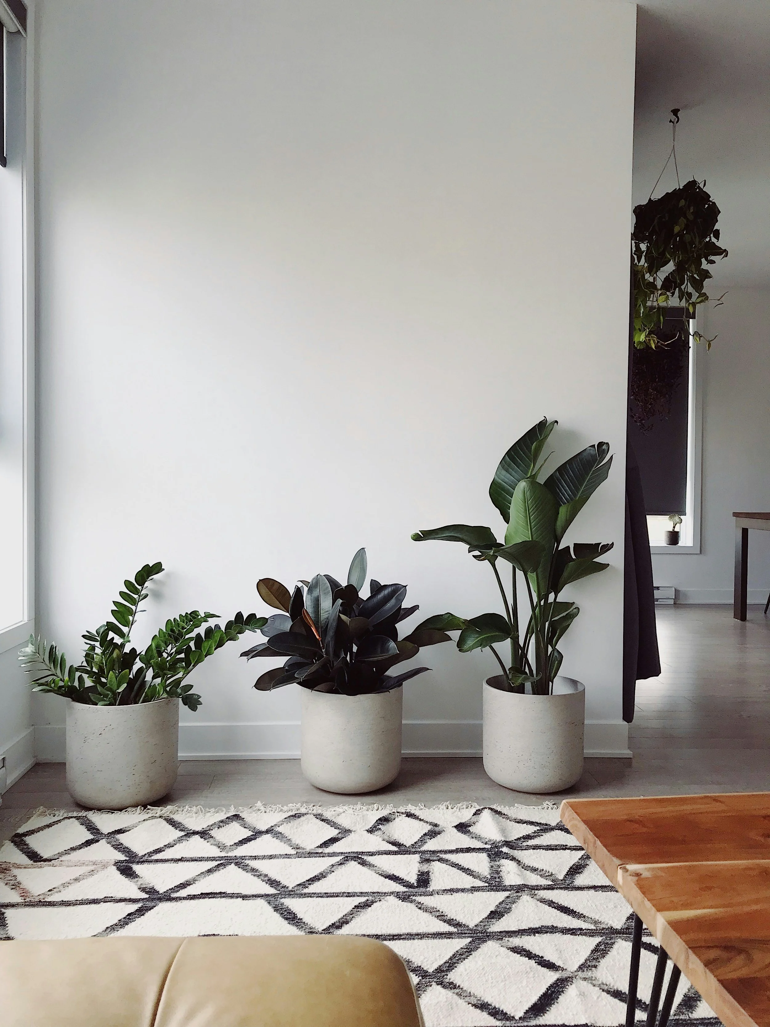
Photo by Lakeisha Bennett

At ten in the morning, the living room looks calm. The sample on the wall is a soft, warm gray. By four, a band of sunlight has crossed the floor, the trees outside have turned the window light green, and that same gray seems cooler.
The paint did not change. The room did.
Color is not a fixed thing we place on a wall. It is what we see when light meets paint, surrounding materials, and the surfaces around us. That is why choosing an interior color from a small chip under store lighting can feel so uncertain—and why the best color decisions begin with looking.
That makes this a useful moment to test the color forecasts. For 2027, Benjamin Moore chose Webster Green, Sherwin-Williams chose Celery, and Little Greene chose Marle. Farrow & Ball takes a different approach: its latest release is a curated group of new and returning colors, rather than one annual Color of the Year. Fine Paints of Europe’s most recent selection is the 2026 color Drama Queen Black.
Those shades range from light green to deep brown, forest green, and black. Farrow & Ball’s latest group includes Reduced Green No. 313, a second green reference for the comparison. The colors are not one coordinated palette, and the brands do not all use the same kind of annual selection. That variety is useful: it shifts the question from “What is the color of the year?” to “What does this color do in my room?”
Follow the Light Through the Room
A room’s light shifts through the day. Its direction, strength, and color are influenced by the windows, the season, nearby buildings, trees, roof overhangs, and even the weather.
North-facing rooms often receive cooler, steadier light. South-facing rooms tend to get stronger direct light for more of the day. East-facing rooms can feel bright in the morning and quieter later; west-facing rooms may take on warmer light toward evening. These are useful tendencies, not rules. Nearby trees, neighboring houses, and window treatments can change the effect.
Before settling on a color, notice when you use the room and what the light is doing then. A bedroom used mostly at night may need to be considered under its lamps as much as in daylight. A kitchen used from breakfast through dinner will have a longer daily range to account for.
The Room Is Part of the Color
Paint also responds to what surrounds it. A warm wood floor can make a nearby neutral feel warmer. Greenery outside a broad window may cast a subtle tint into the room. A bright white ceiling or trim can make a wall color appear deeper by comparison.
This is why the same paint can look different from one room to the next, even when the walls face the same direction. The room’s fixed materials are part of the palette: flooring, stone, tile, cabinetry, counters, and existing woodwork all influence the colors beside them.
When considering a new wall color, look at it next to the things that will remain. The aim is not to make every surface match. It is to understand how they will sit together in the light the home actually receives.
Give a Sample More Than One Look
A tiny paint chip is useful for narrowing choices, but it cannot show how a color will feel across a room. Test a short list with larger samples in the space. Place them on more than one wall if the room has noticeably different light, and look at them from the doorway as well as up close.
Check the samples in the morning, around midday, and late in the day. Then look again after dark with the lights you normally use. Warm bulbs can make a cool color feel softer; cooler bulbs can make some warm neutrals look less settled. The lamp, shade, and bulb temperature all contribute to the view.
It also helps to avoid comparing a new color only with the color it will cover. A strong existing color can affect how a sample appears at its edges. Give yourself a little distance and compare the sample with the room’s trim, flooring, cabinetry, and furnishings.
Sheen Changes the View, Too
Color and sheen work together. A glossier finish reflects more light, so the surface can appear more animated as the light moves across it. That reflection can also make patches, ridges, or unevenness more noticeable. A lower-sheen finish tends to reflect less light, though the exact appearance and cleanability depend on the product.
There is no single sheen that belongs in every room. The choice should fit the surface condition, how the space is used, and the specific paint line. It is useful to compare actual product samples when sheen is an important part of the look, especially on trim, doors, and built-ins, where the reflection can be as noticeable as the color.
Think in Transitions, Not Just Rooms
In a home with connected rooms, color decisions are experienced while moving through the house. A foyer color may be seen from the living room. Hallway walls can connect several different palettes. Trim may run continuously around corners and through doorways.
Rather than treating every room as a separate choice, look at the transitions. Which views should feel quiet and connected? Where could a deeper or more distinctive color create a change in mood? A palette can include variety while still feeling like it belongs to one home.
A practical way to begin is to identify the colors that are already doing the most work such as the flooring, cabinetry, stone, or a large piece of furniture. Then choose a few paint directions that respond to those fixed elements. Test them in the actual rooms and follow them through the day.
Let the Room Have the Last Word
Choosing a color is partly visual judgment and partly observation. Look at the room when it is bright, when it is dim, and when you are most likely to be in it. Notice what the windows bring inside and what the finishes reflect back. Give samples enough size and time to show their character.
The wall at ten in the morning and the wall at four are the same surface. They simply reveal different parts of the color.