
Butter Yellow, Tomato Red, and Cobalt Blue: Summer’s Trend Colors at Home
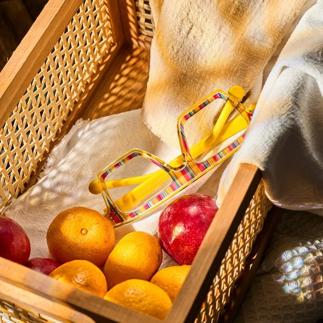
Photo by Vooglam Eyewear on Unsplash
Summer color has a way of escaping the closet.
It starts on the runway, then appears on linen dresses, striped umbrellas, café chairs, beach towels, fruit stands, boutique hotels, glossy sandals, poolside towels, and the kind of vacation photos that make everyone suddenly reconsider their entire neutral wardrobe. Before long, those colors begin to follow us home.
That is the interesting thing about color trends: they rarely stay in one category. Fashion moves faster than interiors, but the colors we see in clothing, travel, street style, and summer destinations often change what we begin craving in our homes. A butter yellow dress makes a pale kitchen feel possible. A tomato red swimsuit makes a front door seem dull. A flash of cobalt blue on a sandal or beach bag suddenly makes the powder room feel like it could use more confidence.
Of course, a house is not a runway…
And that is exactly where translation matters.
Summer color trends are fast, expressive, and fun. Interior paint needs to live with you longer than one season. The goal is not to repaint a dining room chartreuse just because someone wore it beautifully in Capri. The goal is to notice what feels fresh, then decide how that energy belongs in a real home.
Some colors can carry a full room. Some are better as a door, ceiling, powder room, built-in, vanity, pantry, or guest room moment. Some belong in small, controlled doses. Some become surprisingly elegant when softened, grounded, or paired with the right neutral.
This summer’s color story is especially useful because it mixes brightness with warmth. The palette is not only tropical or loud. It has pale butter yellow, tomato red, cobalt and turquoise blues, lime and chartreuse greens, soft pastel pinks, and dark chocolate browns. It feels sun-soaked, a little playful, a little European vacation, a little city street style, and very ready to be edited for the home.
At Stanwich Painting, we love this kind of color conversation because it reminds homeowners that paint does not have to begin with fear. Color can be joyful. It can be stylish. It can make a room feel awake. But the best paint choices are not copied directly from a trend report. They are interpreted through light, architecture, furnishings, trim, finish, and the way the room is actually used.
Butter Yellow: The Softest Way to Bring Summer In
Butter yellow may be the most interior-friendly color of the season because it brings warmth without demanding too much attention. It feels cheerful, but not childish. Fresh, but not neon. It has the mood of morning light, summer breakfast, striped linen napkins, and a kitchen window left open.
In the home, pale yellow works best when it is softened. A creamy butter tone can warm up a small room, brighten a kitchen, or make a guest bedroom feel more welcoming. The key is avoiding anything too sharp or overly saturated unless the room has the architecture and confidence to carry it.
Butter yellow works beautifully in:
Breakfast nooks
Kitchens
Laundry rooms
Guest rooms
Sunrooms
Small bathrooms
Cottage-style bedrooms
Soft ceiling moments
Benjamin Moore colors to consider:
Windham Cream HC-6 — a warm, classic cream-yellow that feels cheerful without becoming loud.
Hawthorne Yellow HC-4 — a brighter historic yellow that can work beautifully in sunny rooms, older homes, or spaces that want a more traditional summer glow.
The beauty of butter yellow is that it can feel fashionable and timeless at once. It does not need to announce itself. It simply warms the room.
Tomato Red: Bold, Confident, and Best with Restraint
Tomato red is summer at full volume. It has the energy of market tables, red geraniums, striped umbrellas, lipstick, lacquer, and Mediterranean lunches that somehow last three hours.
As paint, tomato red is powerful. That is both the attraction and the warning. It can be stunning, but it needs a plan. A whole tomato red room may be fabulous in the right powder room, but overwhelming in a space that already has strong color, busy furnishings, or weak lighting.
This is a color that often works best as punctuation.
Tomato red can be used for:
Front doors
Powder rooms
Mudroom benches
Pantry doors
Painted furniture
Small vestibules
A playful cabinet or vanity
A tiny hallway with personality
Benjamin Moore colors to consider:
Caliente AF-290 — a bold, warm red with depth and confidence.
Raspberry Blush 2008-30 — a vivid coral-red that feels lively, fashionable, and a little more playful than a traditional red.
Red does not have to be used everywhere to have impact. Sometimes the chicest use of red is the one that appears unexpectedly, then disappears before it overstays its welcome.
Cobalt and Turquoise: Vacation Blues for Real Rooms
Blue is always welcome in interiors, but summer blues have a different energy. They are clearer, brighter, and more connected to water, tile, sky, beach clubs, pool houses, and travel.
Cobalt is graphic and confident. Turquoise is softer and more relaxed. Both can be beautiful, but they create very different moods. Cobalt brings structure and drama. Turquoise brings movement and ease.
In a home, these blues can be especially effective when the surrounding palette is simple. White trim, natural wood, woven textures, stone, linen, and brass can all help summer blues feel polished rather than overly themed.
Cobalt and turquoise work well in:
Guest bedrooms
Bathrooms
Pool house spaces
Laundry rooms
Built-ins
Porch ceilings
Small offices
Beach-inspired rooms that should not feel cliché
Benjamin Moore colors to consider:
Champion Cobalt 2061-20 — a saturated blue that feels bold, clean, and graphic.
Blue Danube 2062-30— a rich blue with enough depth to feel more interior-friendly.
Aegean Teal 2136-40 — a sophisticated blue-green that can work beautifully in bedrooms, cabinets, or built-ins.
Galápagos Turquoise 2057-20 — a vivid turquoise for spaces that can handle a more playful, vacation-like hit of color.
The best summer blues do not have to make a room feel nautical. They can feel crisp, artistic, and fresh when they are paired with restraint.
Lime Green and Chartreuse: The Fashionable Troublemakers
Lime green and chartreuse are not shy colors. They are the ones at the party who arrived late, dressed better than everyone expected, and somehow made the room more interesting.
In fashion, these colors feel electric and modern. In interiors, they need more care. A chartreuse wall can be incredible in the right space, but it can also become too much very quickly. The trick is to use these colors where their energy is welcome.
A small room can often handle a sharper color better than a large room because the commitment is contained. A powder room, pantry, laundry room, art wall, or child’s space can become a place for experimentation.
Lime and chartreuse can work in:
Powder rooms
Pantry interiors
Laundry rooms
Kid’s rooms
Accent doors
Painted furniture
Artful entry moments
Small spaces that need energy
Benjamin Moore colors to consider:
Limesicle 2145-50 — a softer, fresher lime that feels playful without being fully electric.
Chic Lime 396 — a brighter, more fashion-forward green for homeowners who want the color to make a statement.
Not every trend color belongs on four walls. Sometimes the smarter choice is a controlled flash of color that gives the home personality without taking over the whole story.
Soft Pastel Pink: The New Summer Neutral
Pastel pink has grown up. It is no longer limited to nurseries or overly sweet bedrooms. In the right tone, pink can function almost like a warm neutral. It softens a room, flatters natural light, and pairs beautifully with cream, brown, stone, brass, natural wood, white oak, and linen.
This is one of the easiest runway-inspired colors to translate into the home because it can be quiet. A powdery pink wall can feel fresh rather than sugary. A blush-toned closet or dressing room can feel warm and flattering. A guest room in soft pink can feel more interesting than beige while still remaining calm.
Soft pink works well in:
Bedrooms
Guest rooms
Dressing rooms
Closets
Powder rooms
Ceilings
Small sitting rooms
Rooms with warm wood or brass accents
Benjamin Moore colors to consider:
First Crush CSP-310 — a soft, sophisticated blush that feels modern and gentle.
Bunny Nose Pink 2074-60 — a cheerful, delicate pink that brings sweetness without feeling too heavy.
Pink becomes especially elegant when it is paired with something grounding. Chocolate brown, deep green, warm white, stone, or natural wood can keep it from feeling overly precious.
Chocolate Brown: The Color That Grounds the Whole Season
Chocolate brown may be the most important color in this summer story because it keeps the brighter shades from floating away. After years of cool grays and pale neutrals, brown has returned with warmth, polish, and depth.
In fashion, dark chocolate brown feels sleek and expensive. In interiors, it can make a room feel tailored, intimate, and grown-up. It is a beautiful counterpoint to butter yellow, blush pink, turquoise, and even tomato red.
Chocolate brown is especially useful when a home wants color, but not brightness. It can bring drama without feeling trendy. It can also make architectural details feel sharper and more intentional.
Chocolate brown works well for:
Dining rooms
Libraries
Studies
Built-ins
Interior doors
Vanities
Mudrooms
Cabinetry
Trim in more tailored rooms
Benjamin Moore colors to consider:
Wenge AF-180 — a deep brown-black that feels rich, dramatic, and sophisticated.
Branchport Brown HC-72 — a warmer historic brown that can bring depth without feeling severe.
Brown is the color that makes the rest of the summer palette feel more livable. It gives brightness somewhere to land.
Trend Color Should Feel Fresh, Not Temporary
The best way to bring summer color into the home is not to copy a trend literally. It is to understand the feeling behind it.
Butter yellow brings warmth. Tomato red brings confidence. Cobalt brings clarity. Turquoise brings ease. Chartreuse brings energy. Pastel pink brings softness. Chocolate brown brings depth.
Once you know what the color is doing, you can decide where it belongs.
Maybe the whole room wants softness. Maybe only the door needs confidence. Maybe the powder room is ready for drama. Maybe the laundry room could use joy. Maybe the walk-in closet deserves a blush wall. Maybe the study is asking for chocolate brown instead of another safe neutral.
Fashion color trends are inspiration, not instruction. They are invitations to look at color with a little more curiosity.
At home, the right paint color should still work with the light, the trim, the furnishings, the architecture, and the way the room is lived in. But that does not mean it has to be timid.
Summer is a good reminder that color can be fun, stylish and have a little sun with it. And when it is translated thoughtfully, a color that began on the runway, the street, or a perfect vacation afternoon can become something much more lasting: a room that feels fresh, personal, and alive.
Ready For Your Own Summer Interior Trend?
Stanwich Painting proudly provides top-quality residential painting services throughout Fairfield County, including: Greenwich, Cos Cob, Riverside, Old Greenwich, Stamford, Darien, New Canaan, and Wilton