
Colors Inspired by Jazz: Moody Palettes For Homes With Soul
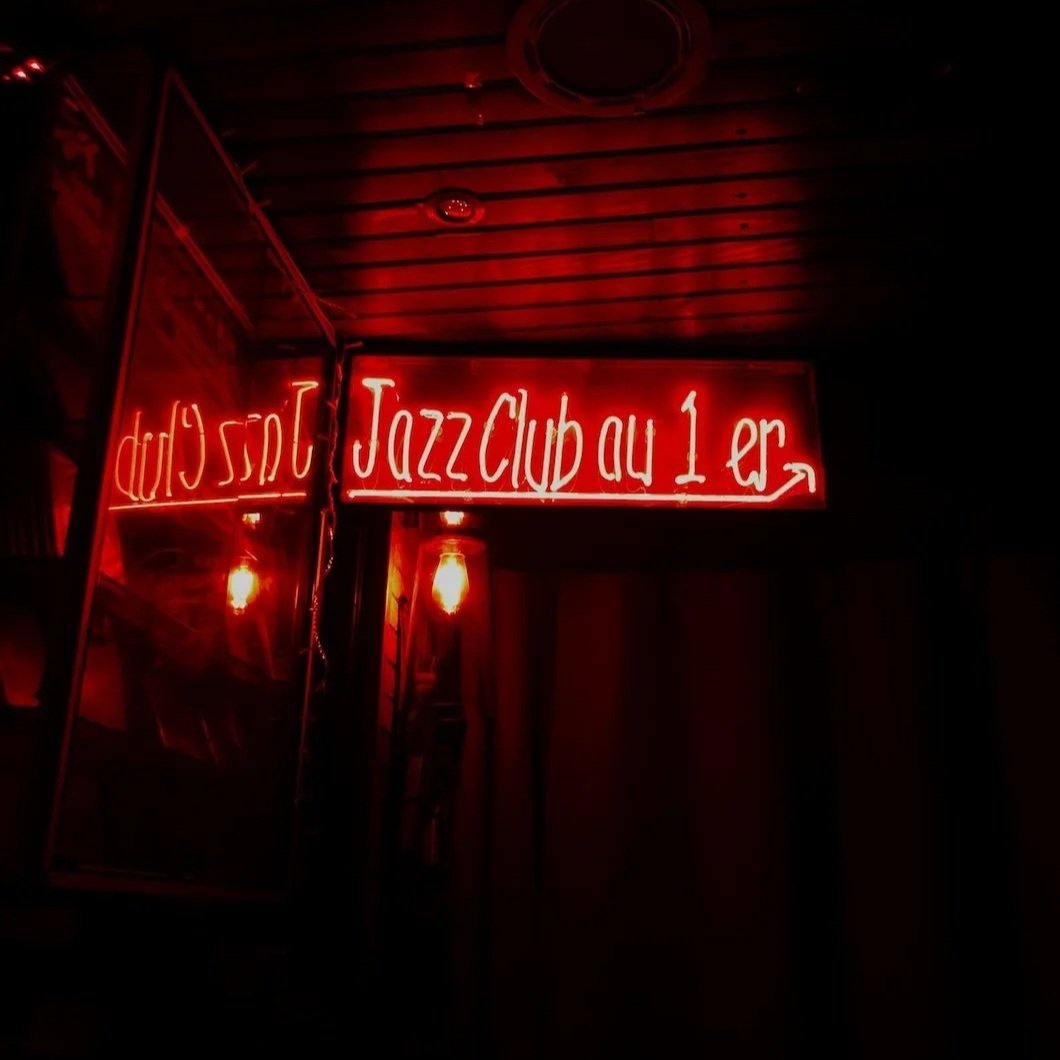
Photo by Enzo Boulet on Unsplash
When Color Plays Like Music
Jazz is more than music.
It’s mood, improvisation, and rhythm layered into something atmospheric. It bends structure without breaking it, surprises without overwhelming, and lingers in the air long after the last note.
Paint has the same power. The right palette can transform a room into something soulful and expressive: a space that doesn’t just look good, but feels alive. For Fairfield County homeowners who want more than safe neutrals, jazz-inspired palettes offer richness, depth, and a touch of sophistication that never goes out of style.
The Jazz Palette: Shades That Set the Mood
Like instruments in a jazz ensemble, each of these colors carries its own tone — but the real magic is in the harmony.
Smoky Blues: Instead of the expected, try Benjamin Moore Andes Summit (a gray-blue with depth) or Sherwin-Williams Deep Sea Dive (rich and atmospheric). Both offer that moody bass note without falling into predictable navy.
Brass & Gold: For warmth, Benjamin Moore Bryant Gold or Farrow & Ball India Yellow feel like trumpet flourishes—bold but not brash.
Burgundy & Plum: Think of velvet vocals and sultry saxophone. Benjamin Moore Raisin Torte or Sherwin-Williams Merlot bring richness without tipping into cliché.
Ivory & Cream: A palette needs balance. Farrow & Ball Joa’s White or Benjamin Moore Ballet White lend softness and light, like piano keys threading the composition.
Together, these shades create a layered mood—sophisticated, unexpected, and just a little improvisational.
Styles of Jazz, Styles of Color
Not all jazz sounds the same. Cool jazz feels different than bebop, just as a muted gray wall carries a different mood than a crimson accent. Choosing a jazz-inspired palette means finding the style that resonates with your lifestyle.
Cool Jazz → restrained palettes of pale blues, soft grays, and gentle neutrals. Perfect for homeowners seeking calm and understatement.
Bebop → high-energy, high-contrast pairings. Imagine teal walls with crimson trim or mustard accents against deep plum. Unexpected, playful, and fearless.
Swing → rhythmic repetition of creams, taupes, and warm neutrals that create harmony without monotony.
Avant-Garde → experimental combinations that push boundaries: chartreuse with aubergine, or black walls softened by rose-colored trim.
In interiors, these “jazz styles” translate into lifestyle choices. A homeowner drawn to Cool Jazz may prefer soft light and minimalism, while someone leaning into Bebop wants their walls to announce themselves boldly. Just as a musician picks an instrument, homeowners pick their palette to reflect personality and mood.
Improvisation in Design: Layering, Lighting, and Texture
Jazz is never flat. It’s layered, shifting, alive in the moment. Paint can do the same when you think beyond a single shade.
Layering = Improvisation: Matte walls paired with satin trim and a glossy ceiling create depth and dimension, much like instruments weaving together in a song.
Lighting = Mood: Jazz thrives at night, and so do deep colors. A smoky blue wall feels commanding in daylight but intimate in dim light. Burgundy grows richer under candlelight. Even ivory changes character under different bulbs.
Texture = Rhythm: Limewash, plaster, or hand-applied finishes introduce rhythm, catching light like a brushed cymbal. These subtle variations add character that flat paint alone can’t achieve.
Improvisation in design doesn’t mean chaos. It means making intentional choices that play off one another in surprising ways.
Where Jazz Colors Belong in the Home
Jazz-inspired palettes can work throughout a home, but they shine brightest in spaces where atmosphere matters.
Living Rooms: Smoky blues paired with brass accents create warmth and depth, ideal for entertaining or relaxing.
Dining Rooms: Burgundy or plum walls turn mealtimes into an occasion, sparking conversation and intimacy.
Libraries & Studies: Deep blues or greens invite focus and reflection — perfect for a paneled office or quiet reading room.
Accent Spaces: Jazz doesn’t have to dominate an entire home. A plum powder room or a smoky blue stairwell riser can deliver the same surprise as a trumpet solo.
And while jazz palettes often play best indoors, exteriors can also carry the mood beautifully. A plum-colored front door with brass hardware, or smoky blue shutters against a cream facade, adds curb appeal that feels both classic and distinctive. These touches don’t overwhelm the architecture but create just enough improvisation to make a home stand out.
Updating the Jazz Palette for Today
Dark, moody shades can feel overwhelming if used carelessly. Updating them for modern Fairfield County homes is all about balance.
Pair smoky blues with crisp whites to keep interiors fresh rather than heavy.
Use metallic or brass-inspired hues in light fixtures, trim, or accents rather than entire walls.
Treat burgundy as an accent rather than the main event: a dining room feature wall or painted built-in adds drama without swallowing space.
Keep sightlines open — balance moody rooms with adjacent spaces painted in lighter tones to avoid visual heaviness.
A jazz-inspired palette should feel dynamic, not dated. With thoughtful use, it becomes a sophisticated accent to modern life.
Tradition Meets Improvisation: The Fairfield County Connection
Fairfield County’s design identity is often rooted in tradition: historic colonials, Georgian facades, shingle-style homes. But homeowners here are also adventurous, blending art, culture, and lifestyle into their spaces.
That’s why jazz-inspired palettes fit so well. They’re grounded in timeless hues like cream and burgundy but allow room for improvisation: a pop of brass on trim, a surprise smoky blue in a hallway, or a textured plaster finish in a dining room. It’s a marriage of tradition and creativity—exactly what jazz has always represented.
Stanwich Pro Tip: Precision in the Dark
Moody palettes are beautiful, but they’re unforgiving. Dark shades highlight every flaw in prep and application. That’s why meticulous surface preparation and professional finishes are essential.
At Stanwich Painting, we understand that smoky blues or burgundies require more than just two coats. We level, sand, and prime until surfaces are flawless — so when the final color goes up, it looks smooth, even, and luminous. Premium paint lines from Benjamin Moore, Sherwin-Williams, and Farrow & Ball provide the depth these palettes deserve.
Paint That Plays With Soul
Jazz is about more than sound; it’s about emotion, atmosphere, and artistry. When translated into paint, it becomes a palette that’s timeless yet improvisational, elegant yet daring.
For homeowners ready to move beyond “safe neutrals,” jazz-inspired colors invite depth and soul into the home creating spaces that look refined by day and atmospheric by night.
Ready to give your Fairfield County home a little rhythm? Call 475-252-9500 or request a consultation.
Further Reading From The Stanwich Blog