
The Summer Fire Palette: Flame, Smoke, and Night Sky
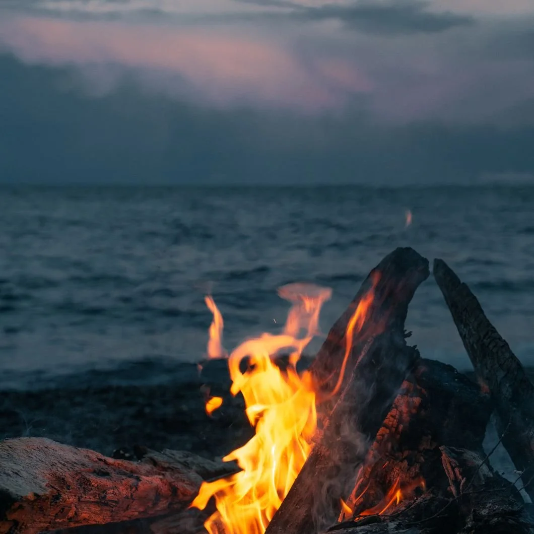
Photo by Anastasia Lebedeva
A summer fire should feel a little unnecessary, which may be why it feels so good. No one is truly gathering for warmth. The air has already handled that part of the evening with more enthusiasm than anyone requested. What people are really gathering around is the shift that happens after sunset, when the yard begins to lose its edges, the chairs pull closer without anyone making an official announcement, and one small source of light gives the night a center.
That is what makes the palette interesting. The color of a summer fire is not simply orange, red, or gold. It is the relationship between those warm colors and everything that cools and darkens around them: the blue-black sky, the gray of smoke, the charcoal edge of burned wood, the brown of bark, the warm white of a shirt catching firelight, and the dull red of embers after the flame settles down.
The beauty is in the contrast, but also in the restraint. A little warmth becomes more powerful when the rest of the scene is allowed to deepen.
That is also what makes this palette useful for the home. Fire-inspired color can go wrong quickly when it is treated too literally. Bright orange walls, aggressive red accents, and anything that starts to feel like a themed restaurant called The Ember Room should probably be approached with care. The better version is quieter and more atmospheric. It borrows from firelight without imitating the fire.
For interiors and exteriors, the summer fire palette is about warmth controlled by shadow. It is clay beside charcoal, rust softened by smoke, blue-black warmed by lamplight, and creamy white that feels less like a blank surface and more like something catching a glow.
Firelight Is Never Alone
A flame in full daylight is not nearly as interesting as a flame after dusk. It needs the darker world around it. It needs the trees to become silhouettes, the lawn to dim, the sky to move toward indigo, and the conversation to slow just enough for everyone to look at the same thing for a while.
That is an important color lesson. Warmth becomes more beautiful when it has something cooler, deeper, or quieter beside it. Clay, rust, copper, terracotta, brick, and ember tones can feel rich and refined, but they need balance. Without that balance, they can become too hot, too rustic, too seasonal, or simply too much.
In a room, that balance might come from smoky gray trim, a deep blue built-in, dark wood floors, a warm white ceiling, aged brass, linen upholstery, or stone. Outside, it might come from a charcoal door, a muted brick walkway, blackened hardware, dark shutters, or a porch that looks better as the evening light drops.
The point is not to make everything warm. The point is to let warmth matter.
A dining room painted in a clay or russet shade can feel elegant when the trim, lighting, furniture, and finish keep it grounded. A study wrapped in deep blue-gray can feel warmer than expected when paired with leather, wood, and amber light. A powder room can handle a more concentrated ember tone because it is small, enclosed, and allowed to be a little theatrical, as long as it knows when to stop.
That last part is important. Every dramatic room should know when to stop.
The Night-Sky Side of the Palette
The most overlooked part of a fire palette is the darkness.
People think first of flame, but the night sky may be doing just as much of the work. Deep blue, blue-black, charcoal, smoky gray, and brown-black shades give fire colors their sophistication. They make the warmer colors feel intentional instead of decorative.
This is why a summer fire palette does not have to be loud. A home could borrow from the palette with only a deep blue front door, a smoky cabinet color, or a warm white interior that looks beautiful in evening light. The fire itself does not need to appear everywhere. Sometimes the suggestion is enough.
A blue-black built-in can create the same sense of depth that the night sky gives the flame. A smoky gray-brown mudroom can feel grounded and practical while still carrying atmosphere. A warm off-white wall can catch lamplight in a way that feels softer than a stark white. A rust or terracotta door can bring just enough heat to an exterior without making the whole house feel like it has developed a personality disorder.
This is where restraint becomes the difference between a palette and a gimmick. A good fire-inspired palette does not announce itself as “fire-inspired.” It simply feels warm, shaded, gathered, and slightly more interesting after sunset.
Where the Palette Works Best
The summer fire palette belongs in rooms and spaces that can handle mood.
Dining rooms are natural candidates because they are already tied to evening, conversation, and low light. A clay, rust, deep blue, or smoky neutral can give the room presence without making it formal in a stiff way. Studies and libraries also work well with this palette because they often benefit from colors that create enclosure: deep blues, smoky browns, charcoal greens, and warm whites that keep the room from feeling cold.
Powder rooms are another strong place for these colors, partly because small rooms can carry concentrated color without asking the whole house to participate. A powder room in terracotta, ember, smoke gray, or deep blue can feel memorable without becoming overwhelming.
The palette also works beautifully on exterior details. A front door in rust, deep blue, charcoal, or clay can bring warmth and weight to the exterior. Shutters can lean toward the night-sky side of the palette. Covered porches can use warm whites, smoky ceilings, or deeper door colors to create a softer evening atmosphere. Garden structures, porch floors, and mudroom entries can also borrow from the palette in small, practical ways.
The best use of this palette is rarely all-over drama. It is more often one strong decision supported by quieter ones.
Paint Colors for a Summer Fire Palette
A summer fire palette needs more than flame colors. It needs ember, smoke, night, ash, and something soft enough to let the deeper colors breathe.
A few paint colors to consider:
Benjamin Moore Rust 2175-30
An earthy orange-red that feels closer to terracotta, ember, and clay than bright orange. It can work well for a front door, powder room, accent wall, or space that wants warmth with confidence.Benjamin Moore Firenze AF-225
A rich clay-orange with a sun-baked quality. It is warm and expressive, but more refined than playful, especially in dining rooms, small rooms, or architectural accents.Benjamin Moore Smoke Embers 1466
A smoky neutral that brings the ash side of the palette into the home. It works well for walls, cabinetry, mudrooms, or transitional spaces that need atmosphere without becoming dark.Benjamin Moore Ashwood Moss 1484
A smoky green-gray that suggests trees, shadow, and cooled embers rather than obvious green. It is especially useful in studies, bedrooms, cabinetry, and rooms with natural materials.Benjamin Moore Mysterious AF-565
A deep blue-gray that feels like evening sky. It can be beautiful on built-ins, doors, cabinetry, or in a room where a traditional navy feels too predictable.Benjamin Moore Blue Note 2129-30
A saturated blue-black with strong night-sky depth. This is a good choice for studies, libraries, dining rooms, interior doors, or dramatic cabinetry.Benjamin Moore Acadia White OC-38
A warm, mellow white that gives the palette relief. It pairs well with rust, clay, charcoal, smoke, and deep blue because it softens the contrast without going stark.Farrow & Ball Red Earth
A warm terracotta-pink that feels like clay, plaster, and firelight. It is especially useful when a room wants color, warmth, and character without tipping into obvious red or orange.
These colors are not meant to recreate a fire literally. They recreate the conditions that make firelight beautiful: warmth, darkness, softness, depth, and enough contrast for everything to feel alive.
Warmth With Shadow
The mistake with warm color is assuming it has to be bright.
Some of the most beautiful warm rooms are quiet because the warmth is balanced by shadow, texture, and restraint. A clay wall can feel calm when it is paired with the right trim and lighting. A rust door can feel classic when the exterior around it is grounded. A smoky blue-black can make a room feel intimate rather than severe. A warm white can hold the whole palette together without calling attention to itself.
That is why the summer fire palette can work well beyond summer. It does not depend on beach colors, fall leaves, holiday reds, or winter coziness. It sits in a more interesting place: warm but not sweet, dark but not cold, atmospheric but still livable.
It is a palette for rooms that feel better when the light is lower. A dining room before dinner. A study in the evening. A porch after sunset. A powder room that can afford to be moody because no one is trying to fold laundry in there for forty-five minutes.
The palette gives those spaces a center of gravity. It lets warmth gather without taking over. It lets darkness feel inviting instead of heavy. It allows color to create atmosphere rather than simply decorate the surface.
Flame, Smoke, and Night Sky
A summer fire lasts only a few hours, but its colors tend to stay in the mind: the orange edge of flame, the dull red of embers, the gray of smoke, the brown of wood, the black of trees, and the deep blue of the sky before it becomes fully dark.
Those are colors worth borrowing because they understand something useful about the home. Warmth is more beautiful when it has shadow beside it. Dark colors are more generous when they catch a little light. A room does not need to be bright to feel alive, and a color palette does not need to shout in order to draw people in.
For interiors and exteriors, the summer fire palette offers a way to bring depth, warmth, and evening elegance into the home without becoming rustic, theatrical, or overly seasonal. It is not about copying the firepit. It is about translating the atmosphere around it.
The glow. The smoke. The darker edge of the yard. The brief blue of the sky. The way everyone settles, almost without noticing, once the night has somewhere to gather.
Looking for a color palette with warmth, depth, and atmosphere? Stanwich Painting can help you choose the right rusts, clays, smoky neutrals, deep blues, charcoals, and warm whites for an interior or exterior that feels refined, grounded, and beautifully suited to the way your home lives in the light.
Stanwich Painting proudly provides top-quality residential painting services throughout Fairfield County, including: Greenwich, Cos Cob, Riverside, Old Greenwich, Stamford, Darien, New Canaan, and Wilton