Paint Regret: What To Do When Your Walls Aren’t What You Imagined
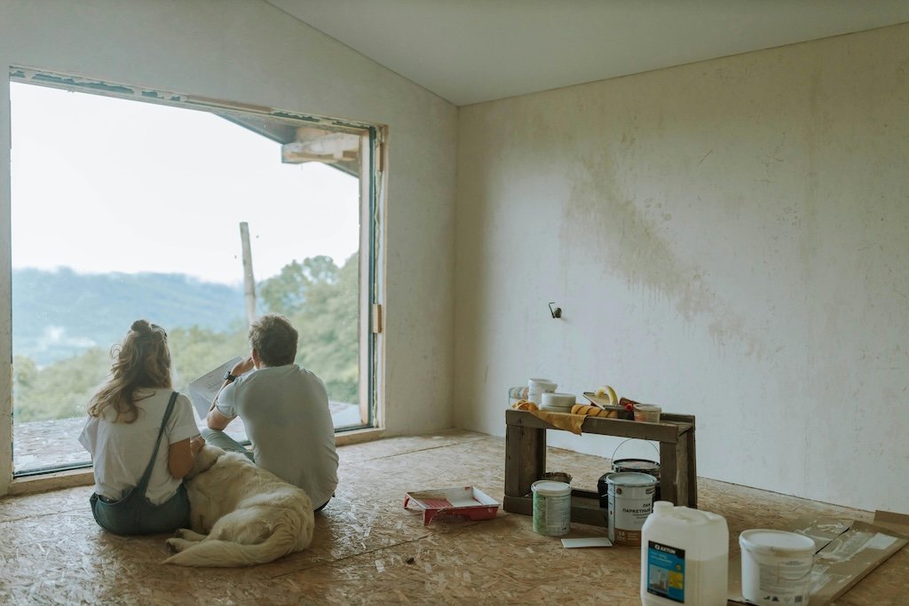
Photo by Anastasia Shuraeva
You picked the color. The painter did their job. And now you’re sitting in your freshly painted room thinking: …I hate it.
You’re not alone. Whether you chose it yourself or got a little too confident scrolling Pinterest, paint regret is real—and surprisingly common. At Stanwich Painting, we’ve noticed a growing number of homeowners seeking guidance earlier in the process—sometimes after second-guessing a trending choice, or sensing something feels 'off' before the paint even hits the wall.
5 Telltale Signs You’ve Got Paint Regret
“I avoid turning the lights on in this room.”
“It looked beige online… why is it pink now?”
“My living room feels like a doctor’s office.”
“This blue makes me tense, not calm.”
“I loved it on TikTok. I hate it here.”
Sound familiar?
You’re not crazy—and you’re not doomed to repaint the entire house.
When It’s Time to Start Over—And How to Get It Right
If you’re ready to repaint, here’s how to avoid round two of regret:
Sample Bigger. Use actual sample boards—at least 12x12—and move them around the room throughout the day.
Watch the Light. Observe the space in morning, midday, and evening. A color that’s cozy at noon may feel harsh at night.
Don’t Crowdsource Color. Pinterest and TikTok are inspiring, sure—but they’re often staged. A room that looks soft beige online may be dark greige in your home.
Test the Finish. A color in matte will read completely differently than in satin or semi-gloss. For example, Sherwin-Williams' Accessible Beige in matte = soft and elegant; in semi-gloss = borderline khaki.
Talk to a Pro. Someone who knows how undertones, lighting, and finish interact can help you choose with actual confidence—not social hype.
Why Personal Trust Beats Social Trends (Every Time)
Here’s something we’ve noticed lately across Fairfield County: an increasing number of clients are coming to us after trying to follow a viral trend or influencer look. And nearly all of them say the same thing:
“I didn’t realize how different it would feel in my house.”
Instagram isn’t responsible for how your room feels at 7PM. Influencers aren’t prepping your drywall. Viral swatches don’t stand behind the roller.
Personal trust—in someone who’s stood in the room, asked questions about how you live, and considered the architecture, light, and feeling of your space—that’s what gets it right.
At Stanwich Painting, we don’t throw trends out the window. We just use them as one piece of a much bigger picture—one rooted in your actual home, not the scrollable version of one.
Paint Psychology: What That Color Might Be Telling You
Still wondering why your paint feels off? Here’s a quick emotional decoder:
Too Cool = Too Distant. Gray-blues and sterile whites can feel cold or uninviting, especially in north-facing rooms.
Too Warm = Too Close. That taupe might feel like it’s “hugging” you… in the worst way.
Too Dark = Too Heavy. Especially in low-ceiling or poorly lit rooms.
Too Saturated = Too Loud. Bold colors are exciting—but can quickly turn exhausting.
Design psychology shows that even subtle color shifts affect our mood, productivity, and sense of calm. Choosing wisely means you’re designing for feeling—not just for finish.
What We’re Seeing in Fairfield County Right Now
In places like Stamford, Riverside, and New Canaan, we’ve had more homeowners reaching out before they paint—looking for help getting it right from the start. There’s a growing sense that color is personal, and that mistakes cost more than just paint—they cost comfort.
We’re also seeing a shift toward layered palettes: rich whites with pale trim, warm neutrals paired with muted greens, and bold color in smaller doses.
The goal isn’t just “what’s trending”—it’s what works for your house and your head.
The Stanwich Way: Designed to Feel Right
Our approach is simple: we ask better questions. How does the room feel in the morning? What do you want it to feel like at night? What’s staying in the space, and what’s changing?
We guide you through color, finish, and layout—not just with swatches, but with experience. And if you’re already living with a shade you regret? We can help fix that too—with tact, taste, and zero judgment.
Because the right paint job doesn’t just look good. It feels right.
Need Help Before the Next Color Mistake? Let’s get it right the first time. Contact Stanwich Painting for a free estimate and personalized color guidance. Serving Greenwich, Stamford, Riverside, Wilton, Westport, Darien, and beyond.
Citations & References
Verywell Mind – “Color Psychology: Does It Affect How You Feel?”https://www.verywellmind.com/color-psychology-2795824Rowan University – “The Psychology of Colors: Research on Mood and Performance”https://rowanblog.com/2025/04/the-psychology-of-colors/Sherwin‑Williams – “Your Guide to Paint Gloss & Sheen”https://www.sherwin-williams.com/architects-specifiers-designers/inspiration/styles-and-techniques/sw-art-gloss-sheen-differencesSherwin‑Williams – “How to Choose Paint Finish”https://www.sherwin-williams.com/en-us/project-center/paint-sheen-guideWikipedia – “Paint sheen”https://en.wikipedia.org/wiki/Paint_sheen

