
Invisible Color: The Hues You Feel But Can’t Name
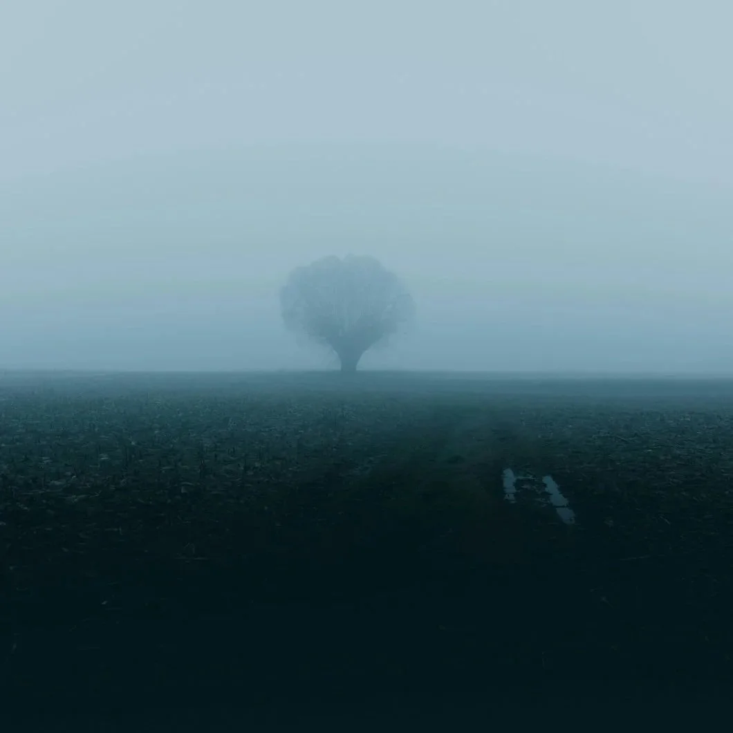
Photo by Branimir Balogović on Unsplash
Seeing Without Seeing
Not long ago, a client called us puzzled. His freshly painted outdoor deck, chosen in a neutral shade, appeared to glow with a yellow undertone in the afternoon sun. He checked the paint can again and again — there was no yellow in the formula. The paint was the color he’d chosen. And yet, in the right light, it seemed to tell a different story.
That moment reveals the secret of what we call invisible color: the undertones, the light shifts, and the quiet hues that shape how a room or surface feels. You don’t see them outright, but you sense them. They can make a home feel warm or cold, inviting or sterile, cohesive or fragmented. And in Fairfield County — with our changing seasons, distinctive light, and wide mix of architectural styles — invisible color is often the difference between a paint job that looks “fine” and one that truly resonates.
Light as Sculptor of Color
Most people think of paint as a fixed property: you pick the shade, apply it to the surface, and it stays that way. But paint is less a fixed substance than a collaborator with light. Light reveals, distorts, and sculpts what we see.
That’s what our deck client experienced. In the can, the paint was neutral. On the surface, in morning shade, it read true to sample. But when late-day sun angled across the boards, bouncing from surrounding greenery and the honey tone of the underlying wood, the color shifted. Suddenly, a neutral was singing with golden undertones.
This is why outdoor spaces in particular seem to change daily. The green reflection of trees, the blue cast of sky, even nearby masonry all bleed into how we perceive paint. Indoors, it’s no different: north-facing rooms tend toward cool, gray light, while south-facing rooms seem to warm every surface.
In Fairfield County, seasonal shifts make invisible color even more dramatic. A warm beige may feel sunlit and golden in September but look washed-out and flat under February’s blue-gray daylight. A subtle gray that seems calming in winter may take on a green edge when spring foliage reenters the picture.
Invisible color, then, isn’t hiding in the paint at all. It’s sculpted by the world around it.
The Psychology of Color You Can’t Name
Even if you don’t consciously see undertones, you feel them. That’s why homeowners so often argue about whether a gray looks blue, green, or violet. The mind resists ambiguity…it wants to categorize.
Invisible color often acts like emotional shorthand:
A gray with a green undertone may calm a room in ways you can’t quite explain.
A beige with a trace of pink undertone can make a space feel cozy, almost nostalgic.
A crisp white might turn cold and sterile if its undertone tilts too blue.
We may not name these shifts, but we sense them in atmosphere. A space feels “inviting,” “off,” or “unexpectedly harsh” based on undertones alone.
Invisible color is the subtext of paint. Like a novel with hidden meanings between the lines, walls whisper things to us even when we can’t articulate why.
Invisible Color as Interior Glue
In larger homes especially, invisible color is what ties everything together. Most people think continuity comes from using the same shade across multiple rooms. But that often leads to monotony. True harmony comes from matching undertones, not just repeating colors.
For example:
A hallway gray with a faint lavender undertone feels connected to a soft purple bedroom, even though the colors are technically different.
A creamy white in the kitchen echoes the warm undertone of the beige in the adjoining living room, creating flow without uniformity.
A subtle sage undertone in a bathroom neutral makes sense when it shares a quiet dialogue with the leafy view outside the window.
These are the choices that feel effortless once they’re made, but they don’t happen by accident. Invisible color is what allows a house to feel like a single story rather than a series of disconnected chapters.
When Blue Isn’t Blue (and Green Isn’t Green)
Invisible color isn’t just about what light does…sometimes it’s baked into the paint itself. Many of the most popular “neutrals” or “soft shades” by Benjamin Moore and Farrow & Ball walk the line between categories, appearing one way at first glance but carrying undertones that shift with the day.
Benjamin Moore Gray Owl (OC-52): A perennial favorite gray that seems crisp and cool until you notice its green undertone. In north light, it leans blue; in afternoon sun, green shows through.
Benjamin Moore Wickham Gray (HC-171): Marketed as a pale gray, but its soft blue-green undertone creates a shifting effect. In some rooms, it feels airy blue; in others, quietly aquatic.
Benjamin Moore Palladian Blue (HC-144): A chameleon color: is it blue? Is it green? Is it gray? Depends entirely on the light — and that’s why designers love it.
Farrow & Ball Light Blue No. 22: Despite the name, this color often reads green-gray, especially in daylight. At night, it deepens into a moody, almost teal atmosphere.
Farrow & Ball Green Blue No. 84: The name gives away the trick — it hovers between seafoam green and soft duck-egg blue, changing hour by hour.
Farrow & Ball Cromarty No. 285: An “invisible” neutral that carries subtle green undertones; often mistaken for gray or blue depending on its companions.
These colors embody the idea of invisible color: they don’t announce themselves as one thing, but live in the space between. They’re why one homeowner insists a room is “gray” while another swears it’s “blue.” Invisible hues resist easy naming, which is exactly what gives them richness.
Fairfield County Light, Fairfield County Homes
The lesson of invisible color takes on special weight in our region. Fairfield County’s diverse housing stock: from historic colonials in Greenwich to modern glass-walled builds in Stamford — all interact with color differently.
Historic Homes: Older plaster walls, dark wood trim, and smaller windows can make cool colors feel moody. Warm undertones usually help balance the architecture’s weight and texture.
Modern Homes: Expanses of glass and open layouts mean undertones are constantly shifting with the light. Cooler undertones often complement these spaces, but only when chosen with care.
Seasonal Shifts: In winter, undertones lean cool under pale light. In summer, lush foliage can turn a neutral wall greenish. In fall, golden sunlight warms everything — sometimes too much.
Invisible color is not an abstract concept here. It’s a reality homeowners notice, even if they can’t put it into words — like our deck client staring at “yellow” that wasn’t there.
The Subconscious of Your Home
Think of invisible color as the subconscious of a house. It doesn’t shout. It whispers, shaping mood and memory quietly.
Like the bass line in a piece of music, you may not hear it directly, but it drives the harmony. Like the undertones in a fragrance, you may not identify them outright, but they determine the character. In a home, invisible color makes the difference between surfaces that merely look painted and walls that feel inhabited, alive, and resonant.
When you choose paint, you’re not just choosing what you see on the chip. You’re choosing the hidden hues, the way light will interact, the way emotion will quietly anchor itself in a room.
Invisible color is what makes a house feel like yours, even if you can’t quite name why.
Closing Thought
The most important colors in your home may be the ones you never notice directly. They’re the undertones, the shifts of light, the invisible hues that give paint its true personality.
At Stanwich Painting, we understand that paint is never just surface deep. It’s about how color behaves in context: in light, in space, and in memory. Whether you’re refreshing a single room or rethinking your whole house palette, we help you choose colors that not only look right, but feel right.
Bring invisible color into focus. Call us at 475-252-9500 or request your free estimate online today.
Further Reading & References“The Psychology of Color” – Wikipedia (Overview of how color influences mood, perception, and behavior) https://99designs.com/blog/tips/the-7-step-guide-to-understanding-color-theory/Memory Color Effect – Wikipedia (Explains how familiar objects—like bananas—bias our perception of color, reinforcing how context alters what we think we see) https://en.wikipedia.org/wiki/Memory_color_effectColor Constancy & Retinex Theory – Wikipedia (Color constancy shows our brains perceive object colors as stable under different lighting; Retinex Theory explains how the brain balances color under varying illumination) https://en.wikipedia.org/wiki/Color_constancy“8 Factors That Influence the Way You See Colors” – Datacolor (Explores how lighting source, intensity, and rendering affect perception) https://www.datacolor.com/business-solutions/blog/factors-that-impact-color-perception/“Understanding Color Temperatures and Undertones” – J. Rainey (Discusses how different lighting—natural vs. artificial—brings out or mutes undertones) https://jennarainey.com/understanding-color-temperatures-and-undertones-a-comprehensive-guide/Color Theory – Wikipedia (Historical and scientific underpinnings of how color mixes and is perceived) https://en.wikipedia.org/wiki/Color_theory