
Colonial Paint Colors: How to Keep a Classic Home Timeless, Not Stuck in Time
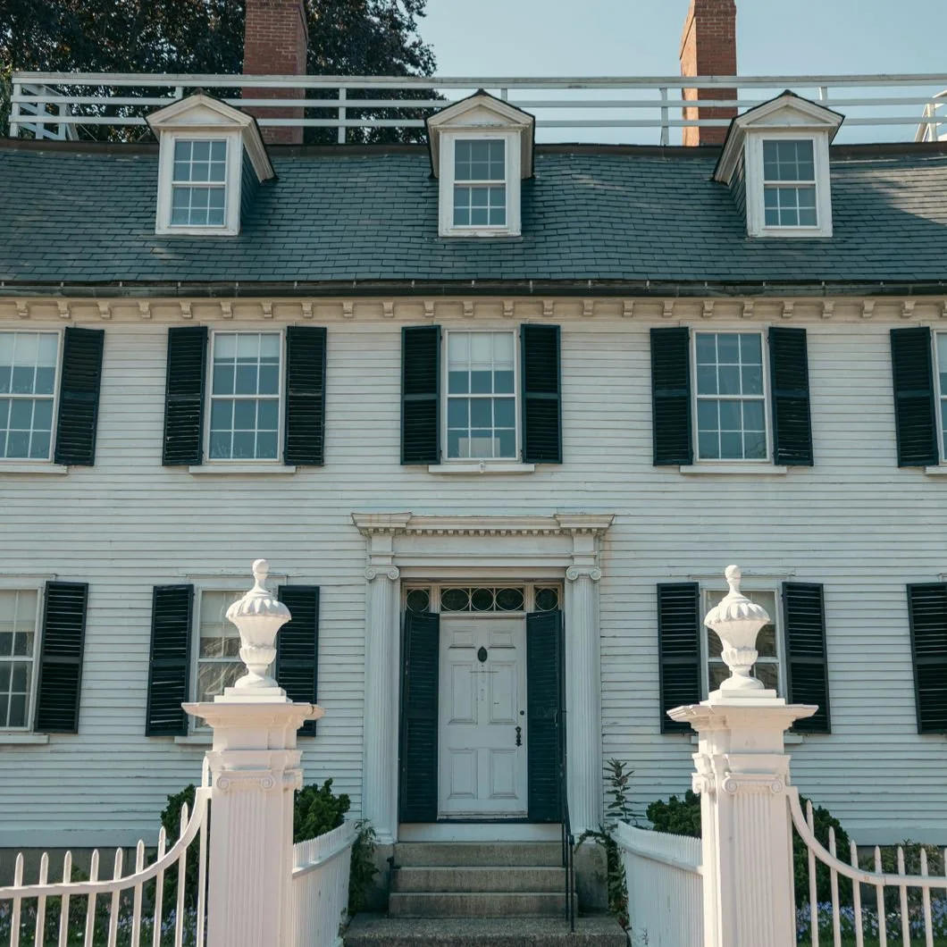
Photo by Banx Photography
A Colonial home has a certain kind of confidence.
It does not need to shout. It does not require a dramatic roofline, a complicated silhouette, or a palette that announces itself from the end of the street. Its strength lies in proportion, balance, repetition, and restraint. Windows align. The front door has presence. Shutters keep a steady rhythm. Trim gives the house its structure.
Even when a home has been updated, expanded, or adapted over time, the essential language remains: order, symmetry, presence.
That is also why choosing exterior paint colors for a Colonial can feel more delicate than expected.
On the surface, the question sounds simple. What color should the house be? But a Colonial exterior is rarely just one color decision. The body color, trim, shutters, front door, window sash, foundation, columns, portico, garage doors, and even the roof all work together. If the palette is too flat, the architecture loses definition. If the contrast is too harsh, the house can feel severe. If the color is too trendy, the home may look current for a few seasons and then suddenly feel out of step with itself.
The goal is not to make a Colonial feel frozen in time. Authenticity does not have to mean turning the house into a museum piece. A thoughtful repaint should respect the architecture while still allowing the home to feel fresh, livable, and cared for today. The right Colonial palette does not need to make the house look dramatic. It should help the proportions, trim, shutters, and front door feel balanced, settled, and true to the home.
Colonial Homes Need Color Hierarchy
One of the most important ideas in painting a Colonial is hierarchy.
A Colonial has a natural order, and each exterior element plays a role in how the house is read. The main body color carries the largest surface, while the trim defines the edges around the windows, roofline, porch, and architectural details. Shutters add rhythm and contrast, the front door gives the eye a place to land, and the foundation helps ground the house. Even the roof, brick, stone, walkway, and surrounding landscape influence whether the final paint palette feels balanced or slightly off.
When those elements are considered together, the exterior feels composed. When they are chosen separately, the house can begin to feel disconnected.
This is why the classic Colonial palette has lasted so long. A white or warm white body, dark shutters, crisp trim, and a strong door color work because the palette reinforces the form of the house. That contrast is what helps the windows feel sharper, the shutters feel intentional, the front door feel properly placed, and the whole exterior feel more ordered and composed.
But classic does not mean automatic. A bright white may be too stark against an older roof or warm stone foundation. Black shutters may feel too severe on a wooded lot. A red door may be perfect on one house and distracting on another. The palette has to belong to the home itself, not just to the idea of a Colonial.
Classic Does Not Have to Mean Cold
Many people imagine a Colonial in white with black shutters and a red door. It is iconic for a reason, but it is not the only timeless option. In fact, some Colonials feel better when the white is softened, the contrast is warmed, or the door color is chosen with more restraint.
A warm white body color can make a home feel classic without feeling harsh. Creamier trim can work beautifully with older brick, weathered stone, slate roofs, and mature landscaping. A deep green, blue-black, or brown-black shutter can soften the contrast while still preserving the architecture’s rhythm.
For a classic Colonial direction, consider the mood more than the formula:
Warm white body, dark shutters, heritage red door for a traditional look with presence.
Soft white body, black or blue-black shutters, warm white trim for a cleaner but still classic palette.
Cream body, dark green shutters, understated door color for a slightly softer, more landscape-friendly interpretation.
This palette works because it feels familiar without feeling lazy, and the colors complement the architecture rather than compete with it.
Warm Stone Palettes Feel Settled
Not every Colonial wants a white exterior. Many homes, especially those surrounded by trees, stone walls, older gardens, gravel drives, or warmer roof tones, can look more natural in a stone, taupe, cream, or greige palette.
These colors can make a Colonial feel settled into its landscape. They are less crisp than white, but often more forgiving. A warm stone body color with cream trim and dark shutters can feel refined, comfortable, and deeply appropriate for an older home.
The key is making sure the palette still has enough definition. If the body, trim, shutters, and foundation are too close in value, the house may begin to blur. Colonial architecture depends on rhythm, so the windows, trim, and shutters need enough contrast to remain visible.
A warm stone Colonial might include:
Taupe or greige body color with cream trim and deep brown shutters.
Warm beige body color with off-white trim and a dark green or black-green door.
Stone-colored siding with a softer shutter color for homes that want restraint rather than high contrast.
This direction is especially strong for homes where pure white would feel too sharp or too formal.
Blue-Gray Can Feel Fresh and Traditional
Blue-gray and slate palettes can be beautiful on Colonial homes because they offer color without becoming loud. They feel traditional enough to respect the architecture, but fresh enough to keep the exterior from feeling predictable.
A blue-gray Colonial can work particularly well in coastal areas, shaded neighborhoods, or homes with cooler roof tones. The color can feel calm, elegant, and slightly atmospheric. With white or warm white trim, the architecture still reads clearly. With navy, blue-black, or charcoal shutters, the palette gains depth.
The caution is undertone. Some blue-grays can turn too cold or too bright outside, especially in strong daylight. Others may lean too purple or too flat. Exterior color always needs to be tested on the house itself because natural light changes everything.
A blue-gray Colonial might include:
Slate blue body color with warm white trim and navy shutters.
Soft gray-blue body color with crisp trim and a blue-black front door.
Deeper blue-gray siding with restrained trim for a more formal, polished look.
This palette can feel especially good on a Colonial that wants to remain classic while moving away from the expected white-and-black combination.
Green Works Beautifully With Landscape
Green is one of the most timeless exterior directions for a Colonial because it has a natural relationship to the landscape. Sage, olive, moss, green-gray, and deep forest tones can all work well, depending on the house and setting.
A green Colonial can feel historic, quiet, and grounded. It can also soften a home that might otherwise feel too formal. In neighborhoods with mature trees, stone walls, hedges, and traditional gardens, green often feels less like a color choice and more like the house belongs where it is.
The most successful green palettes usually avoid anything too bright or too clean. A Colonial tends to respond better to greens with gray, brown, or historic undertones. These colors feel more architectural and less decorative.
A wooded or green Colonial might include:
Sage or green-gray body color with warm white trim and deep green shutters.
Muted olive body color with cream trim and a dark door.
Soft green-gray siding with restrained shutters for a quieter, more tonal exterior.
Green is especially good when the homeowner wants the house to feel timeless, but not overly formal.
The Door and Shutters Should Not Feel Random
On a Colonial, shutters and doors carry more visual weight than people sometimes realize.
Because the architecture is symmetrical, the shutters create rhythm across the façade. If the shutter color is wrong, the whole house can feel unsettled. If the shutters are too bright, too flat, or too disconnected from the roof, door, or body color, they begin to look decorative in the wrong way.
The front door is different. It can carry more personality because it is the punctuation mark of the exterior. But even here, the color should feel grounded. A red door, green door, black door, blue-black door, or deep brown door can all work beautifully, but the choice should relate to the rest of the palette.
A Colonial does not usually need a door color that feels clever. It needs one that feels confident.
Paint Should Respect the House, Not Imitate the Past
There is a difference between timeless and historical costume.
A Colonial home does not need to be repainted exactly as it might have been painted in another century, especially when the house itself has likely changed over time. Windows may have been replaced, additions added, roofs updated, landscaping matured, and interiors reworked for modern life. The goal is not to recreate the past exactly, but to help a house with character feel cared for, livable, and true to itself.
That is why the best exterior palette respects the architecture without becoming rigid. It understands proportion, contrast, restraint, and setting. It allows the house to feel classic, but not stale. Fresh, but not trendy. Authentic, but not frozen.
The right paint colors can restore dignity to a Colonial. They can sharpen the trim, clarify the shutters, warm the façade, ground the foundation, and make the front door feel intentional again.
For homeowners considering a Colonial repaint, the best place to begin is not with the trendiest color of the year. It is with the house itself.
Look at the roof. Look at the trim. Look at the brick, stone, walkway, porch, and landscape. Look at how the house sits in morning light and late afternoon shade. Notice whether the home wants crispness, warmth, softness, contrast, or calm.
A Colonial already has a strong architectural voice and the right palette simply helps it speak clearly.
Ready For Your Colonial’s Refresh?
Stanwich Painting proudly provides top-quality residential painting services throughout Fairfield County, including: Greenwich, Cos Cob, Riverside, Old Greenwich, Stamford, Darien, New Canaan, and Wilton